And there it is — the moment that you realized your productivity was killed and your focus was derailed, all for an idea that probably won’t matter in two weeks (if not two minutes). But you’ll do it again tomorrow, because that’s what product teams do. We entertain ideas. We explore possibilities. We chase potential. […]
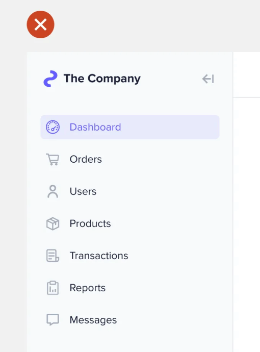
A sidebar navigation on an interface offers users multiple items to select. After making a selection, they need a visual cue to identify the chosen item. This cue is called an indicator. Every sidebar needs a clear and non-distracting selection indicator. However, many designers continue to use bad practices that make it hard for users […]
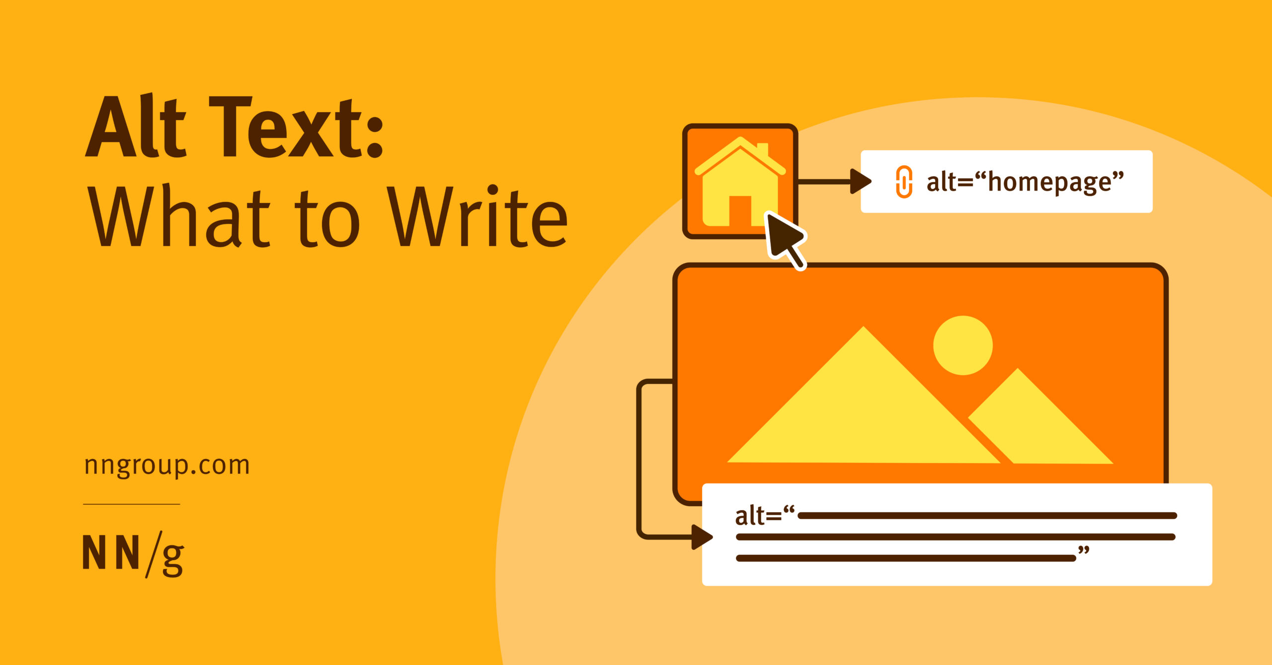
Summary: Images are decorative, functional, or informative. Skip alt text for decorative. Describe the action for functional. Convey the message for informative. Alt text, or alternative text, is a brief description added to images on a website, enabling screen readers to convey visual content to individuals with visual impairments. Well-crafted alt text is essential for […]
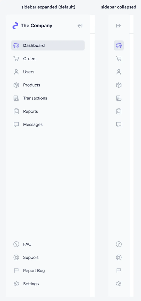
Screen space on a desktop interface is more important than you think. Most designers take it for granted because a desktop screen contains so much space. However, when it comes to data display, every pixel counts. A sidebar can occupy a lot of width space and diminish the content area. As a result, users will […]
From Duolingo, Typeform, Notion, Monzo & more. Recruiting users for research is hard. An email to 1000 users might get you a handful of call bookings at best. That’s 0.2–0.5% conversion. Pretty demoralising 💀 Especially at early-stage startups where you may not have well-oiled communication channels, an allocated budget or many users to contact. But, […]
Many talented professionals hold back from speaking at tech events, believing they need years of experience or expert status first. Drawing from her experience as a first-time speaker at WordPress Accessibility Day 2024, Victoria Nduka discusses how speaking at events benefits both individuals and the tech community. On Thursday, October 10, 2024, I gave my […]
The tension between modernism and postmodernism is more than a philosophical debate — it is a cultural and political contradiction that plays out daily in the UX domain. On one hand, modernism champions clarity, function, and universal accessibility — principles that are central to the discipline. On the other hand, postmodernism thrives on skepticism, irony, […]
There’s a story I want to tell you. It’s a story that emerged out of my recent work with a UX team. They used this story to excite their executives on how recent UX improvements made a substantial business impact. Since it’s not my story to tell, I’ve changed many of the details. The events […]
A throw-away tool is a custom solution developed to address a specific problem. Despite its name, these tools can see frequent and long-term use. The “throw-away” aspect refers not to the tool’s lifespan, but to its intended scope and audience. These tools are built to solve the developer’s own problems. Because of this they focus […]
By now, the HEART framework should be known to every UX designer, as it reaches close to a decade since Kerry Rodden, Hilary Hutchinson, and Xin Fu from Google’s research team introduced the framework to the community. In a nutshell, the framework comprises 5 categories: happiness (H), engagement (E), adoption (A), retention (R), and task […]

