Summary:
Images are decorative, functional, or informative. Skip alt text for decorative. Describe the action for functional. Convey the message for informative.
Alt text, or alternative text, is a brief description added to images on a website, enabling screen readers to convey visual content to individuals with visual impairments. Well-crafted alt text is essential for ensuring web accessibility and usability. The best alt text takes into consideration the context of the image along with its purpose.
Writing Good Alt Text (When It’s Needed)
If an image is essential for a task or for understanding page content, it needs alt text. The following recommendations apply to every instance of alt text — regardless of the type of image it describes.
- Keep it short. Alt text shouldn’t be much longer than around 150 characters. Users can’t pause and resume the screen reader in the middle of alt text without going back to the beginning. People also can’t hold very much information in their working memory. Users will skip alt text if it doesn’t immediately seem like it will help them with their task.
- Do not include words like ‘image’ or ‘photo’ at the beginning. Screen readers already identify images as images when they encounter them because they are contained within the <img> HTML tag. Identifying an image as a certain type (e.g., infographic, chart, illustration) is appropriate if it will help the user understand the other alt text.
- End alt text with a period, even if it isn’t a full sentence. The period ensures that the screen reader pauses after reading the alt text.
- Frontload alt text with the most important words, to help users make a quick and informed decision about whether it’s worth listening to the rest of the alt text before moving on.
- Always include an alt attribute (alt=””), even if it will be empty. Otherwise, screen readers might announce the image file name.
- Avoid technical jargon and abbreviations unless users are certain to understand them.
- Never reuse alt text for the same image without reanalyzing the context in which the image is placed.
- Mention identity only if it’s relevant. If the race, ethnicity, gender, religion, or cultural identifiers of the people pictured aren’t part of the reason the image was included, don’t mention them.
- Include alt text in each language that your page supports. Use a translation key to simplify your process.
3 Steps for Deciding What Your Alt Text Should Include
Consider the Context
Read the page copy surrounding the image to understand its purpose. Look for any references to the image or explanations of the image — especially if image captions are present. (Struggling to understand context is one reason AI does not write good alt text on its own.)
The context of an image and the author’s intention for including it determine what the alt text should say, which is why the best alt text is created with input from those who write the content and choose the images. Alt text for the same image changes from context to context because different things will be relevant about the same image in different places.
The following example shows how the alt text for the same image changes based on its context.
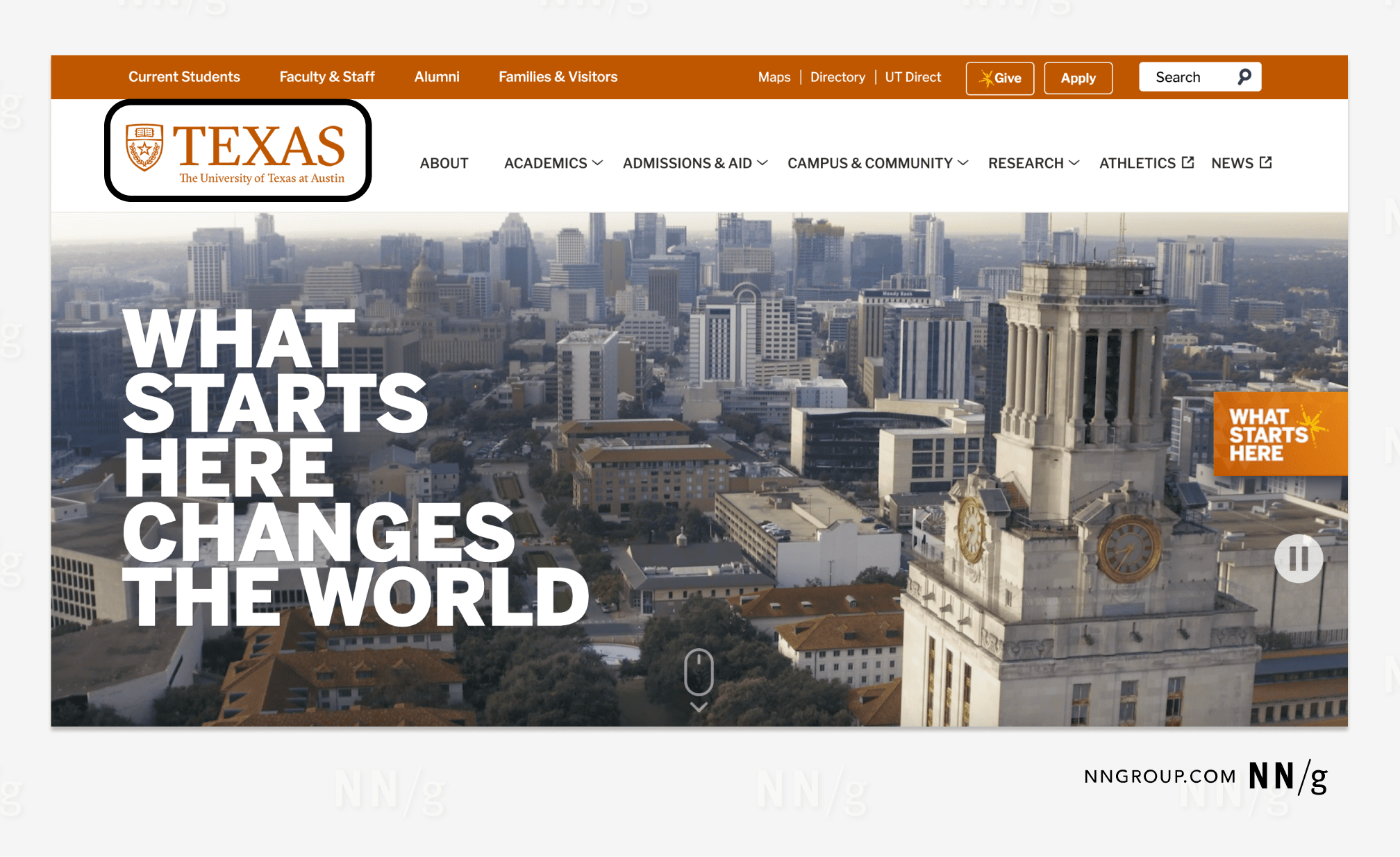
HTML: alt=”UT Austin home.”
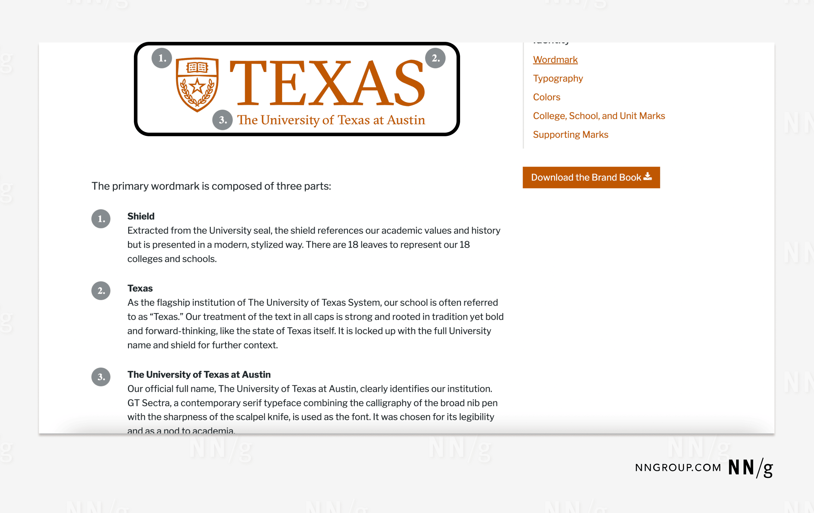
HTML: alt= “The UT Austin logo featuring a shield adjacent to the word ‘Texas’ with the phrase ‘The University of Texas at Austin’ underneath.”
Identify the Intention
Write the basic idea(s) that the image conveys in the context of the surrounding page copy. Try answering the question “Why did the author include this image?”
Trim the Text
Focus the alt text on the unique value that the image adds to the page. Reduce the alt text to state only that unique message to avoid redundancy with other page copy. (AI can be helpful for simplifying your writing at this stage.)
Alt-Text Decision Tree

Decorative Images Don’t Need Alt Text
An image is decorative if users can complete all tasks and understand all information on the page without it. Decorative images create a specific look and feel for sighted users but don’t convey information relevant for any tasks. Because of this, they’re superfluous and don’t merit screen-reader users’ time or attention, so the alt-text attribute should be empty so that the screen reader skips right over them.
The W3C states that: “whether to treat an image as informative or decorative is a judgment that authors make, based on the reason for including the image on the page.”
Decorative images often include:
- Stock photos used to enhance visual appeal
- Hero images
- Icons used for visual appeal
- Ornamental borders
Decorative images can also include page elements that use an image file, such as:
- Headers
- Spacers or dividers
- Background patterns
- Color or gradient overlays
- Animations or hover effects
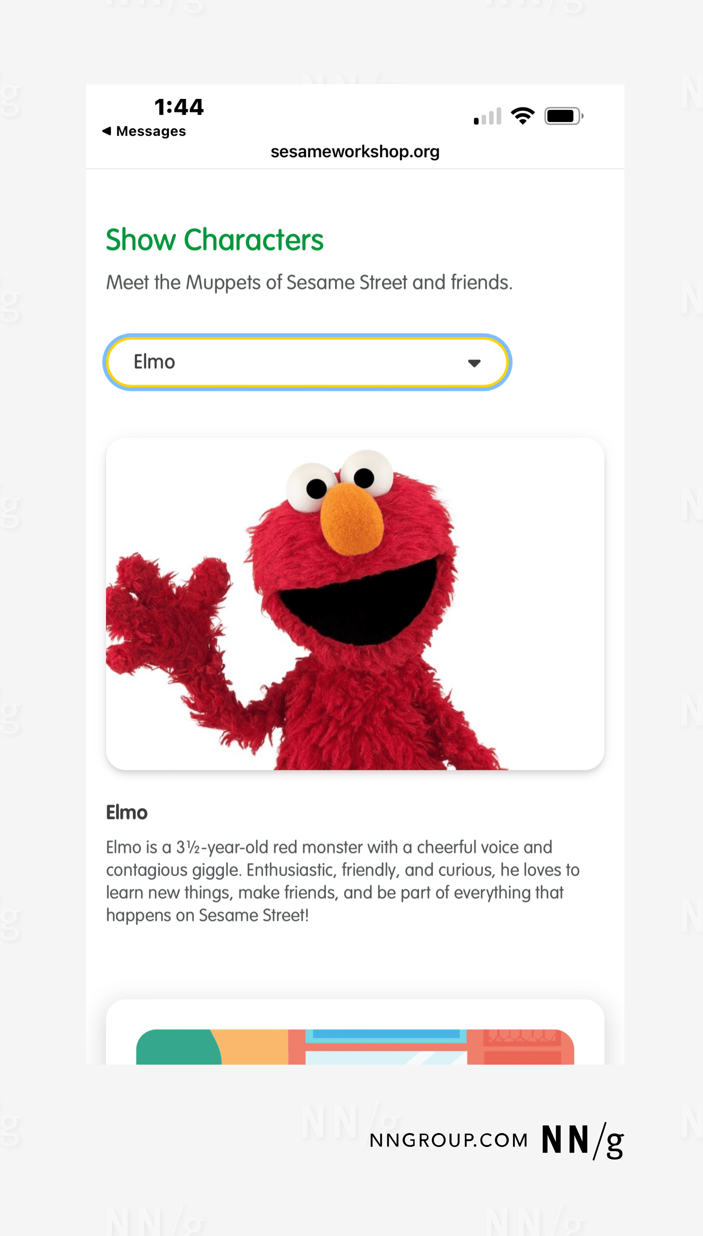
HTML: alt=””
HTML: alt=””
HTML: alt=””
Functional Images
Functional images enable users to take actions within an interface. Alt text for functional images should not describe the image; instead, it should describe what will happen when the image is clicked or tapped.
However, if an image is accompanied by words or a label that enables the same action when clicked, the image is considered redundant and does not merit alt text.
Functional images include:
- Linked images
- Images as buttons
- Icons
- QR codes
- Media controls
- Navigation elements
- Image maps
Linked Images
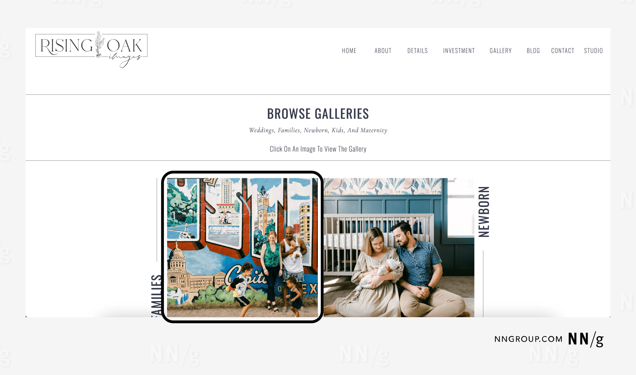
HTML: alt= “Families.”
Buttons
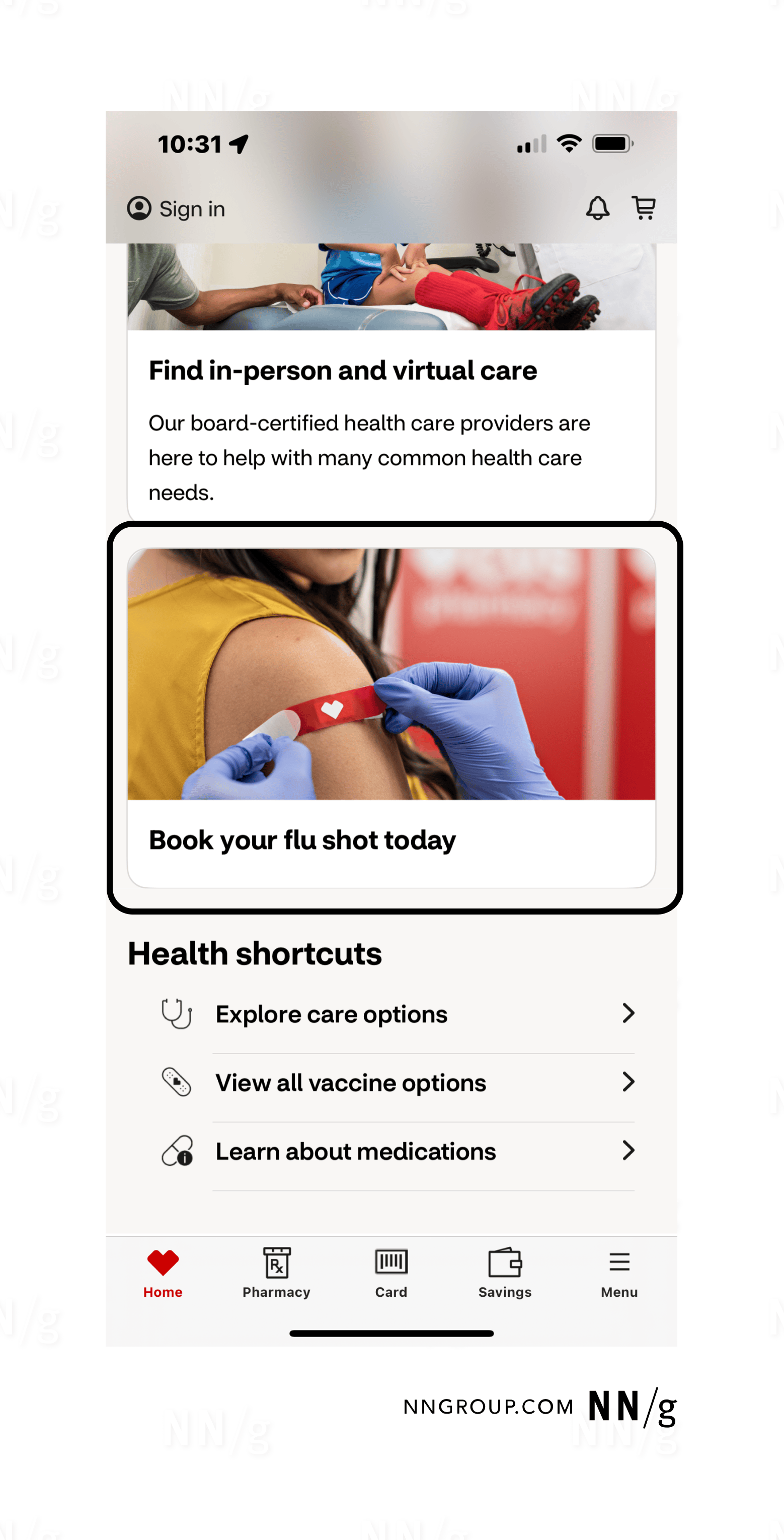
HTML: alt= “”
Icons
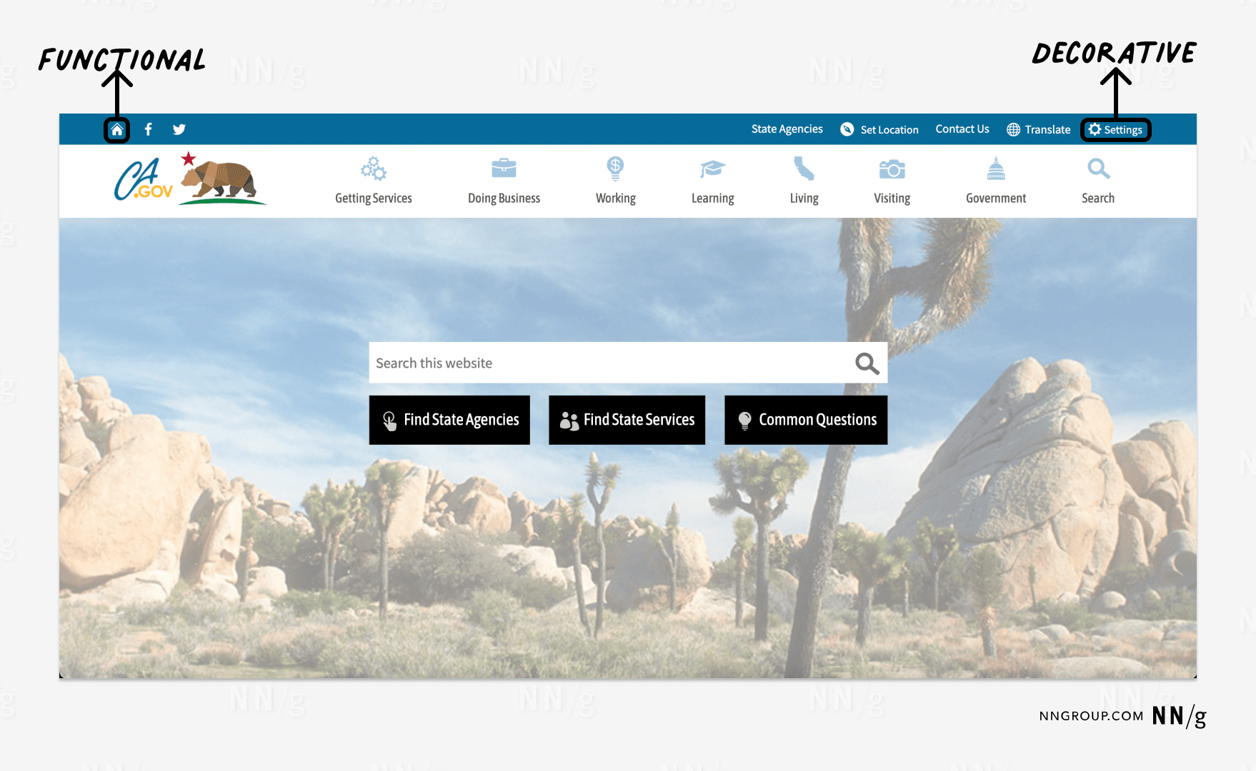
HTML: alt=”California.gov home.”
The gear icon in the top right corner links to the Settings page. Because it is accompanied by the label Settings, this icon is redundant and does not require alt text.
HTML: alt=””
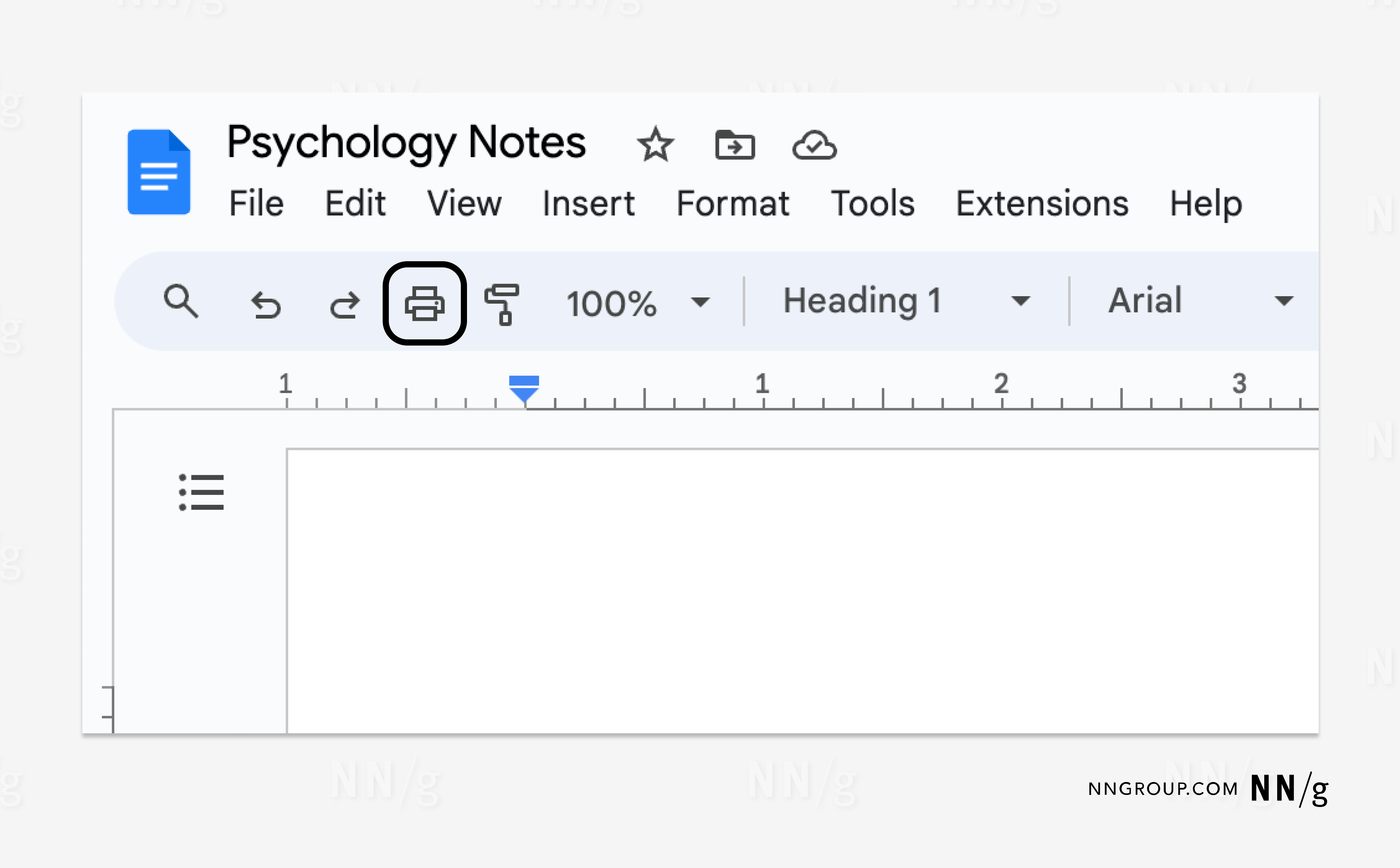
HTML: alt= “Print.”
(Note that Google includes the keyboard command [⌘P] in the alt text to help users learn that there is a more efficient way to take the same action.)
Informative Images
Informative images add task-related information beyond the contents of the surrounding page copy. If they visualize information that is already communicated elsewhere in writing, these images are considered redundant and will benefit from a deeper analysis into whether they actually require alt text.
For example, a graph showing a full data set accompanying a written analysis of that data is informative. Informative images don’t serve a functional purpose. Alt text for informative images should highlight the unique value they contribute to the page and avoid redundantly restating things already communicated elsewhere. Alt text for informative images tends to be the most difficult to write.
Informative images can be simple or complex, depending on how easy it is to textually describe the information conveyed by the image.
Simple Informative Images
An informative image is considered simple when its main message can be summarized in one sentence that fits within about 150 characters.
Simple informative images often include:
- Photographs
- Illustrations
- Simple graphs
- Graphic-based logos
- Animations
- Simple graphics
- Paintings
- Sketches
- Simple renderings
- Pictograms
- Silhouettes
While some images, such as graphs and charts, seem complicated at first glance, their main point is often simple.
For example, a line graph might contain hundreds of data points, yet its main message might be the simple correlation between the two variables, which can be succinctly described in one sentence.

HTML: alt= “Nutrition labels have four sections: serving information, calories, nutrients, and percentage of daily values, for which 5% or less is low, 20% or more is high.”
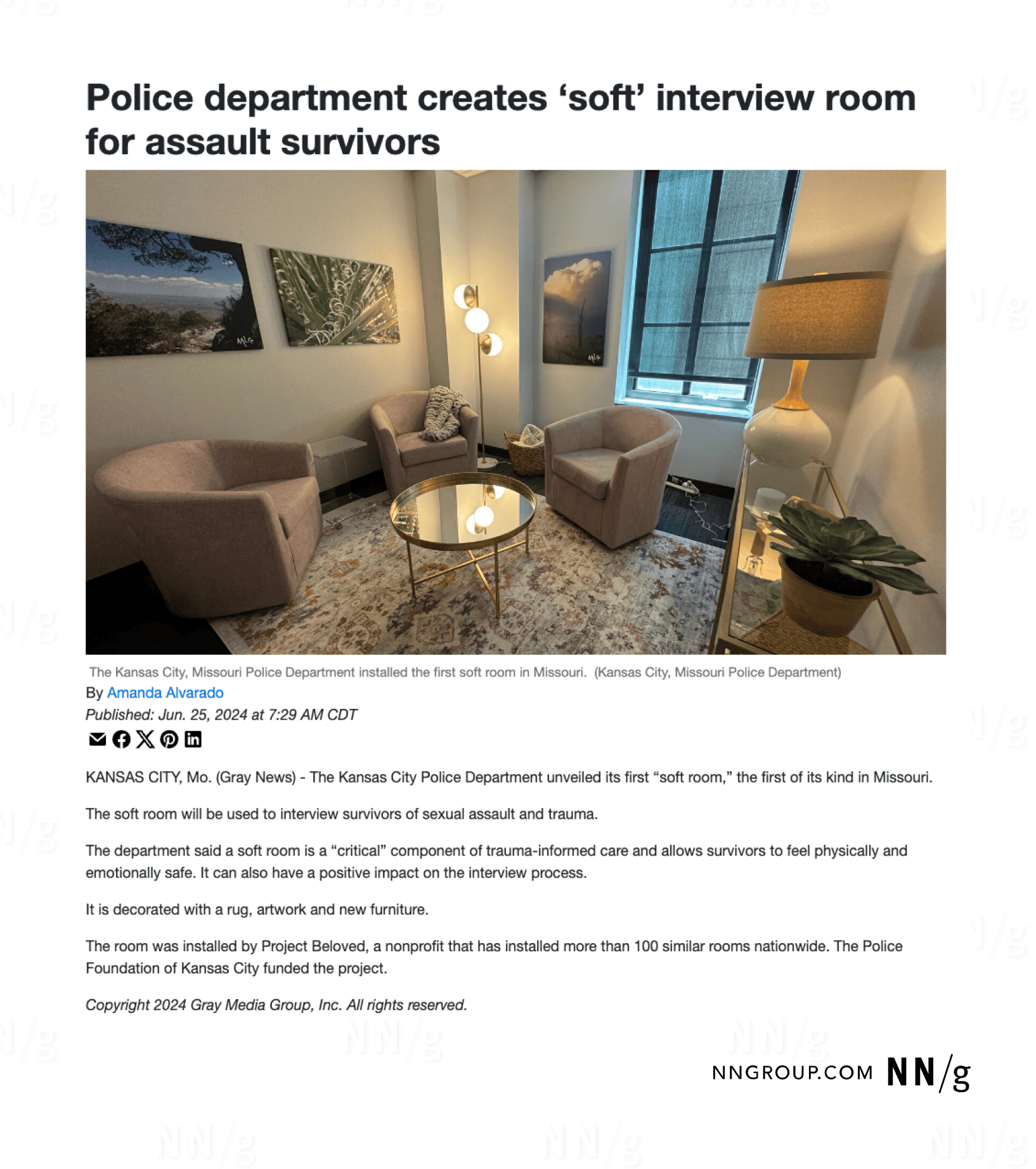
HTML: alt= “A small, inviting room with warm lighting, several cushioned chairs arranged to facilitate discussion, blankets, and calming photos on the walls.”
Simple informative images may include text. If the text is short enough to fit with about 150 characters and is an important part of the image’s message, include the exact words in the alt text. Otherwise, including the exact text isn’t necessary.
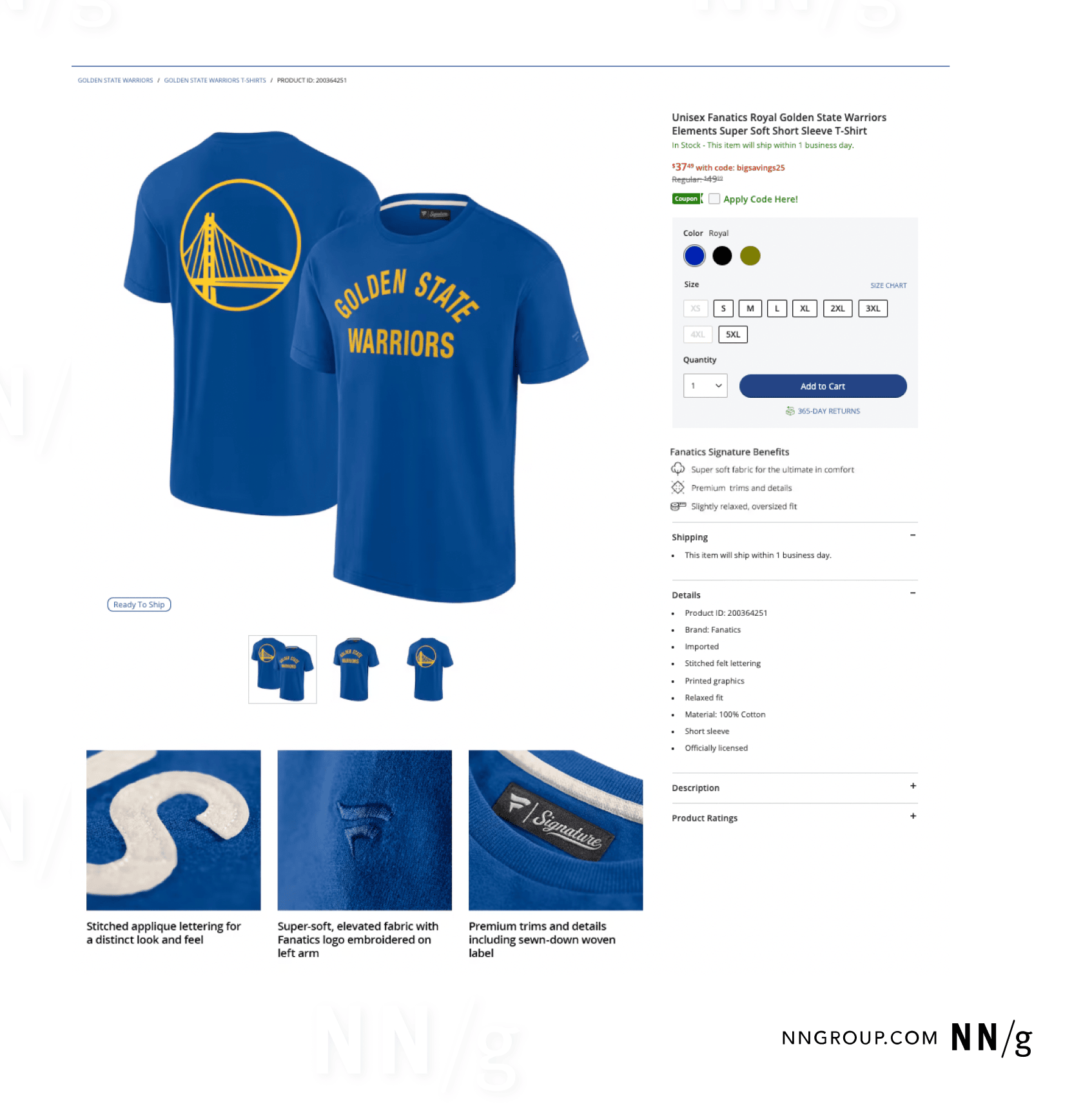
HTML: alt= “Royal blue t-shirt with bold yellow text saying, ‘Golden State Warriors’.”
Complex Informative Images
An informative image is complex when:
- Its message cannot be summarized in 150 characters, and
- A structured description could convey its meaning better.
This is often the case for intricate visuals that communicate more than one point.
Complex informative images often include:
- Charts
- Graphs
- Figures
- Diagrams
- Maps
- Infographics
- Tables
- Flowcharts
- Blueprints
- X-rays
- Heatmaps
- Schematics
- Histograms
- Mind maps
- Collages
- Timelines
- Pie charts
- Venn diagrams
- Gantt charts
- Nutrition labels
- Screenshots (which turn page copy into an image)
Make complex informative images more accessible by altering the page copy surrounding the image. Editing the page copy to communicate the image’s message often makes the visual itself redundant. In many cases, this could be as simple as including a list or table within the HTML of the page.
If the page’s body copy cannot be altered, consider adding a caption right above or below the image. Richer page copy can also benefit users with low vision, learning disabilities, or lack of subject-matter expertise, but must be balanced with brevity.
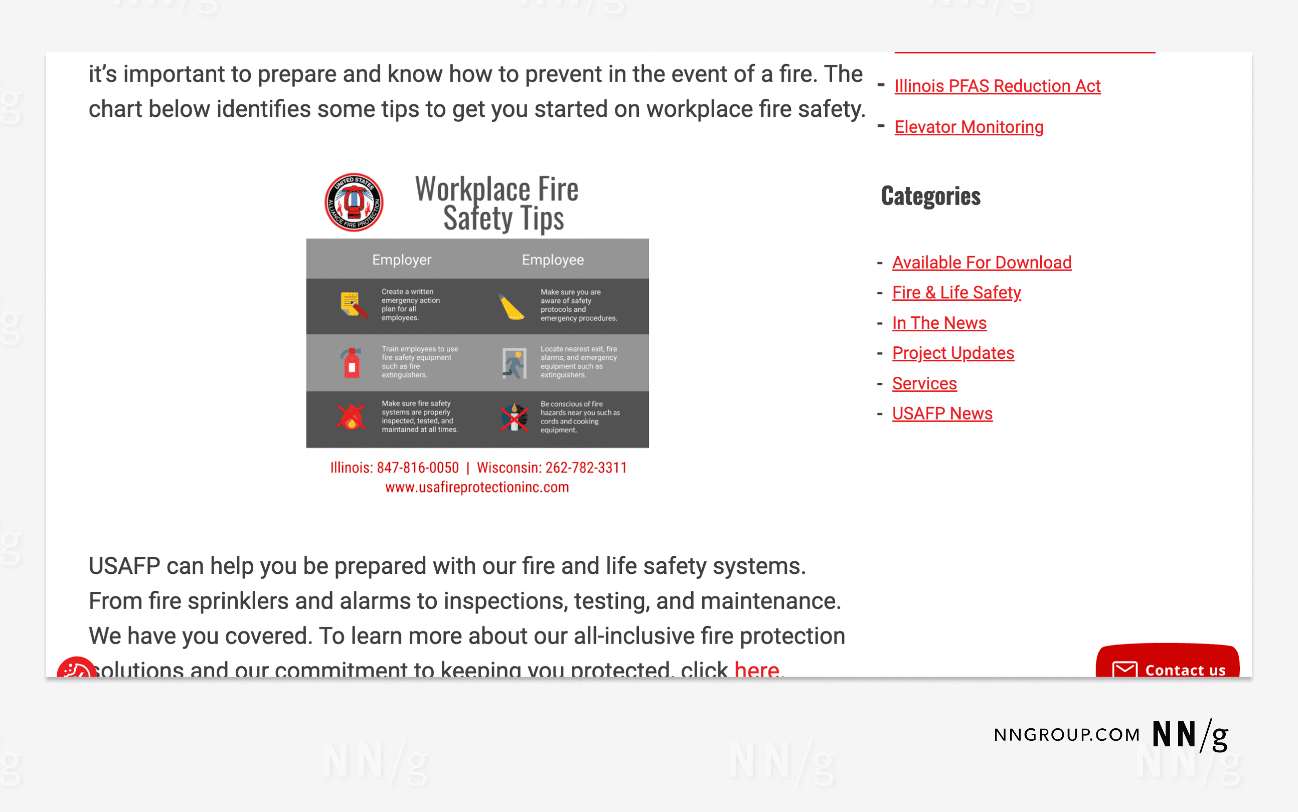
HTML: alt=””
For unalterable page content, provide expanded alt text in a long description. Long descriptions house more detailed information than is reasonable to stuff into traditional alt text. They can include longer paragraphs of text, lists, or tables.
A long description is text that is present in the HTML but invisible to people who do not use a screen reader. It can live on the same page as the image, ideally next to it, or on a separate page, linked to from an invisible link next to the image. If the description is located on a separate page, it can be made visible or invisible, depending on the HTML and the preferences of the designer.
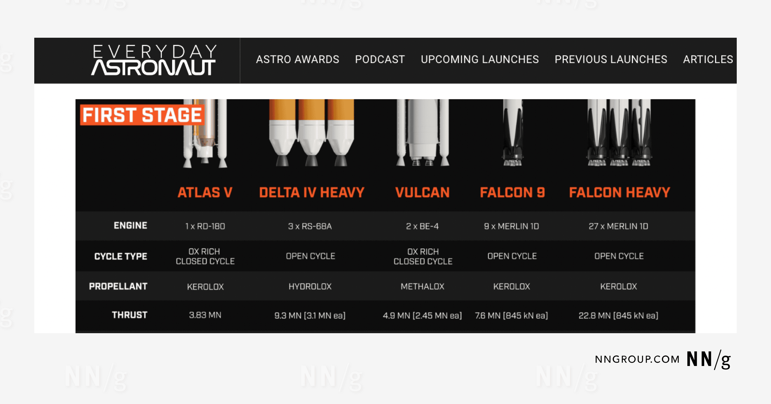
HTML: alt= ”Engine cycle data for the Atlas V, Delta IV Heavy, Vulcan, Falcon 9, and Falcon Heavy.”
|
|
Atlas V |
Delta IV Heavy |
Vulcan |
Falcon 9 |
Falcon Heavy |
|
Engine |
1 x RD-180 |
3 x RS-68A |
2 x BE-4 |
9 x Merlin 10 |
27 x Merlin 10 |
|
Cycle Type |
OX Rich Closed Cycle |
Open Cycle |
OX Rich Closed Cycle |
Open Cycle |
Open Cycle |
|
Propellant |
KeroLOX |
HydroLOX |
MethaLOX |
KeroLOX |
KeroLOX |
However, linking to long descriptions in other locations increases the interaction cost of accessing the alt text compared to presenting the analysis in the body text for all users.
AI Cannot Yet Write Alt Text on Its Own
At the time of writing, Artificial Intelligence (AI) tools still struggle to reliably write good alt text that communicates the intention behind images and accommodates their context.
Use AI to refine alt text rather than relying on AI to write it from scratch — particularly when using LLM chatbots like ChatGPT. One critical step in writing useful alt text is to identify the intention behind including the image.
AI cannot read the mind of the author; it can only describe what it “sees.” When given strict parameters and adequate context, it might generate something decent for redundant or simple informative images. But it will struggle to produce accurate alt text for functional images because it may have difficulty interacting with interfaces and might not have a real understanding of what each interface element does.
When it comes to alt text for complex informative images, AI tends to write too much.
We hope that future accessibility software will leverage AI to efficiently aid in laborious accessibility work, but we are not there yet. Even AI-infused accessibility widgets are not yet up to the task and can cause more harm than good.
Wrangling AI to write alt text is often more time-consuming than doing it yourself. However, if you are set on using an AI chatbot to help, the results should be reviewed by those who understand the intentions behind images. Your prompts should include the following parameters (which can also be used to evaluate the bot’s output):
- A character limit (~150) (However, remember that concise writing is not the same as useful alt text.)
- Context for the image (whether in writing or a screenshot that shows the image in the context of the larger page)
- A reminder to describe the message of the image, not describe what it looks like
- A focus on what the image uniquely contributes to the page to avoid redundancy
We tested AI’s alt text writing ability by inputting a screenshot from an Everyday Astronaut webpage alongside a prompt.
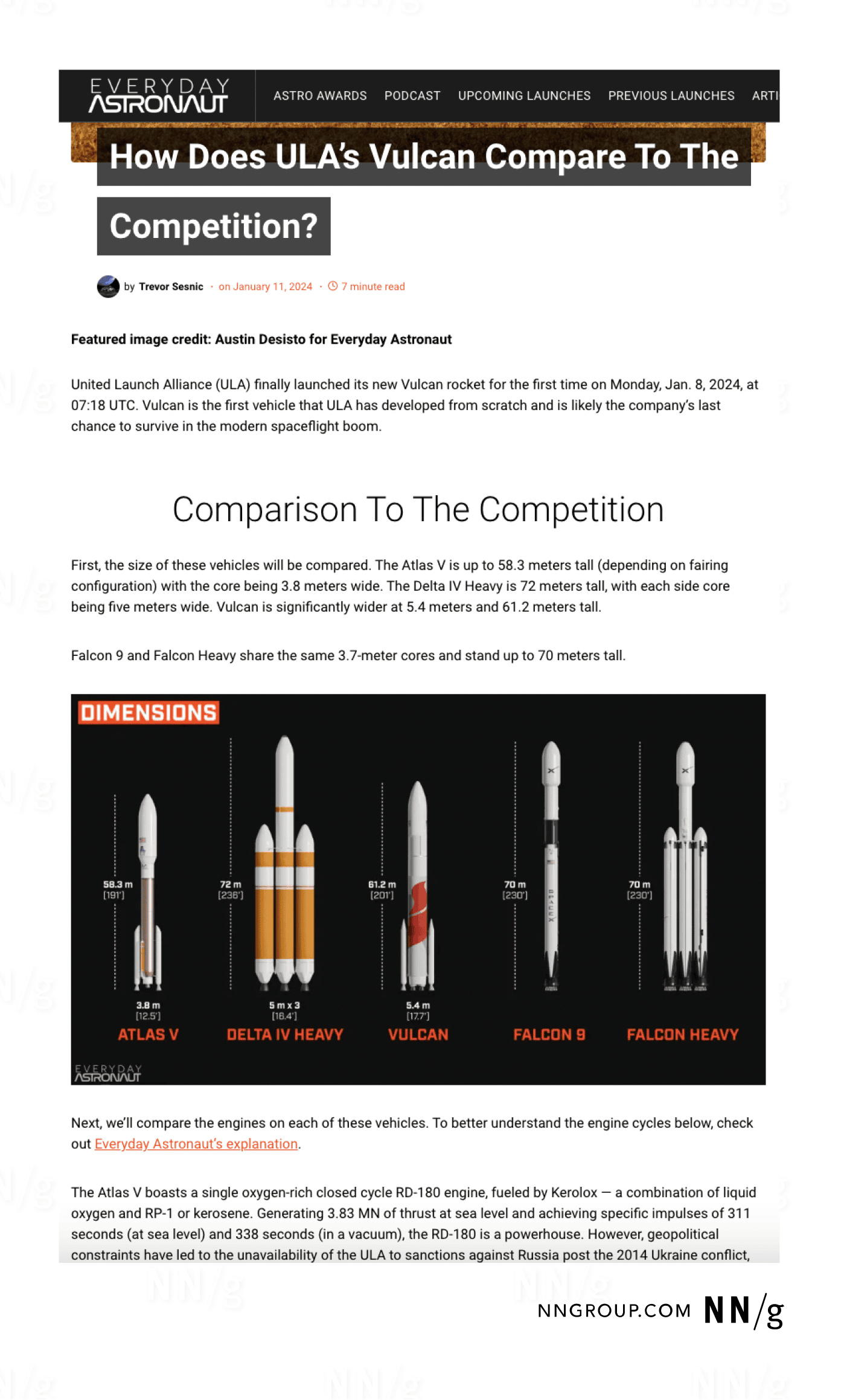
We provided several popular LLM chatbots with the above information and the results were largely lackluster. Important details were often omitted for the sake of concision, and the chatbots misidentified key aspects of the image. While the AI-generated alt text was usable after some editing, it took more time and effort to hold its hand than to write it ourselves.
Conclusion
Always make sure the alt text in your HTML code functions properly by testing prior to publishing. There are many testing tools available online, like this browser extension from the Institute for Disability Research, Policy & Practice at Utah State University, which allows you to test for accessibility issues directly in your browser. Ideally, a person with low or no vision will test your site prior to publishing, and report on the issues that they come up with.
As with anything, writing good alt text takes practice. Always evaluate your alt text before implementing it and remember that your main driver should be meeting the user’s goal. Don’t recreate visual experiences — help your users efficiently obtain necessary information.
Additional Resources
There are many fantastic resources available to help create good alt text. Two of our favorites include:
W3C Web-Accessibility Initiative (WAI)
WebAIM: Web Accessibility In Mind
