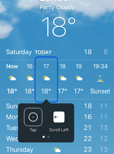
Take a look at your app. Notice the collection of buttons, text, images, and other controls you can see and interact with that make up your app’s user interface. When one of your customers navigates your app with Voice Control, Switch Control, VoiceOver, or any other assistive technology, this isn’t the interface they’re using. Instead, iOS creates a version of your interface for assistive technology to use. This interface is generally known as the accessibility tree. Apple often refers to this as your app’s Accessible User Interface. For brevity and consistency in this article, I’ll refer to it as the AUI
Your app’s AUI contains information about what elements are in your visual interface, what order they’re in, and how your users can interact with them. Your customer’s chosen assistive technology will then decide how to use this information. For example, Voice Control and Switch Control help people to interact with your app, so will only access interactive elements. Speak Screen is only concerned with reading content, so will only access elements that aren’t interactable.
Whenever we change an accessibility property, such as changing the sort order, we’re not changing anything on the visual interface. These are direct changes to the AUI for assistive technology to consume.
UIKit
The concept of an accessibility tree, or AUI, is not new to SwiftUI. UIKit has had one since iPhone OS 3, and it’s been on the web since way before that. If you’re a Chrome user, you can see the accessibility tree for this page by visiting chrome://accessibility/. The difference between SwiftUI and UIKit is how iOS creates the AUI. UIKit has a couple of features that mean your AUI can sometimes be less than perfect.
In UIKit iOS builds your visual interface from code or from Interface Builder files. iOS will then generate an AUI from the screen that iOS has drawn. The accessibility API then combines this with any accessibility modifications you have made in code. This step is lossy. The Accessibility API has to make a lot of assumptions about what you intended the experience to be. Apple has done a ton of work in making those assumptions for you, and the majority of them are great. But when you’re creating custom controls or complex UI, iOS won’t always make the right decision.
Additionally, if you change your interface by adding or removing elements without presenting a new screen, the Accessibility API has no way of knowing something has changed. This means you can be presenting elements in your AUI that no longer exist visually, and new visual elements won’t be present in your AUI.
Some fundamental design choices Apple have made in SwiftUI have made a great improvement in these areas. Including an entire class of accessibility bugs that are no longer possible.
Declarative
Our first issue with UIKit is the lossy step of generating an AUI. Because SwiftUI is declarative, we’re separating what we want to display from how we want to display it. Our SwiftUI code containing our Text(), Button(), Image(), and other elements is the *what&. The how is then left to iOS, TVOS, macOS, and WatchOS. This means each platform can make decisions to tailor your interface for itself.
The AUI is just another platform on this list. It can interpret the same code as your visual interface does, and then make a few small decisions about how best to present it in an accessible form. This completely skips the lossy AUI generation step and requires less intervention as a developer.
In Sync
Our second problem with UIKit comes when we change the visual interface without the AUI knowing. It is possible to fix this in UIKit by calling UIAccessibility.post(notification: .layoutChanged) or UIAccessibility.post(notification: .screenChanged) for larger changes. But this requires us as developers to know where these errors are likely to occur and adds dev and testing effort.
With SwiftUI this category of bug is completely eliminated. Because SwiftUI views are structs, and because structs are value types, when some state changes on a SwiftUI view, the struct is re-created. This struct creation triggers the simultaneous redraw of the screen and AUI update. This means your AUI can never be out of sync with what’s visible on the screen.

Both of these improvements require no developer effort aside from using SwiftUI. This makes adopting SwiftUI the simplest and most impactful decision you can make right now to improve accessibility for your customers.
Thanks for reading. This story is part of a series on SwiftUI Accessibility. Check out my other guides in this series:
SwiftUI Accessibility
SwiftUI Accessibility: Named Controls
SwiftUI Accessibility: Images
SwiftUI Accessibility: Dynamic Type
SwiftUI Accessibility: Accessible User Interface
SwiftUI Accessibility: Sort Priority
SwiftUI Accessibility: Attributes
SwiftUI Accessibility: Traits
SwiftUI Accessibility: User Settings
SwiftUI Accessibility: Semantic Views


