Semantic views are not new to SwiftUI, but changes in SwiftUI mean creating them is simple. Semantic views are not so much a language feature. They’re more a technique for manipulating the accessible user interface and improving the experience for assistive technology users.
A what view?
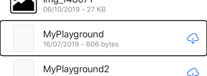
A semantic view is not one view, but a collection of views grouped together because they have meaning (or semantic) together. Take a look at this iOS table view cell from the files app.

I have enabled VoiceOver, and have navigated down the list to a swift playgrounds file. VoiceOver reads “MyPlayground. 16th of July two thousand and nineteen. 606 bytes. In iCloud.” All this information is made up from two labels and a button: the cell title “MyPlayground”, the subtitle including the date and size, and the iCloud download button. But VoiceOver reads them all together without me needing to navigate each element.
iOS does this for us automatically in table views by grouping the cell’s content into the cell and presenting the cell to VoiceOver as one semantic view. This makes navigation simpler by reducing swipes. It also provides more context for each item. If we heard “MyPlayground.” swipe “16th of July two thousand and nineteen. 606 bytes.” How can we be certain what the date and size refer to?
Stacks
Semantic views in SwiftUI start with stacks. This makes perfect sense because stacks are how we visually group elements, so why shouldn’t we use these to group accessibility elements too? Stacks aren’t accessibility elements by default because on their own they have no value we can convey to our user. By adding a modifier we can make the stack take on the accessibility attributes and traits of the elements they contain.
For this example, we’re going to use this stack. It contains a title, subtitle, and an image that acts as a button.

Here’s the code used to create it.
HStack {
   VStack (alignment: .leading, spacing: 10) {

      Text("Mars")
         .foregroundColor(.white)
         .font(.largeTitle)
      Text("The Red Planet")
         .foregroundColor(.white)
         .font(.subheadline)
   }
   .padding()

   Image(systemName: self.liked ? "heart.fill" : "heart")
      .padding()
      .foregroundColor(.pink)
      .font(.title)
      .onTapGesture { self.tappedLiked() }
      .accessibility(addTraits: .isButton)
}
.background(Color.black.opacity(0.7))
.padding()
.accessibilityElement
The current behaviour for VoiceOver on this stack is to read “Mars.” Swipe. “The Red Planet.’ Swipe. “Button. Image.” That’s fine, but really this stack has only one purpose: to introduce the screen and allow our user to like this planet. So if we group this together for accessibility customers, it’s going to be simpler and clearer. We can do this using the .accessibilityElement(children: ) modifier. There are 3 arguments we can pass to this modifier.
.contain
The .contain argument is the behaviour we get when we don’t add a modifier. It tells the stack that all accessibility elements within the stack should be treated as individual elements for assistive technology. This produces the result “Mars.” Swipe. “The Red Planet.” Swipe. “Button. Image.”
.combine
.combine takes all the accessibility properties from inside the stack and combines them into one set of properties. These properties are then added to the stack. The individual elements in the stack are then hidden from assistive technologies.
If we add .accessibilityElement(children: .combine) to our stack above, the result in VoiceOver is “Mars. Newline. The Red Planet. Button. Image.”
.ignore
The .ignore property tells assistive technology to ignore any accessibility elements within this stack. Ignore will turn your stack into a focusable element for assistive technology, but no content will be read. This means we can add our own accessibility attributes and traits to the stack view for VoiceOver to read, replacing the attributes of the child elements.
For the stack above we want to add the following modifiers.
.accessibilityElement(children: .ignore)
.accessibility(label: Text("Mars. The Red Planet. Like."))
.accessibility(addTraits: .isButton)
This causes VoiceOver to read “Mars. The Red Planet. Like. Button”.
This is not the same behaviour as using the modifier .accessibility(hidden: true). This modifier will remove the stack and all elements within it from the accessible user interface. Adding accessibility attributes along with the hidden modifier would be pointless.
.accessibilityAction
There’s one more thing we need to add. While our .accessibilityElement(children: .combine / .ignore) changes above are telling assistive technologies our stack is a button, the stack doesn’t have an action when activated. For that, we need to tell our accessibility user interface that our stack has an accessibility action that can only be activated with assistive technology. We do this with the .accessibilityAction modifier. This modifier takes a trailing closure where we can call the same code as our button.
.accessibilityAction { self.tappedLiked() }
Thanks for reading. This story is part of a series on SwiftUI Accessibility. Check out my other guides in this series:
SwiftUI Accessibility
SwiftUI Accessibility: Named Controls
SwiftUI Accessibility: Images
SwiftUI Accessibility: Dynamic Type
SwiftUI Accessibility: Accessible User Interface
SwiftUI Accessibility: Sort Priority
SwiftUI Accessibility: Attributes
SwiftUI Accessibility: Traits
SwiftUI Accessibility: User Settings
SwiftUI Accessibility: Semantic Views

