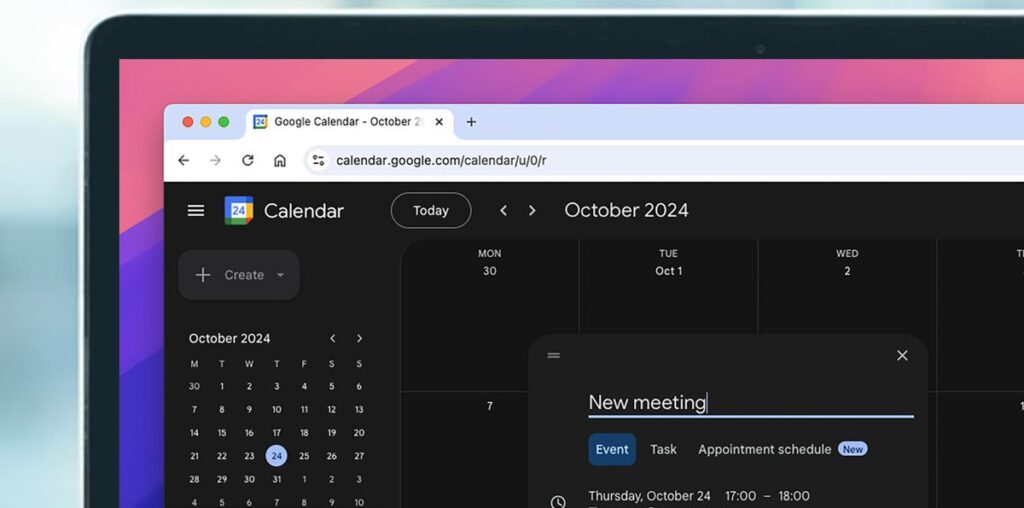
- The web version of Google Calendar has been given an official dark mode
- The feature is rolling out globally this week to all Calendar users
- Google has also given Calendar a “refreshed user interface”
If you’ve been patiently waiting years for Google Calendar to deliver an official dark mode, today is your day – the web version of the app has finally been given a darker optional color scheme, along with a mild redesign.
The news came in a Google Workspace blog post where Google said that it’s introducing the ability to switch between light mode, dark mode, and default themes. As previous reports have noted, dark modes can give you a small battery life saving, particularly if you’re using a device with an OLED screen.

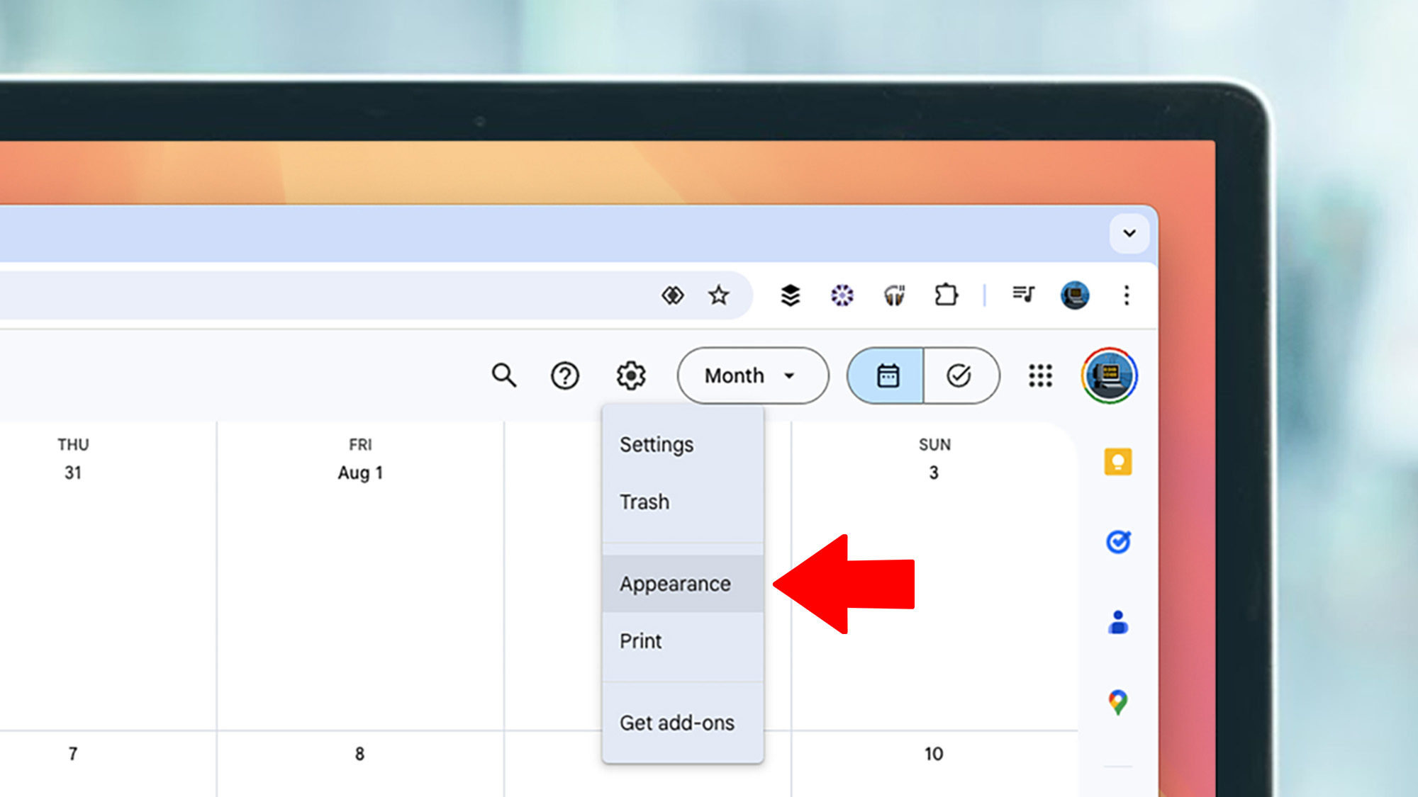
The update is rolling out now, though it’s also become available to a few members of the TechRadar team so far. To see if you have it, head to the settings cog at the top right of the page, then in the new drop-down menu click ‘Appearance’ (see above).
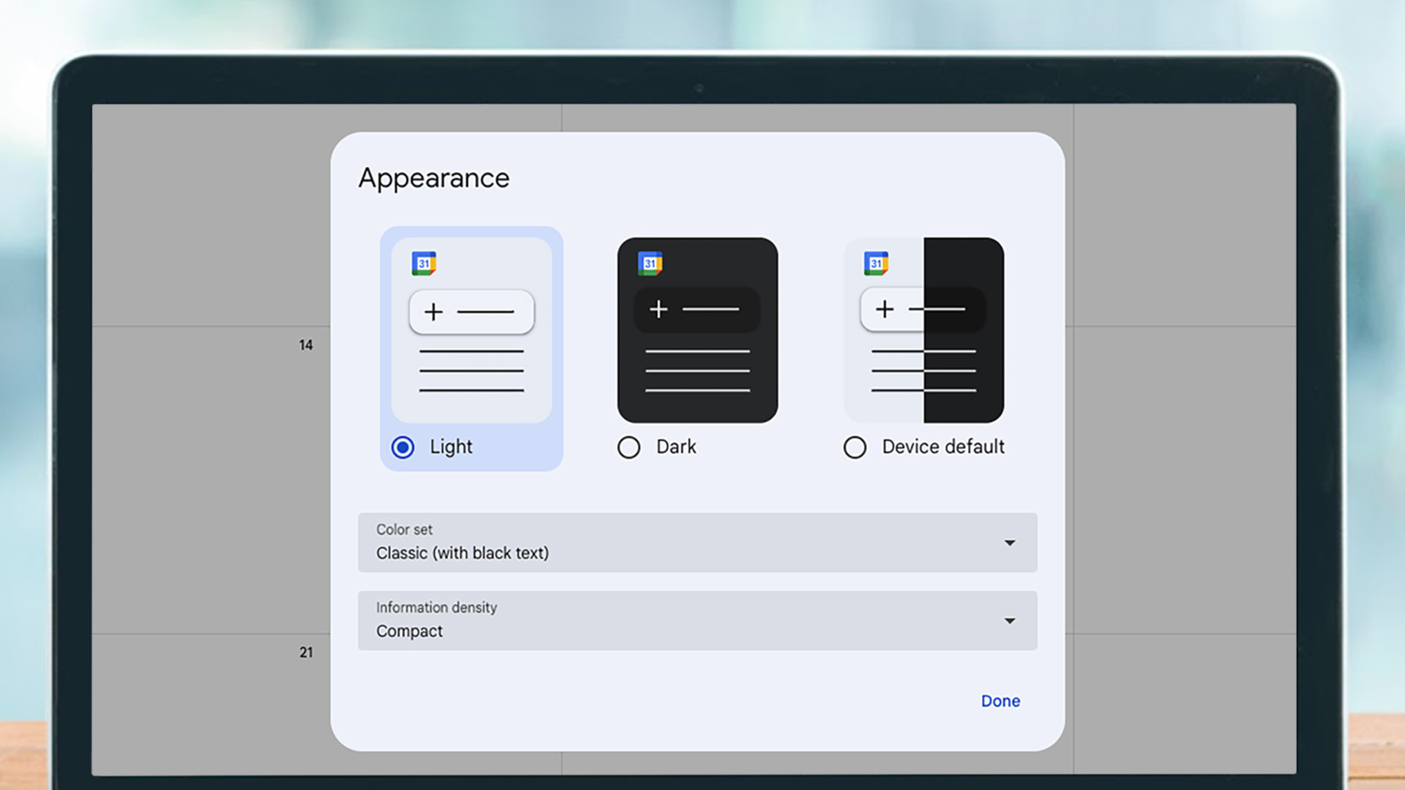
You’ll then see the menu below – choose ‘Dark’ and you’ll be treated to the eye-pleasing sight of the new dark mode. That’s not everything that’s changed either – the typography and controls have been tweaked in line with Google’s ‘Material Design 3’ guidelines, which Google says makes it “more modern and accessible.”
The calendar certainly looks cleaner to us, but the dark mode is the main improvement that we’re particularly happy to see.
Warning: may cause extension headaches

In slightly less good news, Google says these changes may break some of your Chrome extensions if they “are active when using Google Calendar.”
Google didn’t elaborate on what extensions might be affected but said some “might not work as expected” and that you should contact the extension’s developers with any issues. We’d imagine ones like G-Calize (for color-coding calendars) and Timely might be the kind of extensions that could be affected.
Other affected extensions could include some theme customizers that became available in the Chrome Web Store when it looked like Google was reluctant to make an official one.
Fortunately, that dark mode is now here – which is good news for both our eyes and laptop battery lives in general.

