Why is this better?
By laying out the rules visually, users can quickly see how different conditions interact, making it way easier to spot and prevent conflicts or errors. Besides, imagine being able to drag, drop, and link different rules together, just like you’re building with Lego blocks.
That’s what this system offers — complete control over how everything fits:
You can literally see the routing strategy take shape. Thanks to design.
Allowing users to choose a.k.a. A/B test node
What makes this design so powerful is its flexibility.
One of the coolest features of this system is the “A/B Test” node:
Here’s how it works: this node allows users to test different combinations of gateways, operators, and routing rules to see which setup performs better. You can essentially run experiments on your routing flow to find the most efficient path for your payments.
All of the results from these tests get stored in the “Analytics” node.
This gives you detailed insights, like the percentage of savings or the accident rate (aka failed transactions) for each scenario you test. So, you’re not just guessing which setup works best — you have the data right there to back it up. Key metrics such as:
- cost savings and
- success rates
show the performance of each A/B test.
Since it’s all happening on the canvas, you can connect and disconnect rules or scenarios on the fly. The canvas makes it super easy to connect any rule to the A/B test construction, so the user can always experiment and improve the payment flows.
Good-old zoom is a #1 requested feature in mindmaps
The zoom-in and zoom-out features allow users to navigate and overview huge routing systems. Users can shift between detailed views of individual rules and a broader overview of the entire system:
Design can help auto-resolve conflicts
Implementing new changes can sometimes lead to rule conflicts — like when two rules contradict each other or overlap in a way that would confuse the payment routing process. Design can help solve those conflicts — and it’s not only about highlighting them in red.
The real magic is the auto-resolve button (I truly wish I had it for everything in life).
Instead of manually trying to figure out which rule is more beneficial or needs adjustment, the system analyzes the conflicting rules and automatically chooses the most profitable option for you. It does this by looking at metrics like:
- success rates,
- cost savings, and
- gateway performance
to determine which rule combination is best:
Sometimes, the user feels more comfortable with a classic table… and we need to deliver
You know, sometimes, the new systems like our mind map, although ground-breaking, can be overwhelming. So, we need to backtrack a little bit.
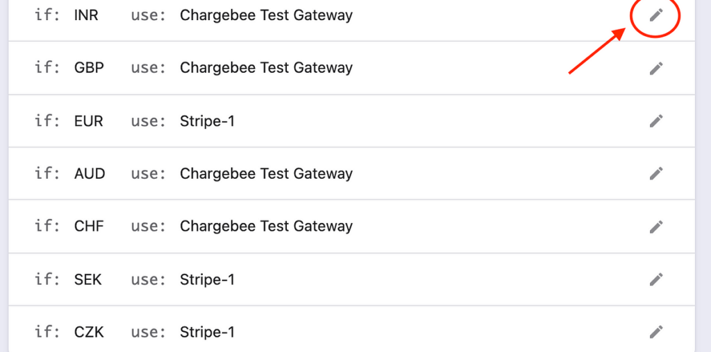
Users are used to classic systems. Throwing them into a completely new interface, even with onboarding, is cruel. Because they will want to return to something they are used to should any problems arise. That’s why we allow them to take a step back and return to a classic “list” view:
It’s about giving users flexibility and control so they can work in whatever style feels most natural to them, whether that’s the dynamic canvas view or the familiar list view. Plus, it’s a great option for users who need to compare rules at a glance or want a pivoted, high-level overview of all their rules and priorities in a straightforward format.
Of course, I also strived to improve the “list” interface as much as I could.
This is how we delivered the best of both worlds.
Design shapes users’ experiences. At its core, design is about solving problems and making things work better for users. It goes beyond aesthetics. It improves:
- functionality,
- usability, and
- overall experience.
Here’s why design matters:
- It makes things easy to use. Design helps users accomplish their tasks efficiently. If users can’t figure out how to use something, it becomes frustrating, which can lead them to abandon the product or service altogether.
- It saves time and money. In fintech, good design can reduce costly mistakes and save money. It can also improve efficiency. A good payment gateway can reduce transaction errors and avoid losses.
- It builds brand trust. When design solves user problems and makes their experience smooth, customers are more likely to return and stay loyal.
- It acts as a translator between business goals and user needs. Design-thinking processes ensure that user needs are met while also aligning with the company’s strategic goals.
- It can set your product apart. Even if multiple products have the same functionality, the one with a better user experience and design will stand out.
- Great design often pushes boundaries and introduces new ways to solve old problems. It lets designers think outside the box. They find better, more intuitive ways to do tasks.
With the case study I presented you, although the design required time and resources to be made, in the end, it saved the companies that use the canvas-based node system millions of dollars (and probably at least a couple of jobs).
So please, next time a stakeholder will say something along the lines of “Oh, but we have a product-first and not design-first approach,” give them a (kick) link to this article.

