InVision got its start back in 2011 as a collaboration tool for designers. At the time, screens were designed largely in Photoshop and Illustrator, with no easy way to make interactive prototypes.
Screenshot via the Wayback Machine of InVision’s start in 2011
InVision made it easy to export screens, create clickable prototypes, and get feedback from users, teammates, and stakeholders. Over the years, we built out our suite of tools to help product teams throughout the design process, from early ideation to shipping products.
What we learned over the course of more than a decade informed how we are approaching our products now. Fundamentally, teams of all kinds, not just product teams, need a path from early, often messy phases of collaboration to more structured work. This product needs to be easy to use, accessible, and inclusive to all types of workers.
In 2017, we introduced Freehand by InVision (launched in 2016 as Craft Freehand), and we believe that the insights we’ve gained from evolving and optimizing the product for the past six years have led us to a tool that fulfills all of these goals, and will help teams be better, more productive collaborators. Here’s the story of how we got here.
Video from the public launch of Freehand in 2017
Sketching the basics
The first iterations of Freehand provided basic functionality like the ability to zoom in and out infinitely, co-draw to share sketches and rough ideas, and comment to share feedback.
Early versions of Freehand allowed for easy drawing of shapes
As Freehand use continued to expand, new features were added. We used the platform internally for things like brainstorming, bridging the gap between low and high-fidelity prototypes, and visual planning.
We began to use Freehand internally for early prototypes and feedback
New ways of working
In 2020— as work for many people shifted to fully remote or hybrid—we accelerated the development of Freehand. From improvements to drawing and text formatting, to the addition of sticky notes, the product became a place for the early, messy work of collaboration.
Sticky-note functionality was added in early 2020
We added reactions to freehand, allowing you to send kudos to your teammates or vote for your favorite idea. We improved organization, allowing you to keep objects in place with locking, organize thoughts into a grid, and stay stress-free with version history.
From whiteboard to workflow
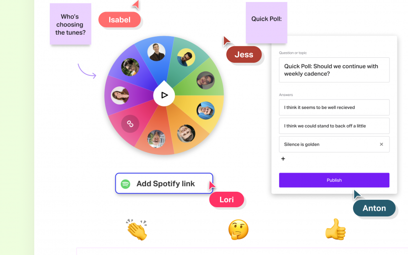
By 2022, Freehand began to integrate widgets—from polls, to charts, to color swatches. As the product continued to evolve, the boundaries of how it could improve the day-to-day workflow of everyone from product teams to human resources to legal began to expand as well.
InVision ensures the customer is always the North Star, empowering everyone on the team, regardless of responsibility or experience, to deliver great product and experiences.
Dawn Ahukanna, Front-End Architect, IBM
No longer simply a whiteboard, our customers began using Freehand as a robust workboard for everything from software architecture diagrams to product flows. We introduced the concept of Pages to Freehand, where you can structure information into a familiar document format in your Freehand canvas, and where the multiplayer editing empowers faster collaboration with your team.
A timeline of Freehand from our public launch in 2017
As we move into 2023, we’re taking the next steps in the evolution of Freehand. We believe there is an opportunity to create an even more connected workflow that will help alleviate a fragmented tool landscape, and reduce the cognitive load of constant task switching between apps.
On Wednesday, March, Freehand by InVision is unveiling a new way to bring the power of customized workflows to the canvas that’s never done before at half the price of Miro and Mural.

