Summary:
Sneaking is a deceptive practice that includes three main patterns: forced continuity, hidden costs, and sneak into basket.
Deceptive patterns are often employed to boost business growth, but they come at the expense of transparency and customer trust. This article discusses three types of deceptive patterns that all fall under the umbrella of sneaking.
Sneaking: Definition
Sneaking is a deceptive practice that tricks customers into agreeing to something they did not intend to.
Sneaking exists because it can drive immediate business growth by increasing sales or subscriptions. However, it does so by misleading users, sacrificing transparency, and damaging long-term customer loyalty. Instead of resorting to sneaking, businesses should aim to be upfront about prices and options, creating a brand that customers can trust.
There are three types of sneaking:
- Forced continuity
- Hidden costs
- Sneak into basket
Forced Continuity
Forced continuity is a deceptive practice that happens when a customer is forced to continue a service without clear consent.
This deceptive practice is often seen in subscription services, where users may not realize they’re committing to ongoing payments unless they actively cancel before the trial period ends.
Spotify provides a clear example of forced continuity. Upon signing up for a free trial for Spotify’s premium plan, users commit to monthly automatic charges, with the service price outlined only in the fine print.

Additionally, Spotify subscribers are sent a bill only after their first paid month. The service doesn’t notify users of subsequent ongoing monthly charges. This practice makes people likely to forget that they have an active subscription and, unsurprisingly, has led to user frustration, as highlighted in a Spotify Community thread, where users questioned, “Is Spotify trying to hide our receipts to let people forget to unsubscribe?”

In contrast, Apple offers a more transparent approach by sending monthly email notifications about recent transactions. This regular communication allows users to reassess their subscriptions and decide if they wish to continue or adjust their plans. Apple’s practice sets a positive example for ethical companies, demonstrating how to avoid forced continuity by keeping users informed and in control of their subscriptions.

Hidden Costs
The hidden-costs deceptive practice refers to attracting users with a lower initial price, only to add extra fees (e.g., taxes, shipping, service charges) at the final stage of the purchase.
This tactic is common in online shopping and travel-reservation processes, often leading to feelings of mistrust toward the platform.
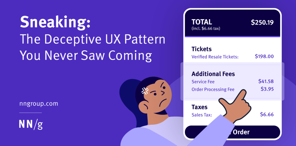
Ticketmaster is infamous for including hidden costs at checkout. Customers are initially shown a ticket price that seems reasonable, but as they proceed through the checkout process, additional fees are added at the last moment. These extra costs can significantly increase the final price, leading to frustration and a sense of being deceived, as customers realize the true cost is much higher than anticipated.

Airbnb also uses sneaking by advertising a lower initial price to make customers think prices are more affordable than they are. As extra costs are revealed only at checkout, customers often feel frustrated.

In contrast, United Airlines provides transparency by showing the final checkout price, including fees, right from the start. This clear communication ensures users know exactly what they will pay, creating trust and a more positive customer experience.


Sneak into Basket
Sneak into basket is a deceptive pattern that involves adding items to users’ shopping carts without their explicit consent.
GoDaddy’s practice of automatically adding two years of domain registration fees to a user’s cart without clear notification is an example of the sneak into basket pattern. Users expecting to pay for a single year may not notice the extra charges unless they carefully review their cart. This lack of transparency can cause users to feel misled.

Sometimes, the sneak into basket practice is used outside an e-commerce context to force users to do something as a side effect of a desired action. For instance, when users apply for jobs using LinkedIn’s Easy Apply feature, a prefilled checkbox automatically subscribes them to updates from the company they applied to.

As a result, users end up with news feeds cluttered with updates they did not choose to receive. Following a company should be an intentional, user-driven action. This practice, while perhaps intended to keep users informed, can instead lead to frustration and a sense of being manipulated, ultimately weakening trust in the platform.
The sneak into basket pattern ultimately takes advantage of users’ limited attention resources and of their desire to minimize interaction cost. Often, in order to avoid falling prey to this pattern, users must read through lengthy fine print and deselect sneaky defaults. Many users don’t have the patience or time to do so.
To promote ethical design, default choices should be noncommittal. Designers can create a transparent and user-friendly experience by allowing people to make personal decisions.
Conclusion
A 2019 international study from Germany discovered that out of 2,000 cookie policies from various European companies, over half of them included deceptive patterns. In addition, only 4% of these companies gave customers choices about their consent or notification of data collection.
While sneaking may seem like a quick way to increase sales, it can harm a brand’s reputation and customer loyalty. Businesses that prioritize transparency by clearly communicating prices and options build stronger, more trustworthy relationships with their customers. Instead of relying on deceptive practices like sneaking, companies should focus on creating positive user experiences that foster long-term growth and trust.
Clear action must be taken to stop the use of deceptive UX patterns. In regions like the EU, using deceptive patterns is regulated under laws like the General Data Protection Regulation (GDPR). The GDPR mandates clear user consent, prohibiting designs including prefilled checkboxes like the ones above. This regulation ensures that users fully understand and agree to what they’re signing up for.
References
[1] Utz, C., Degeling, M., Fahl, S., Schaub, F., and Holz, T. 2019. (Un)informed consent: Studying GDPR consent notices in the field. arXiv preprint arXiv:1909.02638. Available: https://arxiv.org/pdf/1909.02638

