Key Takeaways
- Google Photos on the web now has a new ‘Collections’ tab to simplify finding content.
- The update aims to make finding specific content easier by highlighting folders like ‘People,’ ‘Places,’ ‘Videos,’ and ‘Recently added.’
- The change is rolling out now and might not be widely available just yet.
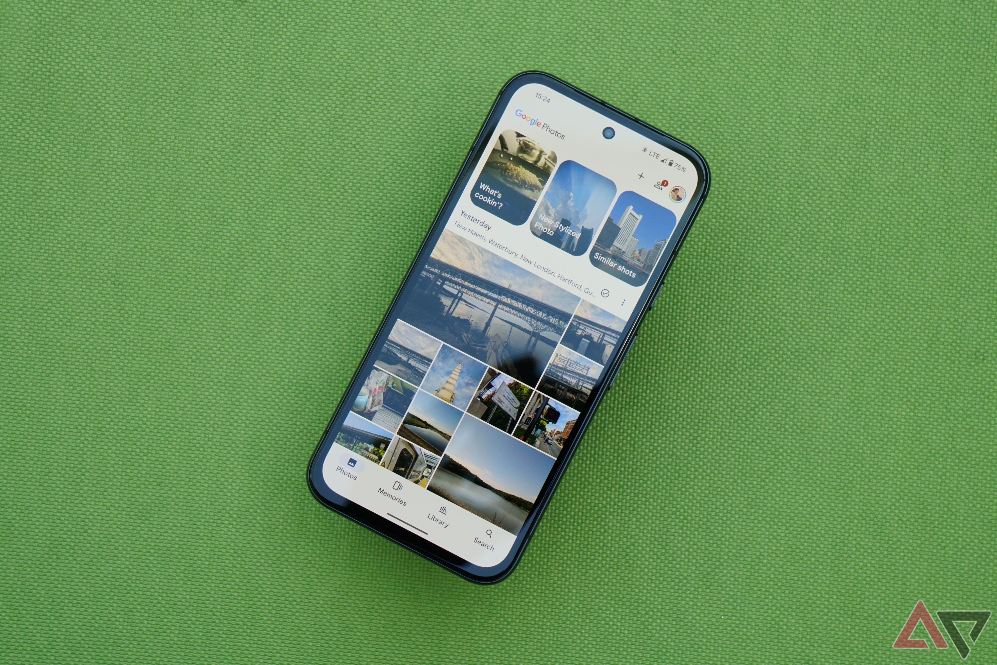
Google, back in August, rolled out a UI update for the Google Photos app on Android and iOS that aimed to make “finding content easier than ever,” and it looks like Google Photos for the web is now getting the same treatment.
The change on the mobile apps essentially brought a new ‘Collections’ view to simplify finding content, alongside quick access pills to find ‘People,’ ‘Places,’ ‘Videos,’ ‘Recently added’ images, and more.
As highlighted by 9to5Google, the change has begun rolling out to Google Photos on the web now, and we’re able to see it on some of our accounts, while others still highlight the old UI.
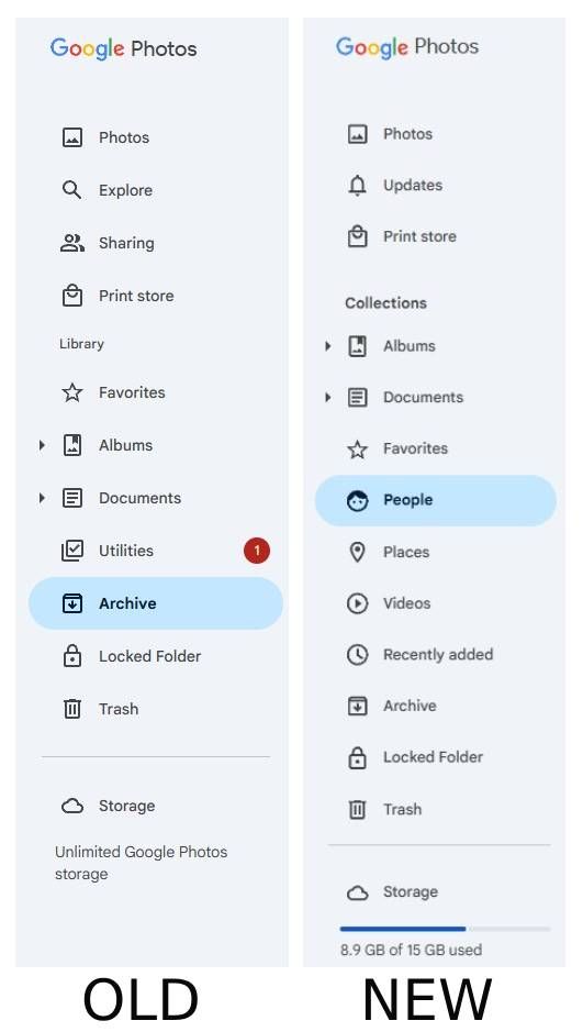
The ‘Photos’ folder retains its spot at the top, followed by a new ‘Updates’ folder that replaces ‘Sharing.’ Additionally, the ‘Explore’ tab seems to have been removed with the new implementation, while ‘Print store’ retains its spot in the top list to give you quick access to print the moments that matter.
The most notable change, however, is the replacement of the ‘Library’ tab within the side panel with ‘Collections.’
A more intuitive way to find memories
The change, similar to its implementation on mobile, aims to make finding specific content easier. It highlights ‘Albums,’ ‘Documents,’ and ‘Favorites’ like it always has, though the dropdowns for Albums and Documents now appear up top, with Favorites relegated to the third spot.
Collections also house dedicated folders for people and pets, images from specific ‘places,’ ‘videos,’ and ‘Recently added,’ which should make the process of finding specific content within the app a bit more intuitive.
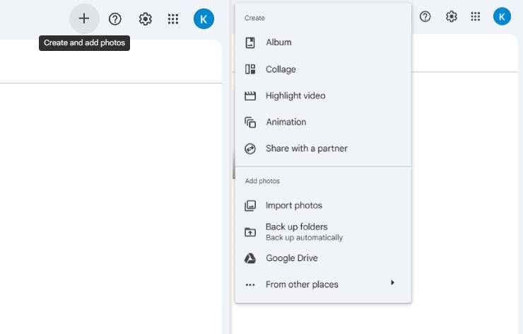
The ‘Utilities’ option has outright been removed from the side panel, with a new ‘+’ icon on the top right picking up the slack of creating highlight videos, animations, and collages, while ‘Archive,’ ‘Locked folder,’ and ‘Trash’ retain their spot at the bottom of the side panel.
The UI change comes soon after Google finally flipped the switch on the long-awaited ability to export Memories as video files — making the process of sharing special memories with loved ones who might not be Google Photos users much more straightforward than before
Related
Google Photos finally gets how people actually want to share memories
Turn your Memories into shareable videos
