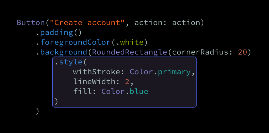
One really powerful aspect of SwiftUI’s overall API is that it enables us to draw things like shapes, gradients, and colors the same way that we render views and UI controls. For example, if we wanted to render a button shaped as a rounded rectangle, then we could do so by assigning a RoundedRectangle shape as our view’s background — like this:
struct CreateAccountButton: View {
    var action: () -> Void

    var body: some View {
        Button("Create account", action: action)
            .padding()
            .background(RoundedRectangle(cornerRadius: 20))
    }
}
By default, the above background shape will be drawn using the current foregroundColor, but if we instead wanted to fill it with a specific color, then we could do so using the fill modifier:
struct CreateAccountButton: View {
    var action: () -> Void

    var body: some View {
        Button("Create account", action: action)
            .padding()
            .foregroundColor(.white)
            .background(RoundedRectangle(cornerRadius: 20).fill(Color.blue))
    }
}
Note how we’re now also applying a white foreground color to our button. That’s because button labels are blue by default, so if we left it like that, it’d now become invisible.
So far, we could’ve actually achieved the exact same result by using the cornerRadius modifier to apply rounded corners directly to our view, rather than using a shape. However, using a shape might give us a few advantages, depending on what kind of styling that we’re going for. For example, let’s say that we also wanted to add a border to our button, and that we’d like that border to follow our button’s rounded corners. An initial idea on how to do that might be to also apply the stroke modifier to our RoundedRectangle — like this:
struct CreateAccountButton: View {
    var action: () -> Void

    var body: some View {
        Button("Create account", action: action)
            .padding()
            .foregroundColor(.white)
            .background(RoundedRectangle(cornerRadius: 20)
                .fill(Color.blue)
                .stroke(Color.primary, lineWidth: 2)
            )
    }
}
Unfortunately, the above code doesn’t compile, since both fill and stroke are only available on the Shape protocol, and both of those modifiers use the standard some View return type. Thankfully, there’s another way, and that’s to actually make our filled rectangle the background of another, stroked rectangle, which we then use as our button’s background:
struct CreateAccountButton: View {
    var action: () -> Void

    var body: some View {
        Button("Create account", action: action)
            .padding()
            .foregroundColor(.white)
            .background(
    RoundedRectangle(cornerRadius: 20)
        .stroke(Color.primary, lineWidth: 2)
        .background(
            RoundedRectangle(cornerRadius: 20)
                .fill(Color.blue)
        )
)
    }
}
Initially, the above solution might seem a bit strange, but we have to remember that — in the world of SwiftUI — views are just descriptions of what we want to render, and any view can be used as a background for any other view. So, using two separate rectangles for stroking and filling is sort of the SwiftUI version of performing two rendering commands.
That being said, stacking multiple shapes like we did above can often result in code that’s a bit hard to read. One way to fix that would be to move our background declaration to its own, dedicated property — like this:
struct CreateAccountButton: View {
    var action: () -> Void

    var body: some View {
        Button("Create account", action: action)
            .padding()
            .foregroundColor(.white)
            .background(background)
    }

    private var background: some View {
        let rectangle = RoundedRectangle(cornerRadius: 20)

        return rectangle
            .stroke(Color.primary, lineWidth: 2)
            .background(rectangle.fill(Color.blue))
    }
}
If we instead wanted to create a more reusable solution, then another option would be to create a custom modifier that lets us style any Shape by both stroking and filling it:
extension Shape {
    func style<S: ShapeStyle, F: ShapeStyle>(
        withStroke strokeContent: S,
        lineWidth: CGFloat = 1,
        fill fillContent: F
    ) -> some View {
        self.stroke(strokeContent, lineWidth: lineWidth)
    .background(fill(fillContent))
    }
}

struct CreateAccountButton: View {
    var action: () -> Void

    var body: some View {
        Button("Create account", action: action)
            .padding()
            .foregroundColor(.white)
            .background(RoundedRectangle(cornerRadius: 20).style(
    withStroke: Color.primary,
    lineWidth: 2,
    fill: Color.blue
))
    }
}
A big benefit of mimicking SwiftUI’s built-in shape styling APIs — by using generic types constrained to the ShapeStyle protocol for our fill and stroke content — is that doing so lets us use more than just colors to style our shapes. For example, if we instead wanted to fill our button using a gradient, then we could now easily do so like this:
struct CreateAccountButton: View {
    var action: () -> Void

    var body: some View {
        Button("Create account", action: action)
            .padding()
            .foregroundColor(.white)
            .background(RoundedRectangle(cornerRadius: 20).style(
                withStroke: Color.primary,
                lineWidth: 2,
                fill: LinearGradient(
    gradient: Gradient(colors: [.blue, .black]),
    startPoint: .top,
    endPoint: .bottom
)
            ))
    }
}
While it could definitely be argued that SwiftUI’s Shape API should enable us to both stroke and fill a given shape without requiring any custom code, the fact that we can compose multiple shapes to build that sort of functionality on our own is definitely a really powerful thing.
Thanks for reading!

