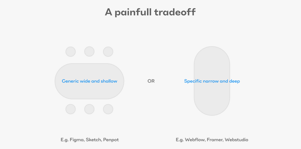
Designers use an unconstrained canvas tool to design for rule-based interactive systems, hoping the devs will perfect everything in production. This causes misalignment between designers and devs.

There are two persistent issues that keep plaguing the product design and development worlds. The first one is very much on the surface, and thus — no surprise — gets both a lot of attention and a plethora of sometimes reasonable solutions. The second one is much deeper, more subtle, and easier to miss.
Let’s start with the first one — the handoff problem.
There are, in fact, several reasons why the handoff process is a major problem:
- Friction, and with it the potential for mistakes in a handoff, causes the actual coded products to differ from the designers’ intentions, as captured in their design tool. The only experience that matters is that of real users with the real-coded product. Not getting the designs perfectly reflected in the final product makes the process ineffective and demoralizing.
- Handoff wastes a lot of time for designers and developers. It takes a lot of mental effort to encode and decode all the relevant info for building the screens correctly. A designer must over-communicate with specs, examples, comments, and documentation, while a developer must inspect the designs with paranoid, detective-level vigilance, sometimes squinting to avoid missing anything.
- Handing designs to developers to build from scratch creates a redundant, atrophied artifact. Once the code is live, it diverges from the source of truth, creating a never-ending race to ensure the design file and the ‘reality’ match. When that pairing is inevitably broken, a chain of mistrust builds. Developers see outdated designs and feel justified in ignoring parts that seem out of touch with ‘reality.’ As a result, designers become hyper-vigilant, hunting for mismatches between the design and the implementation. This occurs frequently when developers choose a library as the optimal solution for a component and do not properly match the specified styling.
- The need to hand designs over forces designers to waste time on things they usually don’t like or value that much. It’s not the peak of creativity to specify and document all the ways a text field should be able to render in the product. Especially knowing that this is not the actual thing being built, but only a disposable artifact. It forces front-end developers to focus on tasks of little joy or meaning as well. Recreating an already designed screen in code while chasing down designers to verify how things should reflow when the viewport gets smaller or larger is no fun either.
Since those problems are quite clear, the motivation for solving them was, and still is, high.
And so there were two general directions for solutions that the market allowed to evolve:
One was a path of helper apps to the most popular canvas design tools. It started with tools for easier inspection (Avocode, Zeplin, Simpli, Abstract). Then, design tools added inspection features (like Dev Mode in Figma, Sketch, XD, and InVision). After that, specific tools appeared. These included Zeroheight and InVision’s DSM for easier documentation. Many plugins also emerged in the Sketch and Figma marketplaces, like Anima, Locofy, and other ‘Figma-to-HTML’ tools.
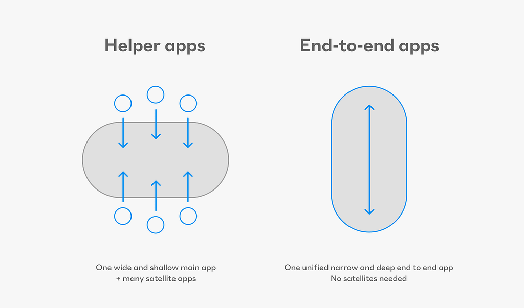
The other path was entirely different in nature. It sought to eliminate the handoff altogether by creating a new breed of design tools that were able to ‘ship end-to-end’ by themselves with little to no help from developers. The most prominent and robust nowadays would be Webflow and Framer, but there is a whole slew of them, starting with Dreamweaver some 25 years ago.
The biggest issue with all these no-code / low-code tools was, and still is, that the way they’re built not only eliminates the handoff, but also the need for developers themselves. This, naturally, created a pretty low ceiling for the complexity of the products these tools can allow designers to build end-to-end. Primarily for this reason, the monetary success followed website building tools, rather than native iOS / Android or web app building tools (at this stage I’m only aware of Play for iOS and Draftbit). The chief reason for this, as I can make sense of it, is that in apps the logical complexity exceeds the ability of the no-code tools to deliver. In the last few years, some vertical tools like Framer, Webflow, Builder.io started building ‘bridges’ as an import ability from canvas tools like Figma, using their own plugins.
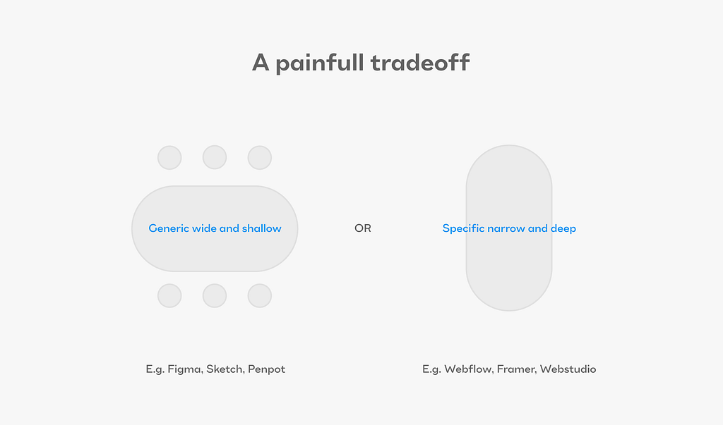
And so, the space of solutions for the handoff problem has a trade-off in the middle of its heart:
You either have a generic canvas tool that allows you to design the most complex apps in the world, but the design is only an artifact and necessitates a handoff, or you have a specialized builder tool that frees you to design and develop by yourself, but it has a low ceiling of complexity for the product you want to create.
As far as I’m aware, there have only been two design/development tools that successfully incorporated a different, unifying strategy.
- Flash (created by Macromedia, succeeded by Adobe, killed by Steve Jobs)
- Blend for Visual Studio using XAML and the WPF platform from Microsoft.
Flash had ActionScript that allowed the same object to be freely designed by the designer and logically manipulated using ActionScript commands by the developer. This setup let all the relevant pros do their jobs. The designers focused on what was important, both experientially and visually. They didn’t need to hand off anything to developers, since they could just target the existing assets created by the designers. No throwaway artifacts, no handoff, and no limit to the complexity. Flash didn’t try to code for you. It allowed developers to pick up where designers maxed out their comfort zone.
Blend for Visual Studio had a similar story, but with different files, structures, and logic. It was a twin-environment setup. The designers could design, and the Visual Studio developers could target the exact same assets. Again, no handoff, no throwaway artifacts, and no limits on complexity.
As we all know, Flash died because of security and performance incompatibility with the iPhone. Blend and Visual Studio are now niche, unpopular tools. In all the surveys of tool usage in the last 7 years, I haven’t seen a single mention of them. Meanwhile, Figma has taken almost all the product design market share).
This has to lead us to the conclusion that the tools with the best approach are still not immune to failing for all sorts of other reasons. Business is a fickle and unpredictable game, indeed.
Now, as I’ve stated at the beginning, there are two persistent issues that keep plaguing the product design and development worlds. Let’s explore the more hidden, but an even more important issue:
Naive canvas-based tools hide the vast spectrum of design properties from designers.
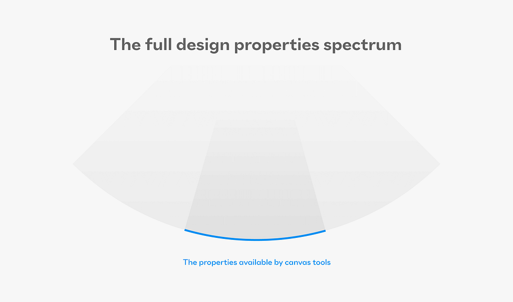
The ramifications of this problem are large. But it’s not a malicious plot to keep designers blissfully ignorant — it’s the bad side of a tradeoff that designers used to only look at its good side. Freedom. And boy, do designers love their freedom. I know I do.
It is important to realize how we got to where we are with the canvas tools that have become so ubiquitous in the industry.
We started with a physical page. Paper, ink, and colors manipulated to perfection by graphic designers. The page was static, concrete, well-defined, and never changing. Then graphic programs arrived to help speed things up — Photoshop, Freehand, Corel Draw, Illustrator (and many more after those). All helped us design printed and mostly static web assets. Then, something important happened. Computers began to diverge in screen sizes. The internet and native apps had to adapt. They introduced responsive units and rules. It all escalated even more after the introduction of the iPhone and tablets. But the designers, graphic and early-interactive designers that is, were hooked on the page metaphor. Naturally, the revenue-powered design tools kept giving them exactly that. The ease of direct manipulation (first with a mouse and keyboard, then with finger gestures and a stylus) was too comfortable to give up for other benefits. This led to a mismatch where designers were encouraged by the tools to have freedom, while the demand now was for responsive, systematic, smart, parametric design rules — for developers to implement.
And this is where the great divide becomes clear because:
The set of tools and abilities that maximize intuitive, freeform graphic manipulation is exactly the opposite of the set of tools that help define coherent, robust, flexible, and parametric systems.
Think about the very basic nature of ‘gravitation’: in all the main canvas tools up until the introduction of Figma’s auto-layout a few years ago, the freedom meant that there was no gravitational pull either upwards or downwards. Very much unlike both the web and the native iOS and Android environments.
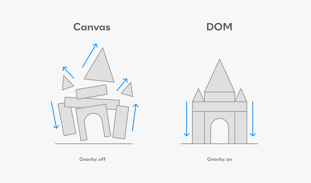
When you have no gravitation, the default mode of everything is to be absolutely positioned in gradual z-index order, one on top of the other. Nothing pushes anything else. Nothing interacts. Paddings and margins don’t mean anything. Text doesn’t make boxes get larger when more words are typed in. Since there’s no viewport, no viewport-related measurements can be used; even percentages are almost never used. So almost nothing is relative.
Slowly, UI-friendly tools started appearing. Sketch opened the door for both XD and Figma. It did this by using components, overrides, a generic mapping of frame = div, and more visual qualities that can be parameterized (colors, typography, effects, and layout grids in Figma). It was a breath of fresh air, but the challenges rose in tandem with the tools.
The most technical designers felt the pressure to start experimenting with code by themselves. This gave them superpowers because it informed their otherwise naive stance about how the real world of UI programming works. A push towards getting more robust tools was felt, and the leading tools (Sketch, Figma, and XD) introduced Auto Layout, which was a slightly capped but friendly version of Flexbox. It was like having a mini-universe with DOM-like gravity inside a capsuled ‘auto-layout-enabled frame,’ inside a universe of a do-whatever-you-like canvas.
This was revolutionary. Designers began to consider how content affects container sizes. Layout reflow became more robust, and finally, padding mattered.
Savvy designers started building almost everything they had in the UI using auto-layout.
Now, let that sink in for a second…
In a universe with no gravitation, we are creating almost everything as a bunch of microuniverses with gravitation! Wouldn’t it be so much easier if the base default reality was the one with the gravitation, sort of auto layout by default!? Oh wait, that’s exactly how the web, iOS, and Android already work.
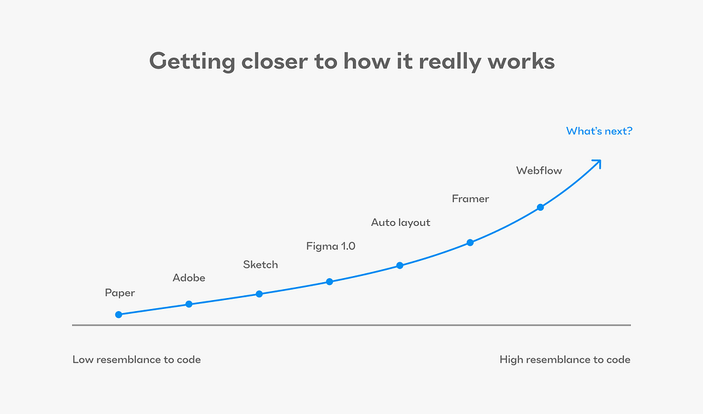
So the trajectory of progress seems clear if you look at the last 10 years. Tools are trying to get designers closer and closer to systematic and flexible design rule-making.
But…
We are still before the biggest, most important leap forward.
For the actual UI building (components and pages) — product designers will have to give up their beloved free-form canvas.
As far as I can see it, designing and building digital products will have to abide by the constraints of the platform in which they are coded and tested. As a designer, I must have the full spectrum of tools to use flex, grid, padding, margin, percentages on every single measurement, viewport units, and many more. I need to be able to easily change the viewport and see everything that needs to be affected — be affected. Components should have a difference between states and properties because they are not the same. Their variants should be set in a rule-based fashion, not by specifying all my variants one by one. Instead of styles, Design Tokens should parametrize everything. Robust, multi-layered tokens with aliases and composite token types (like typography).
The default of the tool has to help me make better decisions, not nicer or easier decisions. It has to keep me from veering too easily into a naive, chaotic, inconsistent mess of a system. A system that will be easy to create on a whim, but nightmarish to maintain. To get a sense of what we are actually doing when we’re designing for interactive digital experiences — read what Frank Chimero wrote in his essay ‘The Web’s Grain’. This part is about how hard it is to master the design for screens because they are:
‘an edgeless surface of unknown proportions comprised of small, individual, and variable elements from multiple vantages assembled into a readable whole that documents a moment’.
This is the grain of digital products, web, and elsewhere. So the design tools we use should help us actually interact with this ‘surface,’ not hide and abstract it away from us. It’s time we mature as designers. The quality of processes, the relationships with the developers, our products, and the well-being of our customers are all well worth the effort.
The right tool will have to be built for a collaboration. A true collaboration, not a handoff. With developers, because complex products (which will be the vast majority) need them. There’s no avoiding that with dreams of magic AI fairy dust and no-code, no-dev narrow builders, empowering as they may seem.
I hope disruption is well on its way. I’m working with my friends to build a tool I believe has these properties. It’s called Jux. Still very early days and a long way to go, but I think we’re on to something truly radical.
Dive even deeper by reading these:
- Nathan Curtis’s great article about what should a spec for handoff include
- Brad Frost’s article + demo for prototyping using Claude with real coded objects.
- To have a good sense of the real interactivity of most common components go through this list by Iain Bean. There’s a page for components and a page for some great design systems.
- Read Shamsi’s article laying out an argument against the handoff.
- Read Joe Alterio’s deep piece about tools and craft and how AI will affect it all.
- Great read from Vitaly Friedman of Smashing Magazine regarding ‘no handoff’
Originally posted on the Jux blog here
The root causes for the dev-design mismatch was originally published in UX Collective on Medium, where people are continuing the conversation by highlighting and responding to this story.
