Design Meets Disability was recommended to me by accessibility consultant Jon Gibbins while we were sharing a long train journey through mid-Wales. We were talking, amongst many things, about our love for Apple products and their design.
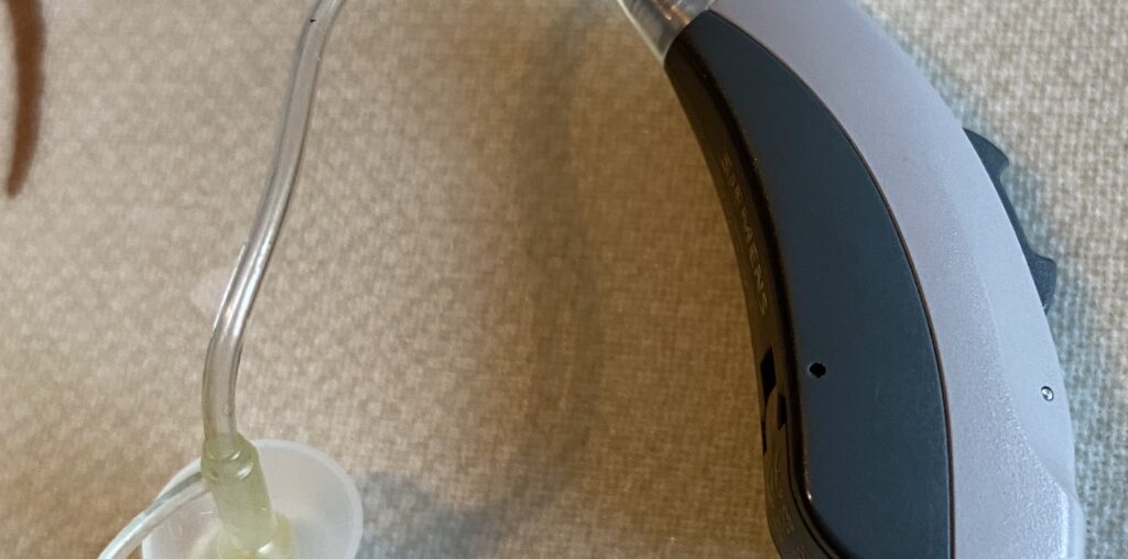
I am a hearing aid wearer, my aid is two-tone grey. A sort of dark taupe grey above, and a darker, almost gun-metal grey below. There’s a clear tube into my ear. This is fine, I don’t hate it. It’s certainly better than the nowhere close to anyone’s actual skin colour weird pinky-taupe colour of older style aids. But, why is the tube clear? I didn’t make the design decision here, but I think we can safely assume it’s clear to hide the tube. But why would I want to hide it?

Having a hearing aid isn’t me, but its part of what makes me who I am. Why should I be made to feel like I should be ashamed of that by a design decision? Glasses wearers spend hundreds on frames that suit their style. Yet I can only choose between solid grey, silver or taupe. The majority of us will wear jewellery on our ears from time to time. Yet my ear accessory is hidden.
This is exactly the area Graham covers in his book. The book places objects such as RGK wheelchairs on a par with chairs designed by Charles & Ray Eames and discusses what each can learn from the other. The book is a combination of actual meetings with designers and imagined meetings. Each discussing how the designer in question would re-imagine accessibility aids. The latter considering how leaders in their field such as Jony Ive would use his expertise in Earpods to create assistive hearing devices.
Like any good design book, Design Meets Disability contains full page, full colour images of beautiful objects and beautiful people. Presenting disability and assistive design as just as beautiful as any other images you may find in a design book.
Graham Pullin’s Design Meets Disability (2009) is published by MIT Press and is available directly from them or from
Amazon £.

