Is anyone else feeling the same way as I do? Struggling to keep up with the thousands of AI products and capabilities being launched every day? When I first discovered Claude Artifacts a couple of months ago, it felt like magic. Suddenly, I had the power to see interactions, animations, and complex user flows unfold right before my eyes — instantly. We’re truly at a point where AI is turning our design dreams into a reality.
Remember when designing a product meant meticulously crafting static layouts in Photoshop, hoping they would translate well into the real world? We’ve come a long way from those days of pixel-perfect PSDs. Our journey has taken us through the revolution of collaborative design tools like Figma, which transformed how we create and iterate. But now, in 2024, we’re witnessing another evolution in our design toolkit — one where AI serves as a powerful ally in testing and validating our design decisions through rapid, interactive prototyping. Incorporating realistic interactions through prototyping is essential for obtaining valid user feedback. As highlighted by AWA Digital, “Prototypes that demonstrate realistic user flows and interactions help users evaluate designs in a meaningful way.”
Today’s digital experiences are no longer confined to clicks and taps. We’re designing for a world where users interact through images, voice, gesture, text, and multiple modalities. This shift has added a level of complexity that traditional prototyping tools struggle to handle effectively. While tools like Figma excel at crafting pixel-perfect interfaces, they fall short when it comes to capturing dynamic interactions — animations, conditional behaviors, or real-time data feedback. Testing complex interactions and behaviors often becomes a bottleneck, requiring costly and time-consuming handoffs to development just to see if an idea will work.
The conversation between Brian Chesky and Suhail underscores the reality that many companies skip prototyping, leading to poor outcomes. Prototyping helps validate a design in its full context, reducing the risks of building something that ultimately misses the mark.
The data-driven dilemma:
Crafting a beautiful real-time analytics dashboard in Figma is one thing; validating smooth tooltip animations or natural chart transitions is another. Static prototypes can’t capture these nuanced interactions, and waiting for development cycles can take weeks.
The cross-device dance:
Users start tasks on their phones and continue them on desktops. Static mockups can’t show fluid state transitions or seamless data sync across devices, leaving designers guessing if interactions will feel intuitive in real use.
The stakeholder communication gap:
Imagine presenting a new filtering system only to hear weeks later: “This isn’t what I imagined.” Without demonstrating complex interactions early, features risk missing the mark on expectations.
The innovation barrier:
Innovative ideas often fall flat because prototyping them is too resource-intensive. We default to conventional patterns not because they’re better, but because they’re easier to validate.
Generative AI tools like Claude and Vercel v0 are changing the game. They aren’t replacing our design process but enhancing it. With Claude, we can quickly generate interaction scenarios from natural language, while Vercel v0 turns these ideas into polished, production-ready components. This revolution in prototyping allows us to rapidly validate and communicate our design decisions through live, interactive previews.
Let’s explore how AI can enhance our prototyping phase with a real example. Imagine you’ve already designed a stock market dashboard in Figma, carefully considering the visual hierarchy, component structure, and interaction patterns. Now you want to validate how certain interactions would feel in practice — particularly those complex, data-driven behaviors that are hard to simulate in traditional prototyping tools.
Here’s how we can use AI to rapidly prototype and test these interactions. Here’s the prompt I used to bring this vision to life:
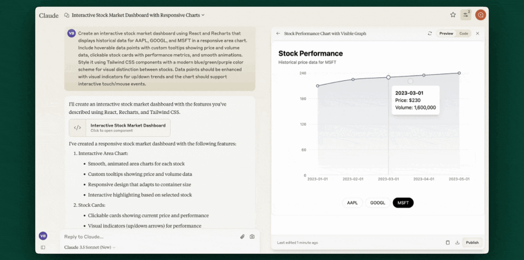
Create an interactive stock market dashboard using React and Recharts that displays historical data for AAPL, GOOGL, and MSFT in a responsive area chart. Include hoverable data points with custom tooltips showing price and volume data, clickable stock cards with performance metrics, and smooth animations. Style it using Tailwind CSS components with a modern blue/green/purple color scheme for visual distinction between stocks. Data points should be enhanced with visual indicators for up/down trends and the chart should support interactive touch/mouse events.
Within seconds of sending this prompt to Claude, we got a fully functional React component with interactive charts, complete with hover states, animations, and responsive design. Notice how the component isn’t just a static visualization — it’s a living, breathing interface that responds to user interaction. The tooltips smoothly appear on hover, the charts animate between data points, and the entire layout adjusts fluidly to different screen sizes.
Similarly, Vercel v0 transformed the same prompt into a polished UI component, offering a different yet equally impressive interpretation. The subtle differences between these implementations showcase an interesting aspect of AI-powered design — how the same prompt can yield different creative solutions, much like how different designers might approach the same brief.

