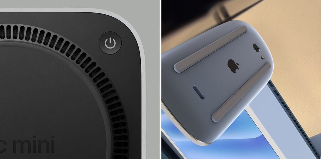
Apple recently released the M4 Mac Mini which sparked controversy among tech enthusiasts and designers. The culprit? A power button that is inconspicuously placed on the bottom of the device. This decision has left many scratching their heads, with some calling it a design flaw that is reminiscent of the Magic Mouse charging port placement.
“You’ve got to be kidding me. The power button is ON THE BOTTOM of the new M4 Mac Mini. So in order to power the computer on, you have to lift it or tip it forward. That is the dumbest design EVER. Who approved that?” — Twitter user’s reaction
But is this truly a misstep by Apple’s design team? Or could there be more to this apparent madness? As a designer, here are my takes on the reasoning behind this controversial choice.
To understand the significance of this change, it’s definitely worth examining the power button placement and designs on earlier Mac mini models.

