A little while ago, Etsy introduced a new feature in its iOS app that could place Etsy sellers’ artwork on a user’s wall using Apple’s Augmented Reality (AR) tools. It let them visualize how a piece would look in their space, and even gave them an idea of its size options. When we launched the feature as a beta, it was only available in “wall art”-related categories, and after the initial rollout we were eager to expand it to work with more categories.
What differentiates Etsy is the nature of our sellers’ unique items. Our sellers create offerings that can be personalized in numbers of ways, and they often hand-make orders based on demand. Taking the same approach we did with wall art and attempting to show 3D models of millions of Etsy items – many of which could be further customized – would be a huge undertaking. Nevertheless, with inspiration from Etsy’s Guiding Principles, we decided to dig deeper into the feature. What could we improve in the way it worked behind the scenes? What about it would make for a compelling extension into the rest of our vast marketplace?
We took steps to improve how we parse seller-provided data, and we used this data with Apple’s AR technology to make it easy for Etsy users to understand the size and scale of an object they might want to buy. We decided we could make tape measures obsolete (or at least not quite as essential) for our home-decor shoppers by building an AR tool to let them visualize–conveniently, accurately, and with minimal effort–how an item would fit in their space.
Improving dimension parsing
In our original post on the wall art experience, we mentioned the complexity involved in doing things like inferring an item’s dimensions from text in its description. Etsy allows sellers to add data about dimensions in a structured way when they create a listing, but that wasn’t always the case, and some sellers still provide those details in places like the description or the item’s title. The solution was to create a regex-based parser in the iOS App that would glean dimensions (width and height) by sifting through a small number of free-form fields–title, description, customization information, overview–looking for specific patterns. We were satisfied being able to catch most of the formats in which our sellers reported dimensions, handling variable positions of values and units (3 in x 5 in vs 3 x 5 in), different long and short names of units, special unit characters (‘, “), and so on, in all the different languages that Etsy supports.
Migrating our parsing functionality to the API backend was a first step towards making the AR measuring tool platform-independent, so we could bring it to our Android App as well. It would also be a help in development, since we could iterate improvements to our regex patterns faster outside the app release schedule. And we’d get more consistent dimensions because we’d be able to cache the results instead of having to parse them live on the client at each visit.
We knew that an extended AR experience would need to reliably show our users size options for items that had them, so we prioritized the effort to parse out dimensions from variations in listings. We sanitized free-form text input fields that might contain dimensions—inputs like title or description—so that we could catch a wider range of formats. (Several different characters can be used to write quotation marks, used as shorthand for inches and feet, and we needed to handle special characters for new lines, fraction ligatures like ½ or ¼, etc.) Our regex pattern was split and updated so it could detect:
- Measurement units in plural forms (inches, feet, etc.);
- Incorrect spellings (e.g. “foots”);
- Localization of measurement units in the languages spoken by Etsy’s users (“meters”, “metros”, and “mètres” in English, Spanish, and French, respectively);
- Other formats in which dimensions are captured by sellers like dimensions with unit conversions in parentheses (e.g.
12 in x 12 in (30 cm x 30 cm)) or with complex measurements in the imperial system (3’6”).
Making our dimension parsing more robust and bringing it server-side had several ancillary benefits. We were able to maintain the functionality of our iOS app while removing a lot of client-side code, even in Etsy’s App Clip, where size is a matter of utmost importance. And though regex processing isn’t that processor-intensive, the view feature performed better once we implemented server-side caching of parsed dimensions. We figured we could even take the parsing offline (rather than parsing every listing on every visit) by running a backfill process to store dimensions in our database and deliver them to the App along with item details.
We found, thanks to decoupling our parser work from the App release cycle, that we were able to test hypotheses faster and iterate at a quicker pace. So we could proceed to some improvements that would have been quite resource-intensive if we had tried to implement them on the native app side. Sellers often provide dimensions in inconsistent units, for instance, or they might add the same data multiple times in different fields, when there are variations in properties like material or color. We worked out ways to de-duplicate this data during parsing, to minimize the number of size options we show users. (Though where we find dimensions that are specifically associated with variations, we make sure to retain them, since those will more directly correlate with offering prices.) And we made it possible to prioritize structured dimension data, where sellers have captured it in dedicated fields, as a more reliable source of truth than free-form parsing.
Measuring in 3D
The box
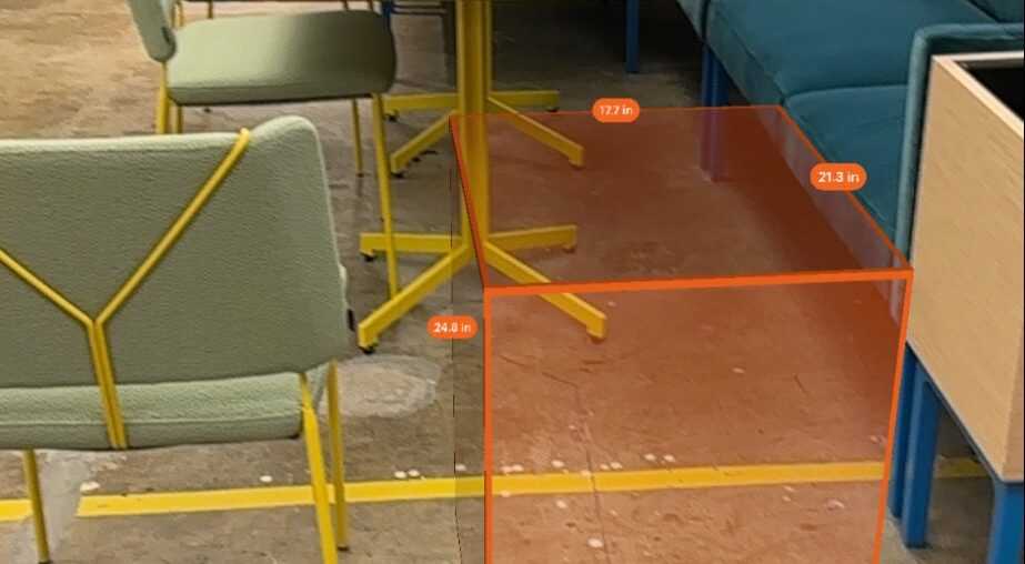
With this new and improved dimension data coming to us from the server, we had to figure out the right way to present it in 3D in iOS. The display needed to be intuitive, so our users would know more or less at a glance what the tool was and how to interact with it. Ultimately, we decided to present a rectangular prism-type object scaled to the parsed dimensions we have for a given listing. Apple’s SceneKit framework – specifically its SCNBox class – is what creates this box, which of course we style with the Etsy Orange look. So that users understand the box’s purpose, we make sure to display the length on each side. We use SceneKit’s SCNNode class to create the pills displaying our measurements.
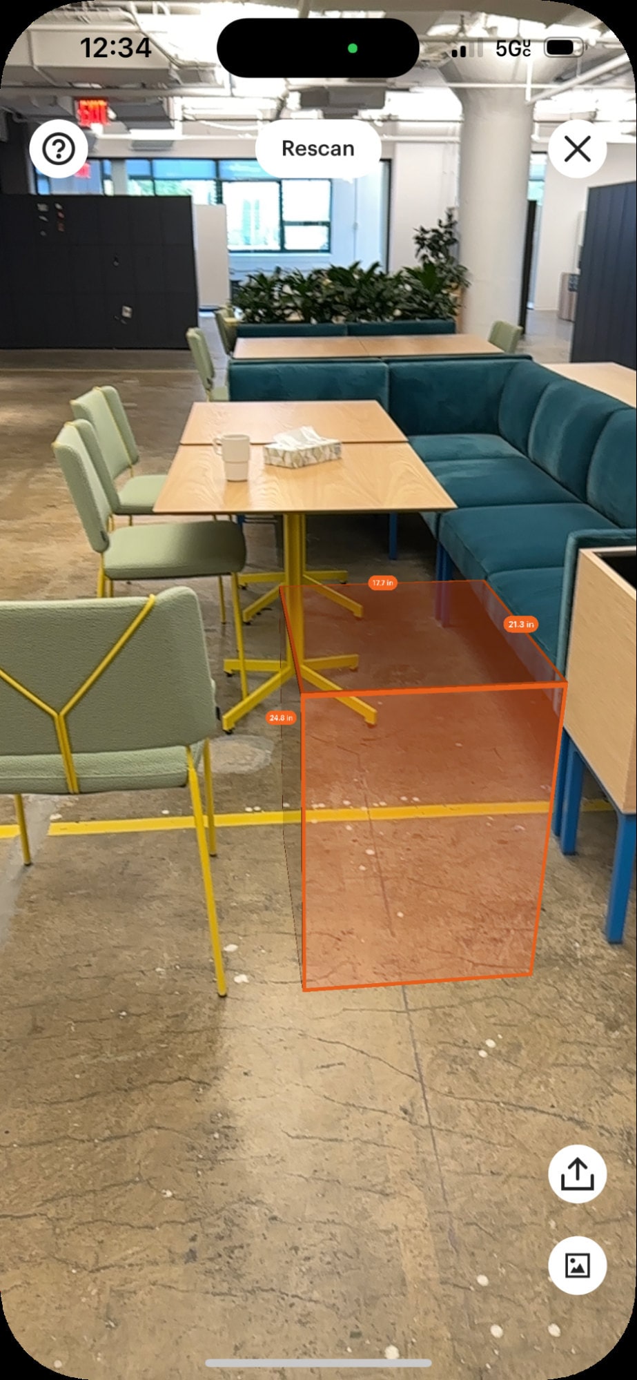
Users drag or tap the measuring box to move it around, and it can rotate on all axes – all made possible by having a different animation for each type of rotation using SCNActions. Rotation is a must-have feature: when we place the measuring box in a user’s space, we may not always be able to get the orientation correct. We might, as in the illustration below, place a side table vertically on the floor instead of horizontally. Our users would have a poor experience of the measuring tool if they couldn’t adjust for that. (Note that you may see some blinking yellow dots when you try out the AR experience: these are called feature points, and they’re useful for debugging, to give us an idea of what surfaces are successfully being detected.)
Environment occlusion
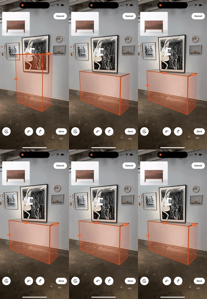
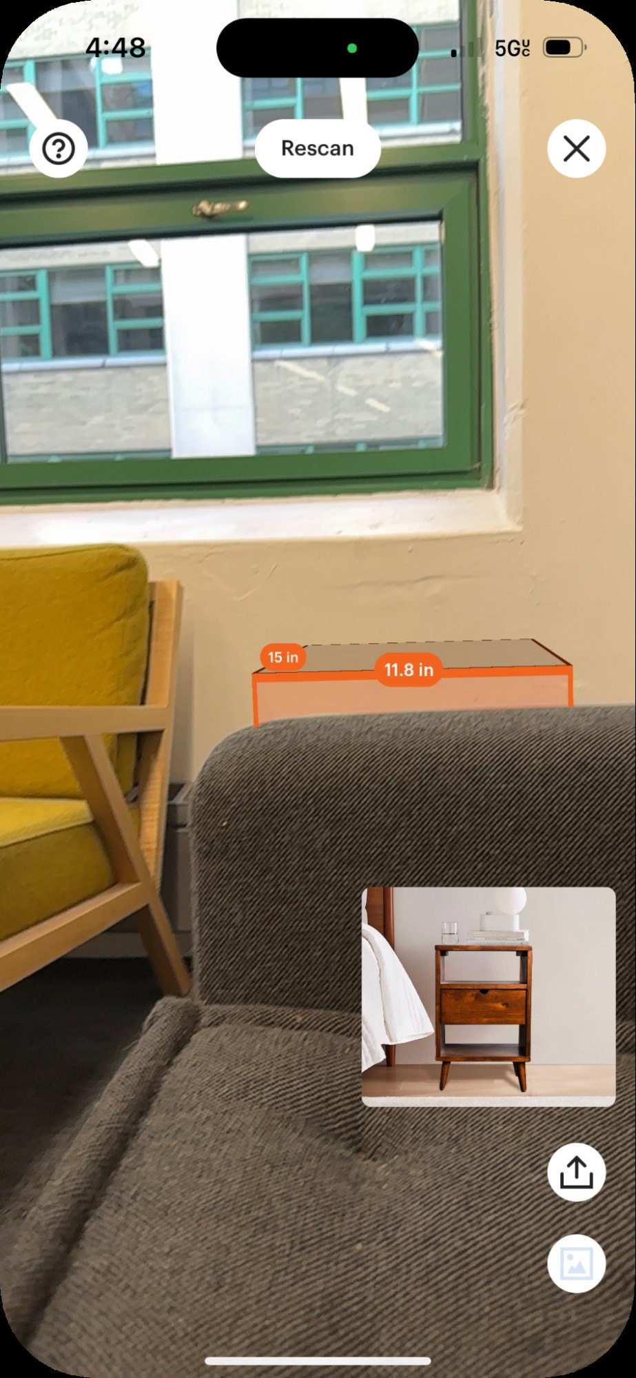
In addition to ensuring the box would be scaled correctly, we wanted it to “sit” as realistically as possible in the real world, so we built in scene occlusion. When a user places the measuring box in a room with other furniture, scene occlusion lets it interact with real-life objects as if the box were actually there. Users get valuable information this way about how an item will fit in their space. Will that end table go between the wall and couch? Will it be tall enough to be visible from behind the couch? (As demonstrated below, the table will indeed be tall enough.)
Environment occlusion became a possibility with LiDAR, a method of determining depth using laser light. Although LiDAR has been around for a few decades, used to map everything from archeological sites to agricultural fields, Apple only included LiDAR scanners in iPhones and iPads beginning in 2020, with the 4th-generation iPad Pro and the iPhone 12 Pro.
An iPhone’s LiDAR scanner retrieves depth information from the area it scans and converts it into a series of vertices which connect to form a mesh (or a surface). To add occlusion to our SpriteKit-backed AR feature, we convert the mesh into a 3D object and place it (invisibly to the user) in the environment shown on their phone. As the LiDAR scanner measures more of the environment, we have more meshes to convert into objects and place in 3D. The video below shows an AR session where for debugging purposes we assign a random color to the detected mesh objects. Each different colored outline shown over a real-world object represents a different mesh. Notice how, as we scan more of the room, the device adds more mesh objects as it continues drawing out the environment.
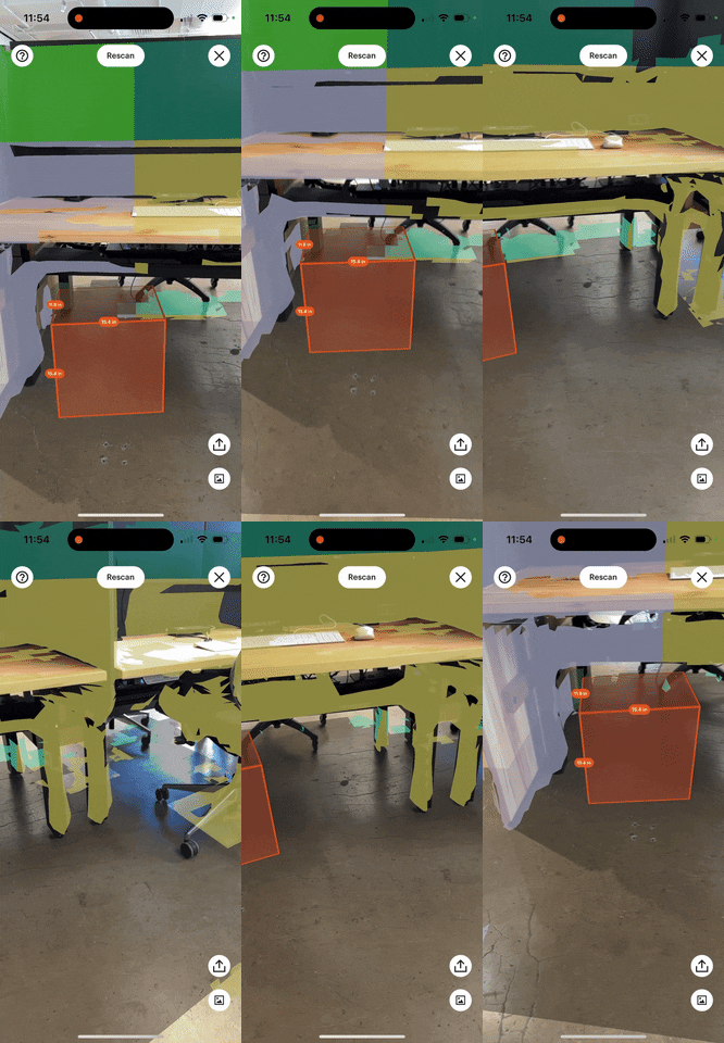
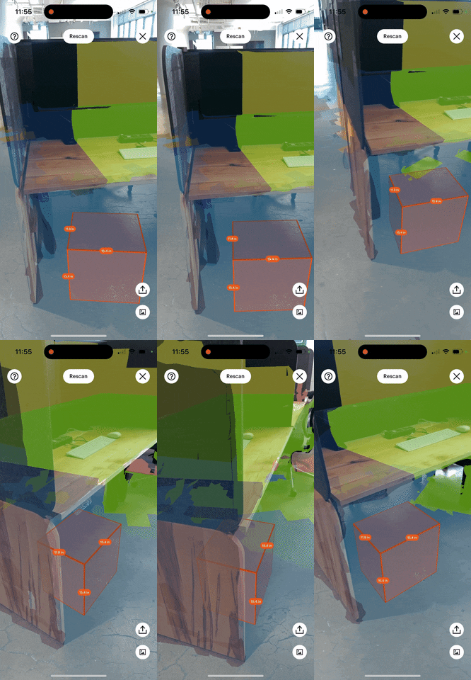
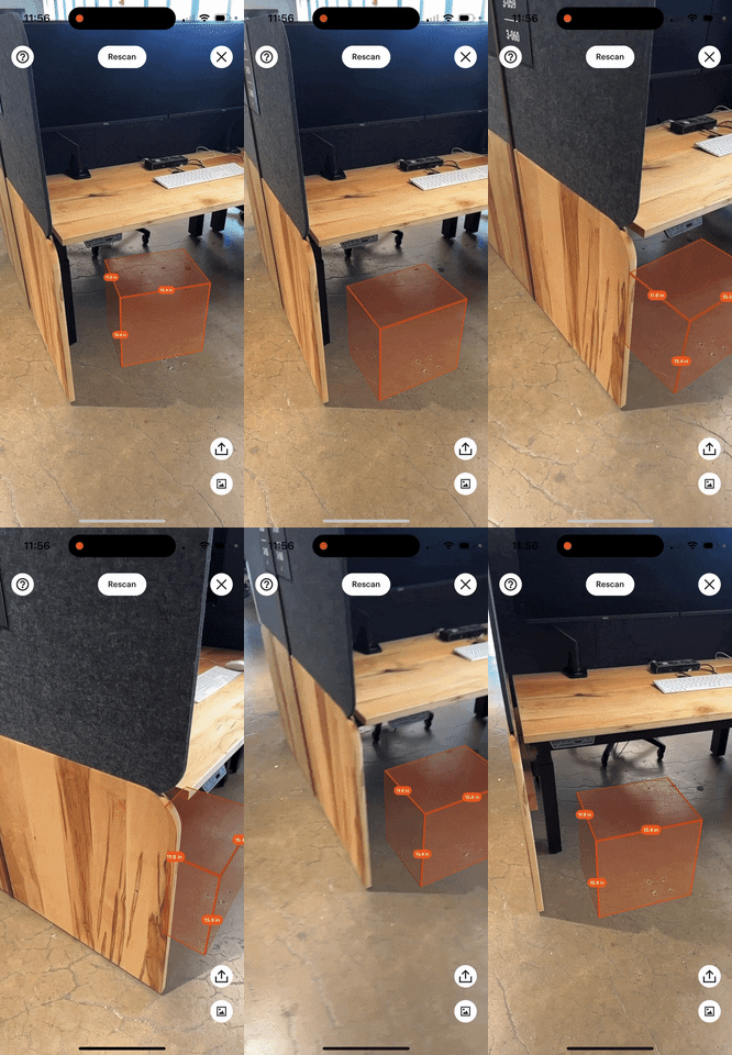
The user’s device uses these mesh objects to know when and how to occlude the measuring box. Essentially, these mesh objects help determine where the measuring box is relative to all the real-world items and surfaces it should respect. Taking advantage of occlusion gives our users an especially realistic AR experience. In the side-by-side comparison below, the video on the left shows how mesh objects found in the environment determine what part of the measuring box will be hidden as the camera moves in front of the desk. The video on the right shows the exact same thing, but with the mesh objects hidden.
| Mesh objects are visible | Mesh objects are hidden |
|---|---|
 |
 |
Closing thoughts
This project took a 2D concept, our Wall View experience, and literally extended it into 3-dimensional space using Apple’s newest AR tools. And though the preparatory work we did improving our dimension parser may not be anything to look at, without the consistency and accuracy of that parsed information this newly realistic and interactive tool would not have been possible. Nearly a million Etsy items now have real-size AR functionality added to them, viewed by tens of thousands of Etsy users every week. As our marketplace evolves and devices become more powerful, working on features like this only increases our appetite for more and brings us closer to providing our users with a marketplace that lets them make the most informed decision about their purchases effortlessly.
Special shoutout to Jacob Van Order and Siri McClean as well as the rest of our team for their work on this.
