We recently made updates to our SoundCloud iOS and Android apps to address key user experience (UX) fixes according to user feedback.
We’ll be updating this blog regularly as we actively work to improve the SoundCloud experience for our users, and we’re so excited to share these improvements with everyone.
Here are our most recent updates across iOS and Android as of 4 October 2022.
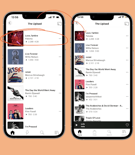
Track Cell Size Reduction (iOS)
We made the size of tracks, playlists, artwork, and creators smaller so you can access more music with less scrolling.
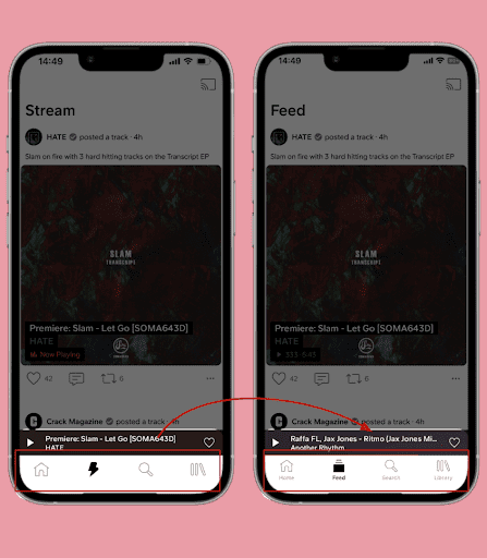
Labels in the Navigation Tab Bar (iOS)
We updated the navigation and included labels, making it easier to understand the purpose of each menu item, in turn streamlining your experience.
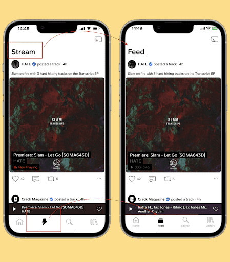
Stream Is Now Feed (iOS)
Based on user feedback, we renamed Stream to Feed to make it more widely understood. Nothing in your stream has been removed or lost — you still have access to all the music discovery you know and love.
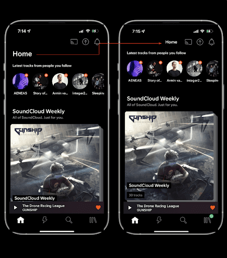
Smaller Page Titles (Android, iOS)
Thanks to labels in the navigation bar, we made page titles smaller to make the best use of space and ensure users they’re not missing out on any music. This increases content density in the first scroll of pages like Home.
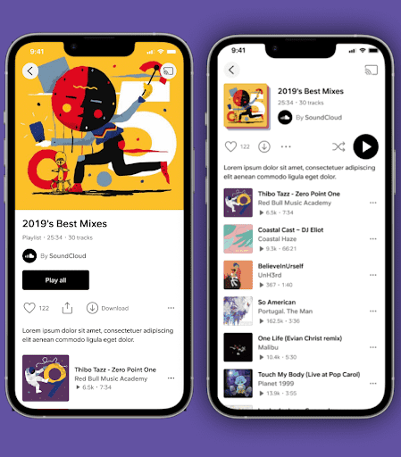
New Playlist Header (Android, iOS)
Our updated and reduced-sized playlist header puts less space between you and your music, allowing you to access your playlist tracks — plus shuffle and play buttons — faster and easier.
More to Come
We’re excited to unveil future updates to SoundCloud, and we couldn’t do it without your support and feedback — stay tuned for what’s next!


