In a few recent projects, I’ve needed to utilise Google Maps within environments utilising Jetpack Compose. In the early days of Compose this felt light a sought-after piece of functionality – even though it is still being built on, it now seems to be in a place where I can confidently use it. In this series of blog posts, I’ll share how we can use the different parts of the Compose mapping package.
Now that we have the basics down from a previous post, we’re going to dive into the Circle composable and learn how we can draw circular indicators on our map.
Looking to learn more Jetpack Compose? The video course for Practical Jetpack Compose is now available 🚀
The Circle Composable
In the previous post we looked at the Marker composable, which is used to indicate POIs and display further information on click events. When it comes to the Circle composable, the concept is much simpler – often used to display things such as the current location for a user, this component does not handle additional information (such as information windows) – we simply provide it with a center location and a circle will be drawn. While we can style this circle and provide a click listener for handling click events, the foundations of the composable are very simple. It’s important to note the @GoogleMapComposable annotation – we covered in the previous post that the GoogleMap composable only supports children using this annotation.
@Composable
@GoogleMapComposable
public fun Circle(
    center: LatLng,
    clickable: Boolean = false,
    fillColor: Color = Color.Transparent,
    radius: Double = 0.0,
    strokeColor: Color = Color.Black,
    strokePattern: List<PatternItem>? = null,
    strokeWidth: Float = 10f,
    tag: Any? = null,
    visible: Boolean = true,
    zIndex: Float = 0f,
    onClick: (Circle) -> Unit = {},
)
As we can see from this composable, there is a collection of arguments that allow us to customise our Circle. The composable contains on required argument, the center. This is required to draw the circle at the specified location, which is provided in the form of a LatLng instance. While the radius isn’t a required argument, this defaults to 0.0 meaning that no circle will initially be visible. For this reason, we’re also going to provide a radius argument so that our circle is visible on the map.
val london = LatLng(51.5072, 0.1276)

Circle(
    center = london,
    radius = 150.0
)
With this in place, we’ll now be able to see a Circle displayed on our map.

However, you can probably notice that this isn’t very visible on our Map. This is because the Circle defaults to a transparent fill color and a Black stroke color. Because we are using a dark styling for our map this causes the Circle to be barely visible. To improve this we’ll provide a value for the strokeColor argument.
Circle(
    center = london,
    radius = 150.0,
    strokeColor = Color.White
)
With this in place, our Circle has become more visible on the Map.

Even with this in place, our Circle still isn’t easily visible. The lack of a fill color still takes me a moment to notice the Circle on the map, so to improve this we can go one step further here and provide a fillColor for our Circle.
Circle(
    center = london,
    radius = 150.0,
    strokeColor = Color.White,
    fillColor = Color.Blue
 )
With a fillColor now being provided, our Circle is now much more visible on the Map.

In some cases, we can further increase the visibility of our Circle by increasing the thickness of the Circle stroke. This is done via the strokeWidth argument which allows us to increase the width of the stroke drawn around the border of the Circle.
Circle(
    center = london,
    radius = 150.0,
    strokeColor = Color.White,
    fillColor = Color.Blue,
    strokeWidth = 20f
)
With the thicker strokeWidth applied, this gives our Circle a bolder appearance when being drawn and a clearer representation on our Map.

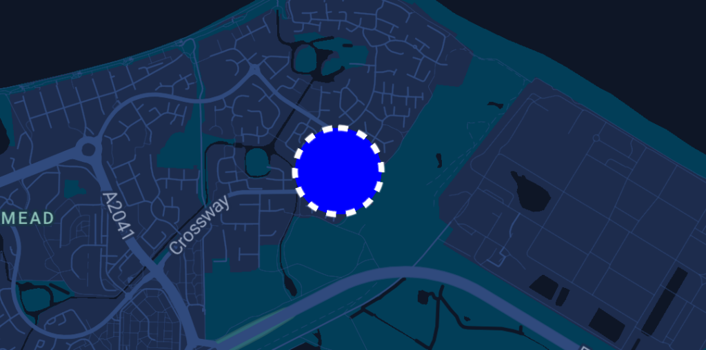
Alongside an increase stroke thickness, we can modify the strokePattern to give our Circle more prominence within our Map. This argument allows us to apply a pattern to the stroke being drawn, for which we must provide a list of PatternItem instances for the pattern to be repeated around the Circle. We won’t dive too much into the different options here, but will cover a quick example of a repeated Dash + Gap pattern.
Circle(
    center = london,
    radius = 150.0,
    strokeColor = Color.White,
    fillColor = Color.Blue,
    strokeWidth = 10f,
    strokePattern = listOf(
        Dash(15f),
        Gap(15f)
    )
)
With this pattern in place, we can see the Dash + Gap applied to our Circle instance. This can help to give our Circle greater visibility within our Map, helping it to stand out more against other drawn components.

While the Circle component is not designed to behave in the same way as a Marker (to show information windows), we can still handle interactions with the Circle via the onClick argument of the Circle composable. This is a simple lambda argument that is triggered when the click event occurs on the composable.
Circle(
    center = london,
    radius = 150.0,
    strokeColor = Color.White,
    fillColor = Color.Blue,
    strokeWidth = 10f,
    strokePattern = listOf(
        Dash(15f),
        Gap(15f)
    ),
    onClick = {

    }
)
In this blog post we’ve taken a quick look at the Circle composable, a simple composable which is often used to display contextual information such as the current location for a user. We can see how the purpose of this composable is very different of that of the Marker composable, and we’ve learnt how we can style this Circle composable to adhere to the required look/feel of our application. In the following posts, we’ll continue to look at customising our map further through other composables that are supported through the GoogleMapComposable content scope.

