As lavish influencer lifestyles, wealth flaunting, and hauls dominate social media feeds, we shouldn’t be surprised that excessive consumption has become the default way of living. We see closets filled to the brim with cheap, throw-away items and having the latest gadget arsenal as signifiers of an aspirational life.
Consumerism, however, is more than a cultural trend; it’s the backbone of our economic system. Companies eagerly drive excessive consumption as an increase in sales is directly connected to an increase in profit.
While we learned to accept this level of material consumption as normal, we need to be reminded of the massive environmental impact that comes along with it. As Yvon Chouinard, founder of Patagonia, writes in a New York Times article:
“Obsession with the latest tech gadgets drives open pit mining for precious minerals. Demand for rubber continues to decimate rainforests. Turning these and other raw materials into final products releases one-fifth of all carbon emissions.”
— Yvon Chouinard
In the paper, Scientists’ Warning on Affluence, a group of researchers concluded that reducing material consumption today is essential to avoid the worst of the looming climate change in the coming years. This need for lowering consumption is also reflected in the UN’s Sustainability goals, specifically Goal 17, “Ensuring sustainable consumption and production patterns”.
For a long time, design has been a tool for consumer engineering by for example, designing products with artificially limited useful life (planned obsolescence) to ensure continuous consumption. And if we want to understand specifically UX design’s role in influencing how much and what people buy, we have to take a deeper look at pushy online shopping experiences.
Today, most online shopping experiences are designed with persuasion, gamification, nudging and even deception to get unsuspecting users to add more things to their basket.
There are “Hurry, only one item left in stock” type messages and countdown clocks that exploit well-known cognitive biases to nudge users to make impulse purchase decisions. As Michael Keenan explains,
“The scarcity bias says that humans place a higher value on items they believe to be rare and a lower value on things that seem abundant. Scarcity marketing harnesses this bias to make brands more desirable and increase product sales. Online stores use limited releases, flash sales, and countdown timers to induce FOMO — the fear of missing out — among shoppers.”
— Michael Keenan
To make buying things quick and effortless, we remove friction from the checkout process, for example, with the one-click-buy button. As practitioners of user-centered design, we might implement the button and say: thanks to this frictionless and easy checkout process, we improved the customer experience. Or did we just do a huge disservice to our users?
Gliding through the checkout process in seconds leaves no time for the user to ask, “Do I actually want this?” or “Do I have the money for this?”. Indeed, putting users on autopilot to make thoughtless decisions is the goal.
As a business.com article says: “Click to buy helps customers complete shopping within seconds and reduces the amount of time they have to reconsider their purchase.”
Amanda Mull writes from a user perspective about how it has become “too easy to buy stuff you don’t want”:
“The order took maybe 15 seconds. I selected my size and put the shoes in my cart, and my phone automatically filled in my login credentials and added my new credit card number. You can always return them, I thought to myself as I tapped the “Buy” button. […] I had completed some version of the online checkout process a million times before, but I never could remember it being quite so spontaneous and thoughtless. If it’s going to be that easy all the time, I thought to myself, I’m cooked.”
— Amanda Mull
This quote also highlights that this thoughtless consumption is not only harmful to the environment but also to the very same user we say we center our design process around. The rising popularity of buy-now-pay-later services, credit card debt, and personal finance gurus to help “Overcoming Overspending” are indicators that people are spending more than they can afford, a huge source of stress for many.
The one-click-buy button is not about improving user experience but building an environment where users are “more likely to buy more and buy often.” If we care to put this bluntly, frictionless and persuasive e-commerce design is not user-centered but business-centered design.
While it is not unusual for design to be a tool to achieve business goals, we, designers, should be clear about who we are serving and at what cost with the power of design. To reckon with our impact, first, we have to understand the source of power we yield — the power asymmetry between the designer and the user.
Power Asymmetry Between User And Designer
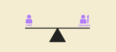
Imagine a scale: on one end sits the designer and the user on the other. Now, let’s take an inventory of the sources of power each party has in their hands in an online shopping situation and see how the scale balances.
Designers
Designers are equipped with knowledge about psychology, biases, nudging, and persuasion techniques. If we don’t have the time to learn all that, we can reach for an out-of-the-box solution that uses those exact psychological and behavioral insights. For example, Nudgify, a Woocommerce integration, promises to help “you get more sales and reduce shopping cart abandonment by creating Urgency and removing Friction.”
Erika Hall puts it this way: “When you are designing, you are making choices on behalf of other people.” We even have a word for this: choice architecture. Choice architecture refers to the deliberate crafting of decision-making environments. By subtly shaping how options are presented, choice architecture influences individual decision-making, often without their explicit awareness.
On top of this, we also collect funnel metrics, behavioral data, and A/B test things to make sure our designs work as intended. In other words, we control the environment where the user is going to make decisions, and we are knowledgeable about how to tweak it in a way to encourage the decisions we want the user to make. Or, as Vitaly Friedman says in one of his articles:
“We’ve learned how to craft truly beautiful interfaces and well-orchestrated interactions. And we’ve also learned how to encourage action to meet the project’s requirements and drive business metrics. In fact, we can make pretty much anything work, really.”
— Vitaly Friedman
User
On the other end of the scale, we have the user who is usually unaware of our persuasion efforts, oblivious about their own biases, let alone understanding when and how those are triggered.
Luckily, regulation around Deceptive Design on e-commerce is increasing. For example, companies are not allowed to use fake countdown timers. However, these regulations are not universal, and enforcement is lax, so often users are still not protected by law against pushy shopping experiences.
After this overview, let’s see how the scale balances:
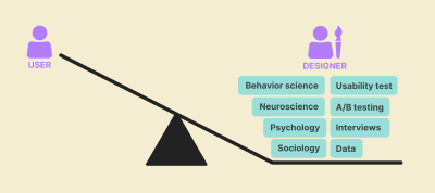
When we understand this power asymmetry between designer and user, we need to ask ourselves:
- What do I use my power for?
- What kind of “real life” user behavior am I designing for?
- What is the impact of the users’ behavior resulting from my design?
If we look at e-commerce design today, more often than not, the unfortunate answer is mindless and excessive consumption.
This needs to change. We need to use the power of design to encourage sustainable user behavior and thus move us toward a sustainable future.
What Is Sustainable E-commerce?
The discussion about sustainable e-commerce usually revolves around recyclable packaging, green delivery, and making the site energy-efficient with sustainable UX. All these actions and angles are important and should be part of our design process, but can we build a truly sustainable e-commerce if we are still encouraging unsustainable user behavior by design?
To achieve truly sustainable e-commerce, designers must shift from encouraging impulse purchases to supporting thoughtful decisions. Instead of using persuasion, gamification, and deception to boost sales, we should use our design skills to provide users with the time, space, and information they need to make mindful purchase decisions. I call this approach Kind Commerce.
But The Business?!
While the intent of designing Kind Commerce is noble, we have a bitter reality to deal with: we live and work in an economic system based on perpetual growth. We are often measured on achieving KPIs like “increased conversion” or “reduced cart abandonment rate”. We are expected to use UX to achieve aggressive sales goals, and often, we are not in a position to change that.
It is a frustrating situation to be in because we can argue that the system needs to change, so it is possible for UXers to move away from persuasive e-commerce design. However, system change won’t happen unless we push for it. A catch-22 situation. So, what are the things we could do today?
- Pitch Kind Commerce as a way to build strong customer relationships that will have higher lifetime value than the quick buck we would make with persuasive tricks.
- Highlight reduced costs. As Vitaly writes, using deceptive design can be costly for the company:
“Add to basket” is beautifully highlighted in green, indicating a way forward, with insurance added in automatically. That’s a clear dark pattern, of course. The design, however, is likely to drive business KPIs, i.e., increase a spend per customer. But it will also generate a wrong purchase. The implications of it for businesses might be severe and irreversible — with plenty of complaints, customer support inquiries, and high costs of processing returns.”
— Vitaly Friedman

Helping users find the right products and make decisions they won’t regret can help the company save all the resources they would need to spend on dealing with complaints and returns. On top of this, the company can save millions of dollars by avoiding lawsuits for unfair commercial practices.
- Highlight the increasing customer demand for sustainable companies.
- If you feel that your company is not open to change practices and you are frustrated about the dissonance between your day job and values, consider looking for a position where you can support a company or a cause that aligns with your values.
A Few Principles To Design Mindful E-commerce
Add Friction
I know, I know, it sounds like an insane proposition in a profession obsessed with eliminating friction, but hear me out. Instead of “helping” users glide through the checkout process with one-click buy buttons, adding a step to review their order and give them a pause could help reduce unnecessary purchases. A positive reframing for this technique could be helpful to express our true intentions.
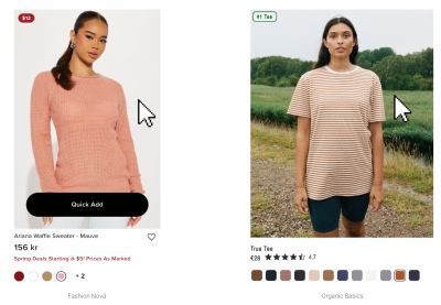
Instead of saying “adding friction,” we could say “adding a protective step”. Another example of “adding a protective step” could be getting rid of the “Quick Add” buttons and making users go to the product page to take a look at what they are going to buy. For example, Organic Basics doesn’t have a “Quick Add” button; users can only add things to their cart from the product page.
Inform
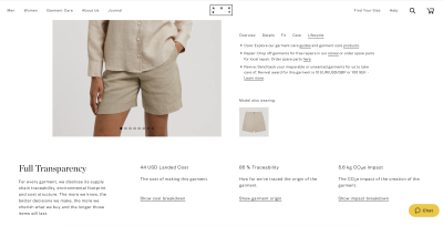
Once we make sure users will visit product pages, we can help them make more informed decisions. We can be transparent about the social and environmental impact of an item or provide guidelines on how to care for the product to last a long time.
For example, Asket has a section called “Lifecycle” where they highlight how to care for, repair and recycle their products. There is also a “Full Transparency” section to inform about the cost and impact of the garment.
Design Calm Pages
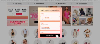
Aggressive landing pages where everything is moving, blinking, modals popping up, 10 different discounts are presented are overwhelming, confusing and distracting, a fertile environment for impulse decisions.
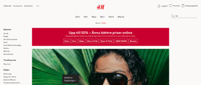
Respect your user’s attention by designing pages that don’t raise their blood pressure to 180 the second they open them. No modals automatically popping up, no flashing carousels, and no discount dumping. Aim for static banners and display offers in a clear and transparent way. For example, H&M shows only one banner highlighting a discount on their landing page, and that’s it. If a fast fashion brand like H&M can design calm pages, there is no excuse why others couldn’t.
Be Honest In Your Messaging
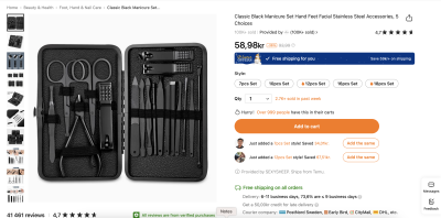
Fake urgency and social proof can not only get you fined for millions of dollars but also can turn users away. So simply do not add urgency messages and countdown clocks where there is no real deadline behind an offer. Don’t use fake social proof messages. Don’t say something has a limited supply when it doesn’t.
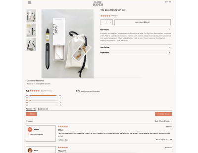
I would even take this a step further and recommend using persuasion sparingly, even if they are honest. Instead of overloading the product page with every possible persuasion method (urgency, social proof, incentive, assuming they are all honest), choose one yet impactful persuasion point.
Disclaimer
To make it clear, I’m not advocating for designing bad or cumbersome user experiences to obstruct customers from buying things. Of course, I want a delightful and easy way to buy things we need.
I’m also well aware that design is never neutral. We need to present options and arrange user flows, and whichever way we choose to do that will influence user decisions and actions.
What I’m advocating for is at least putting the user back in the center of our design process. We read earlier that users think it is “too easy to buy things you don’t need” and feel that the current state of e-commerce design is contributing to their excessive spending. Understanding this and calling ourselves user-centered, we ought to change our approach significantly.
On top of this, I’m advocating for expanding our perspective to consider the wider environmental and social impact of our designs and align our work with the move toward a sustainable future.
Mindful Consumption Beyond E-commerce Design
E-commerce design is a practical example of how design is a part of encouraging excessive, unnecessary consumption today. In this article, we looked at what we can do on this practical level to help our users shop more mindfully. However, transforming online shopping experiences is only a part of a bigger mission: moving away from a culture where excessive consumption is the aspiration for customers and the ultimate goal of companies.
As Cliff Kuang says in his article,
“The designers of the coming era need to think of themselves as inventing a new way of living that doesn’t privilege consumption as the only expression of cultural value. At the very least, we need to start framing consumption differently.”
— Cliff Kuang
Or, as Manuel Lima puts in his book, The New Designer,
“We need the design to refocus its attention where it is needed — not in creating things that harm the environment for hundreds of years or in selling things we don’t need in a continuous push down the sales funnel but, instead, in helping people and the planet solve real problems. […] Designs’s ultimate project is to reimagine how we produce, deliver, consume products, physical or digital, to rethink the existing business models.”
— Manuel Lima
So buckle up, designers, we have work to do!
To Sum It Up
Today, design is part of the problem of encouraging and facilitating excessive consumption through persuasive e-commerce design and through designing for companies with linear and exploitative business models. For a liveable future, we need to change this. On a tactical level, we need to start advocating and designing mindful shopping experiences, and on a strategic level, we need to use our knowledge and skills to elevate sustainable businesses.
I’m not saying that it is going to be an easy or quick transition, but the best time to start is now. In a dire state of need for sustainable transformation, designers with power and agency can’t stay silent or continue proliferating the problem.
“As designers, we need to see ourselves as gatekeepers of what we are bringing into the world and what we choose not to bring into the world. Design is a craft with responsibility. The responsibility to help create a better world for all.”
— Mike Monteiro
(yk)
