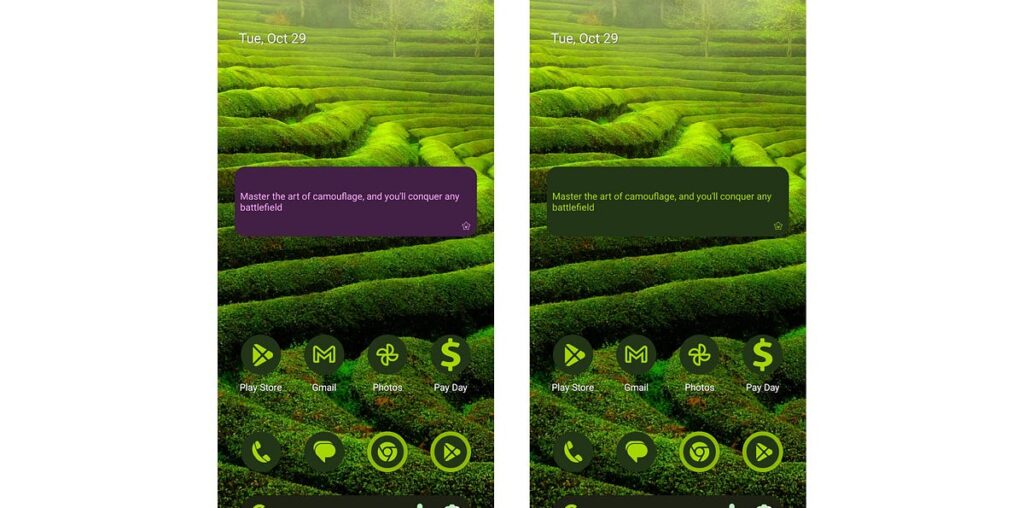
If you haven’t looked into Glance theming, it is pretty easy to set up. It is just the same as Material Design 3 theming where you can provide a custom set of colors to style your widget to match your app branding.
In this basic set up, we have the app color scheme lightScheme and darkScheme provided as ColorProviders (using androidx.glance:glance-material3) to GlanceTheme which will set the custom color scheme for the widget.
To use this, wrap the content by the GlanceTheme and the widget will use the app branding.
Now, this would look a lot better on this background with coordinating colors rather than the purple app branding which clashes with this particular wallpaper.
For this, we need to use the dynamic system color theming available for some devices (manufacturer depending) with Android 12 and above. If you haven’t yet played with the system theming, you just need to long press on the wallpaper and select ‘Wallpaper & style’. Here you can select a color theme to match your wallpaper or personal preference.
To use this color theme, just update your GlanceTheme definition to use GlanceTheme.colors for supported versions of Android:
For non supported devices, the app branding will be used. Now the widget blends nicely with the background without the jarring purple theming.
You may notice that it still doesn’t match the themed app icons. In the example above the background is using GlanceTheme.colors.background for the background and GlanceTheme.colors.onBackground for the foreground text and icon. If you want to match the themed app icons for your widget then use GlanceTheme.colors.widgetBackground for the background and GlanceTheme.colors.primary for the foreground.
To see a full example, see my sample widget app:
Do you want your widget to stand out from the background with custom colours depending on the wallpaper? Check out my other article Widgets with Glance: Standing out

