If you’ve been following along with our Penpot series, you’re already familiar with this exciting open-source design tool and how it is changing the game for designer-developer collaboration. Previously, we’ve explored Penpot’s Flex Layout and Grid Layout features, which bring the power of CSS directly into the hands of designers.
Today, we’re diving into another crucial aspect of modern web design and development: components. This feature is a part of Penpot’s major 2.0 release, which introduces a host of new capabilities to bridge the gap between design and code further. Let’s explore how Penpot’s implementation of components can supercharge your design workflow and foster even better collaboration across teams.
About Components
Components are reusable building blocks that form the foundation of modern user interfaces. They encapsulate a piece of UI or functionality that can be reused across your application. This concept of composability — building complex systems from smaller, reusable parts — is a cornerstone of modern web development.
Why does composability matter? There are several key benefits:
- Single source of truth
Changes to a component are reflected everywhere it’s used, ensuring consistency. - Flexibility with simpler dependencies
Components can be easily swapped or updated without affecting the entire system. - Easier maintenance and scalability
As your system grows, components help manage complexity.
In the realm of design, this philosophy is best expressed in the concept of design systems. When done right, design systems help to bring your design and code together, reducing ambiguity and streamlining the processes.
However, that’s not so easy to achieve when your designs are built using logic and standards that are much different from the code they’re related to. Penpot works to solve this challenge through its unique approach. Instead of building visual artifacts that only mimic real-world interfaces, UIs in Penpots are built using the same technologies and standards as real working products.
This gives us much better parity between the media and allows designers to build interfaces that are already expressed as code. It fosters easier collaboration as designers and developers can speak the same language when discussing their components. The final result is more maintainable, too. Changes created by designers can propagate consistently, making it easier to manage large-scale systems.
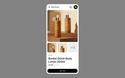
Now, let’s take a look at how components in Penpot work in practice! As an example, I’m going to use the following fictional product page and recreate it in Penpot:

Components In Penpot
Creating Components
To create a component in Penpot, simply select the objects you want to include and select “Create component” from the context menu. This transforms your selection into a reusable element.
Creating Component Variants
Penpot allows you to create variants of your components. These are alternative versions that share the same basic structure but differ in specific aspects like color, size, or state.
You can create variants by using slashes (/) in the components name, for example, by naming your buttons Button/primary and Button/secondary. This will allow you to easily switch between types of a Button component later.
Nesting Components And Using External Libraries
Components in Penpot can be nested, allowing you to build complex UI elements from simpler parts. This mirrors how developers often structure their code. In other words, you can place components inside one another.
Moreover, the components you use don’t have to come from the same file or even from the same organization. You can easily share libraries of components across projects just as you would import code from various dependencies into your codebase. You can also import components from external libraries, such as UI kits and icon sets. Penpot maintains a growing list of such resources for you to choose from, including everything from the large design systems like Material Design to the most popular icon libraries.
Organizing Your Design System
The new major release of Penpot comes with a redesigned Assets panel, which is where your components live. In the Assets panel, you can easily access your components and drag and drop them into designs.
For the better maintenance of design systems, Penpot allows you to store your colors and typography as reusable styles. Same as components, you can name your styles and organize them into hierarchical structures.
Configuring Components
One of the main benefits of using composable components in front-end libraries such as React is their support of props. Component props (short for properties) allow you a great deal of flexibility in how you configure and customize your components, depending on how, where, and when they are used.
Penpot offers similar capabilities in a design tool with variants and overrides. You can switch variants, hide elements, change styles, swap nested components within instances, or even change the whole layout of a component, providing flexibility while maintaining the link to the original component.
Creating Flexible, Scalable Systems
Allowing you to modify Flex and Grid layouts in component instances is where Penpot really shines. However, the power of these layout features goes beyond the components themselves.
With Flex Layout and Grid Layout, you can build components that are much more faithful to their code and easier to modify and maintain. But having those powerful features at your fingertips means that you can also place your components in other Grid and Flex layouts. That’s a big deal as it allows you to test your components in scenarios much closer to their real environment. Directly in a design tool, you can see how your component would behave if you put it in various places on your website or app. This allows you to fine-tune how your components fit into a larger system. It can dramatically reduce friction between design and code and streamline the handoff process.
Generating Components Code
As Penpot’s components are just web-ready code, one of the greatest benefits of using it is how easily you can export code for your components. This feature, like all of Penpot’s capabilities, is completely free.
Using Penpot’s Inspect panel, you can quickly grab all the layout properties and styles as well as the full code snippets for all components.
Documentation And Annotations
To make design systems in Penpot even more maintainable, it includes annotation features to help you document your components. This is crucial for maintaining a clear design system and ensuring a smooth handoff to developers.
Summary
Penpot’s implementation of components and its support for real CSS layouts make it a standout tool for designers who want to work closely with developers. By embracing web standards and providing powerful, flexible components, Penpot enables designers to create more developer-friendly designs without sacrificing creativity or control.
All of Penpot’s features are completely free for both designers and developers. As open-source software, Penpot lets you fully own your design tool experience and makes it accessible for everyone, regardless of team size and budget.
Ready to dive in? You can explore the file used in this article by downloading it and importing into your Penpot account.
As the design tool landscape continues to evolve, Penpot is taking charge of bringing designers and developers closer together. Whether you’re a designer looking to understand the development process or a developer seeking to streamline your workflow with designers, Penpot’s component system is worth exploring.
(yk)

