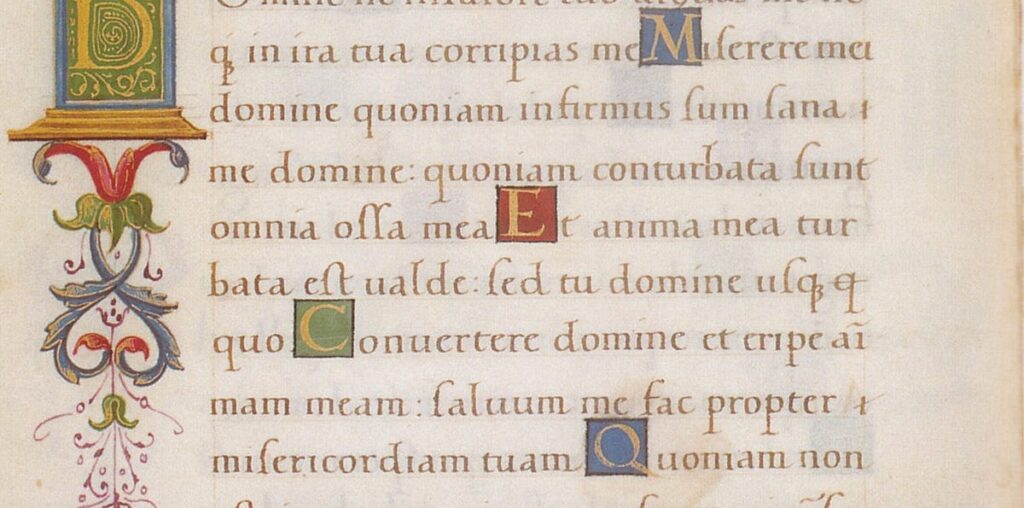
Oh noble sovereign, let me present unto thee: Humanist minuscule. If you never heard about it before, it’s because you’re a normal person. But you’ve been seriously missing out.
This typeface (or, as there were no typewriters yet, it is more correct to call it a “script”) was developeth to be the most readable script of the Renaissance and early Baroque era. Over this past week, I confess, I hath fallen into an obsession with it.
Grant me but a moment, and I shall reveal why it is the finest and most readable script of the olden days. And, I swear not to speak “pretend Medieval” again during the course of the story. But maybe turn on this Medieval-style Lana Del Rey playlist to get into the mood.
What makes a typeface great?
The battle for the “best,” “most readable” typeface is one of the most futile and complicated in the design world.
- Why is the battle complicated? Text-based products, like digital media, are very eager to invent a typeface that would keep the user’s attention for as long as possible. They invest in introducing their own…

