Balancing Engineering Ambition with Product Realism
Introduction
In July of 2023, Etsy’s App Updates team, responsible for the Updates feed in Etsy’s mobile apps, set off with an ambitious goal: to revamp the Updates tab to become Deals, a home for a shopper’s coupons and sales, in time for Cyber Week 2023.
The Updates tab had been around for years, and in the course of its evolution ended up serving multiple purposes. It was a hub for updates about a user’s favorite shops and listings, but it was also increasingly a place to start new shopping journeys. Not all updates were created equal. The most acted-upon updates in the tab were coupons offered for abandoned cart items, which shoppers loved.
We spotted an opportunity to clarify intentions for our users: by refactoring favorite-based updates into the Favorites tab, and (more boldly), by recentering Updates and transforming it into a hub for a buyer’s deals.
Technical Opportunity
While investigating the best way to move forward with the Deals implementation, iOS engineers on the team advocated for developing a new tab from the ground up. Although it meant greater initial design and architecture effort, an entirely new tab built on modern patterns would let us avoid relying on Objective C, as well as internal frameworks like SDL (server-driven layout), which is present in many legacy Etsy app screens and comes with a variety of scalability and performance issues, and is in the process of being phased out.
At the same time, we needed a shippable product by October. Black Friday and Cyber Week loomed on the horizon in November, and it would be a missed opportunity, for us and for our users, not to have the Deals tab ready to go. Our ambition to use modern, not yet road-tested technologies would have to balance with realism about the needs of the product, and we were conscious of maintaining that balance throughout the course of development.
In comes Swift UI and Tuist!
Two new frameworks were front of mind when starting this project: Swift UI and Tuist. Swift UI provides a clear, declarative framework for UI development, and makes it easy for engineers to break down views into small, reusable components. Maybe Swift UI’s biggest benefit is its built-in view previews: in tandem with componentization, it becomes a very straightforward process to build a view out of smaller pieces and preview at every step of the way.
Our team had experimented with Swift UI in the past, but with scopes limited to small views, such as headers. Confident as we were about the framework, we expected that building out a whole screen in Swift UI would present us some initial hurdles to overcome. In fact, one hurdle presented itself right away. In a decade-old codebase, not everything is optimized for use with newer technologies. The build times we saw for our Swift UI previews, which were almost long enough to negate the framework’s other benefits, testified to that fact.
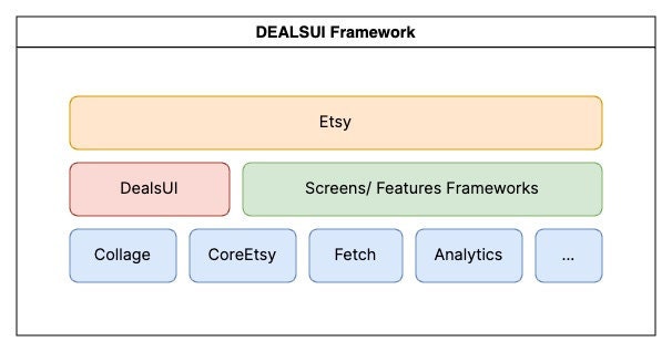
This is where Tuist comes in. Our App Enablement team, which has been hard at work over the past few years modernizing the Etsy codebase, has adopted Tuist as a way of taming the monolith making it modular. Any engineer at Etsy can declare a Tuist module in their project and start working on it, importing parts of the larger codebase only as they need them. (For more on Etsy’s usage of Tuist, check out this article by Mike Simons from the App Enablement team.) Moving our work for the Deals tab into a Swift-based Tuist module gave us what it took to make a preview-driven development process practical: our previews build nearly instantly, and so long as we’re only making changes in our framework the app recompiles with very little delay.

Our architecture
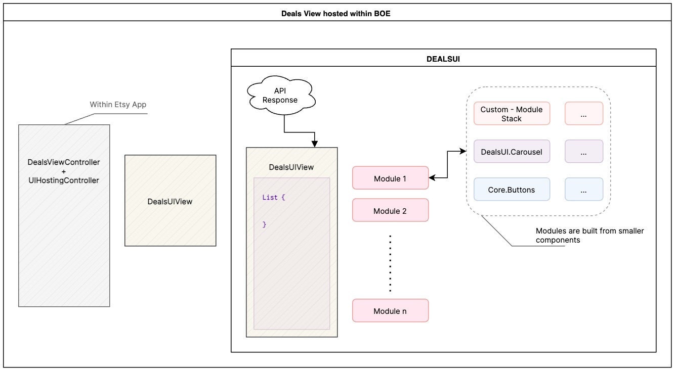
The Deals tab comprises a number of modules for any given Etsy user, including a Deals Just for You module with abandoned cart coupons, and a module that shows a user their favorite listings that are on sale. Since the screen is just a list of modules, the API returns them as an array of typed items with the following structure:
{
    "type": "<ModuleName>",
    "<ModuleName>": { ... }
}
Assigning each module a type enables us to parse it correctly on the client, and moves us away from the anonymous component-based API models we had used in the past. Many models are still used across modules, however. These include, but are not limited to, buttons, headers and footers, and listing cards. To parse a new module, we either have to build a new component if it doesn’t exist yet, or reuse one that does. Adding a footer to a module, for example, can be as simple as:
// Model
{
    "type": "my_module",
    "my_module": {
        "target_listing": { <ListingCard> }",
        "recommended_listings": [ <ListingCard> ],
        "footer": { <Footer> } // Add footer here
    }
}

// View
var body: some View {
    VStack {
        ListingView(listing: targetListing)
        ListingCarouselView(listings: recommendedListings)
        MyFooterView(footer: footer) // Add footer here
    }
}
We also used Decodable implementations for our API parsing, leading to faster, clearer code and an easier way to handle optionals. With Etsy’s internal APIv3 framework built on top of Apple’s Decodable protocol, it is very straightforward to define a model and decide what is and isn’t optional, and let the container handle the rest. For example, if the footer was optional, but the target and recommended listings are required, decoding would look like this:
init(from decoder: Decoder) throws {
    let container = try decoder.containerV3(keyedBy: CodingKeys.self)

    // These will throw if they aren't included in the response
    self.targetListing = try container.requireV3(forKey: .targetListing)
    self.recommendedListings = try container.requireV3(forKey: .recommendedListings)

    // Footer is optional
    self.footer = container.decodeV3(forKey: .footer)
}
As for laying out the view on the screen, we used a Swift UI List to make the most of the under-the-hood cell reuse that List uses.

Previews, previews, more previews
If we were going to maintain a good development pace, we needed to figure out a clean way to use Swift previews. Previewing a small component, like a header that takes a string, is simple enough: just initialize the header view with the header string. For more complex views, though, it gets cumbersome to build a mock API response every time you need to preview. This complexity is only amplified when previewing an entire Deals module.
To streamline the process, we decided to add a Previews enum to our more complex models. A good example of this is in the Deals Just for You coupon cards. These cards display an image or an array of images, a few lines of custom text (depending on the coupon type), and a button. Our previews enum for this API model looks like this:
// In an extension to DealsForYouCard

enum Previews {
    static var shopCouponThreeImage: ResponseModels.DealsForYouCard {
        let titleText = "IrvingtonWoodworksStudio"
        let images = [...] // Three images
        let button = ResponseModels.Button(
            buttonText: "10% off shop",
            action: .init(...)
        )

        return ResponseModels.DealsForYouCard(
            button: button,
            saleBadge: "20% off",
            titleText: titleText,
            subtitleText: "Favorited shop",
            action: .init(...),
            images: images
        )
    }

    static var listingCoupon: ResponseModels.DealsForYouCard {
        ...
    }
}
Then, previewing a variety of coupon cards, it’s as straightforward as:
#Preview {
    DealsForYouCardView(coupon: .Previews.listingCoupon)
}

#Preview {
    DealsForYouCardView(coupon: .Previews.shopCouponThreeImage)
}
The other perk of this architecture is that it makes it very easy to nest previews, for example when previewing an entire module. To build preview data for the Deals for You module, we can use our coupon examples this way:
// In an extension to DealsForYouModule
enum Previews {
    static var mockModule: ResponseModels.DealsForYouModule {
        let items: [ResponseModels.DealsForYouCard] = [.Previews.listingCoupon, .Previews.shopCouponThreeImage, .Previews.shopCouponTwoImage]
        let header = ResponseModels.DealsForYouHeader(title: "Deals just for you")

        return .init(header: header, items: items)
    }
}
These enums are brief, clear, and easy to understand; they allow us to lean into the benefits of modularity.
This architecture, along with our Decodable models, also enabled us to clear a roadblock that used to occur when our team had to wait for API support before we could build new modules. For example, both the Similar Items on Sale and Extra Special Deals modules in the Deals tab were built via previews, and were ready approximately two weeks before the corresponding API work was complete, helping us meet deadlines and not have to wait for a new App Store release.
By taking full advantage of Swift UI’s modularity and previewability, not only were we able to prove out a set of new technologies, we also exceeded product expectations by significantly beating our deadlines even with the initial overhead of adopting the framework.
Challenges: UIKit interoperability
Particularly when it came to tasks like navigation and favoriting, interfacing between our module and the Etsy codebase could pose challenges. An assumption that we had as engineers going into this project was that the code to open a listing page, for example, would just be readily available to use; this was not the case, however. Most navigation code within the Etsy codebase is handled by an Objective C class called EtsyScreenController. While in the normal target, it’s as straightforward as calling a function to open a listing page, that functionality was not available to us in our Deals module.
One option would have been to build our own navigation logic using Swift UI Navigation stacks; we weren’t trying to reinvent the wheel, however. To balance product deadlines and keep things as simple as possible, we decided not to be dogmatic, and to handle navigation outside of our framework. We did this by building a custom @Environment struct, called DealsAction, which passes off responsibility for navigation back to the main target, and uses the new Swift callAsFunction() feature so we can treat this struct like a function in our views.
We have a concept of a DealsAction type in our API response, which enables us to match an action with an actionable part of the screen. For example, a button response has an action that will be executed when a user taps the button. The DealsAction handler takes that action, and uses our existing UIKit code to perform it.
The Deals tab is wrapped in a UIHostingController in the main Etsy target, so when setting up the Swift UI view, we also set the DealsAction environment object using a custom view modifier:
let dealsView = DealsView()
                .handleDealsAction {
                    [weak self] in self?.handleAction(action: $0)
                }

...

func handleDealsAction(action: DealsAction) {
    // UIKit code to execute action
}
Then, when we need to perform an action from a Swift UI view, the action handler is present at any layer within the view hierarchy within the Deals tab. Performing the action is as simple as:
@Environment(\.handleDealsAction) var handleDealsAction: DealsAction
...
MyButton(title: buttonText, fillWidth: false) {
    handleDealsAction(model.button?.action)
}
We reused this pattern for other existing functionality that was only available in the main target. For example, we built an environment object for favoriting listings, or for following a shop, and for logging performance metrics. This pattern allows us to include environment objects as needed, and it simplifies adding action handling to any view. Instead of rebuilding this functionality in our Tuist module in pure Swift, which could have taken multiple sprints, we struck a balance between modernization and the need to meet product deadlines.
Challenges: Listing Cards
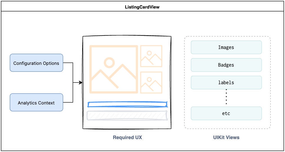
The listing card view is a common component used across multiple screens within the Etsy app. This component was originally written in Objective-C and throughout the years has been enhanced to support multiple configurations and layouts, and to be available for A/B testing. It also has built-in functionality like favoriting, which engineers shouldn’t have to reimplement each time they want to present a listing card.

It’s been our practice to reuse this same single component and make small modifications to support changes in the UI, as per product or experimentation requirements. This means that many functionalities, such as favoriting, long-press menus, and image manipulation, are heavily coupled with this single component, many parts of which are still written in Objective C.
Early in the process of developing the new tab, we decided to scope out a way of supporting conventional listing card designs—ones that matched existing cards elsewhere in the app—without having to rebuild the entire card component in Swift UI. We knew a rebuild would eventually be necessary, since we expected to have to support listing cards that differed significantly from the standard designs, but the scope of such a rebuild was a known unknown. To balance our deadlines, we decided to push this more ambitious goal until we knew we had product bandwidth.
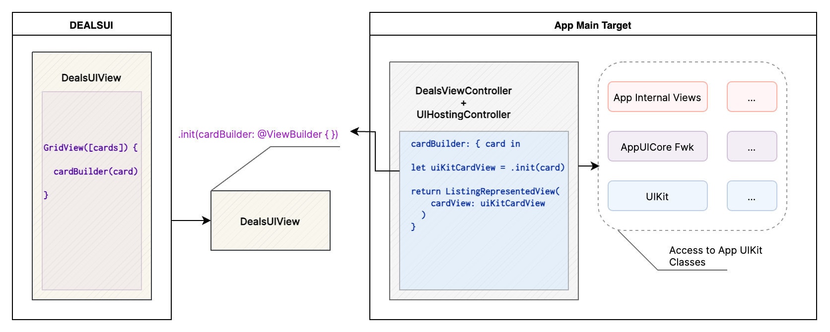
Since the listing card view is heavily coupled with old parts of the codebase, however, it wasn’t as simple as just typing import ListingCard and flying along. We faced two challenges: first, the API model for a listing card couldn’t be imported into our module, and second the view couldn’t be imported for simple use in a UIViewRepresentable wrapper. To address these, we deferred responsibility back up to the UIKit view controller. Our models for a listing card component look something like this:
struct ListingCard {
    public let listingCardWrapper: ListingCardWrapper

    let listingCard: TypedListingCard
}
The model is parsed in two ways: as a wrapper, where it is parsed as an untyped dictionary that will eventually be used to initialize our legacy listing card model, and as a TypedListingCard, which is used only within the Deals tab module.

To build the listing card view, we pass in a view builder to the SwiftUI DealsView initializer in the hosting controller code. Here, we are in the full Etsy app codebase, meaning that we have access to the legacy listing card code. When we need to build a listing card, we use this view builder as follows:
var body: some View {
    LazyVGrid(...) {
        ForEach(listings) { listing in
            cardViewBuilder(listing) // Returns a UIViewRepresentable
        }
    }
}
There was some initial overhead involved in getting these cards set up, but it was worth it to guarantee that engineering unknowns in a Swift UI rewrite wouldn’t block us and compromise our deadlines. Once built, the support for legacy cards enabled us to reuse them easily wherever they were needed. In fact, legacy support was one of the things that helped us move faster than we expected, and it became possible to stretch ourselves and build at least some listing cards in the Deals tab entirely in Swift UI. This meant that writing the wrapper ultimately gave us the space we needed to avoid having to rely solely on the wrapper!
Conclusion
After just three months of engineering work, the Deals tab was built and ready to go, even beating product deadlines. While it took some engineering effort to overcome initial hurdles, as well as the switch in context from working in UIKit in the main target to working in Swift UI in our own framework, once we had solutions to those challenges and could really take advantage of the new architecture, we saw a very substantial increase in our engineering velocity.
Instead of taking multiple sprints to build, new modules could take just one sprint or less; front-end work was decoupled from API work using Previews, which meant we no longer had to wait for mock responses or even API support at all; and maybe most important, it was fun to use Swift UI’s clear and straightforward declarative UI building, and see our changes in real time!
From a product perspective, the Deals tab was a great success: buyers converted their sessions more frequently, and we saw an increase in visits to the Etsy app. The tab was rolled out to all users in mid October, and has seen significant engagement, particularly during Black Friday and Cyber Monday.
By being bold and by diving confidently into new frameworks that we expected to see benefits from, we improved engineer experience and not just met but beat our product deadlines. More teams at Etsy are using Swift UI and Tuist in their product work now, thanks to the success of our undertaking, sometimes using our patterns to work through hurdles, sometimes creating their own. We expect to see more of this kind of modernization start to make its way into the codebase. As we iterate on the Deals tab over the next year, and make it even easier for buyers to find the deals that mean the most to them, we look forward to continuing to work in the same spirit.
Special thanks to Vangeli Ontiveros for the diagrams in this article, and a huge shoutout to the whole App Deals team for their hard work on this project!

