We recently made updates to our SoundCloud iOS and Android apps to address key user experience (UX) fixes according to user feedback.
We’ll be updating this blog regularly as we actively work to improve the SoundCloud experience for our users, and we’re so excited to share these improvements with everyone.
Here are our most recent updates across iOS and Android as of 11 November 2022.
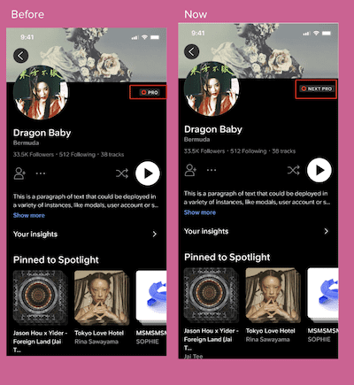
New Creator Subscription Names (Android, iOS)
With the rollout of our Next, Next Pro, and Next Plus subscription names as part of our SoundCloud for Artists evolution, we’ve replaced old creator tiers on profiles to align with these new plan names, resulting in a more streamlined experience. This will be available to all users.
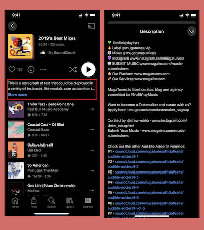
Sheet for Playlist/Album Descriptions (iOS)
We know that what artists and curators have to share about their music is important — so important that we’ve given playlist and album descriptions their own dedicated space with room for 4,000 characters.
Previously, when expanded, descriptions would take up the entire screen. To accommodate both artist expression and ease of platform use, we separated these two elements.
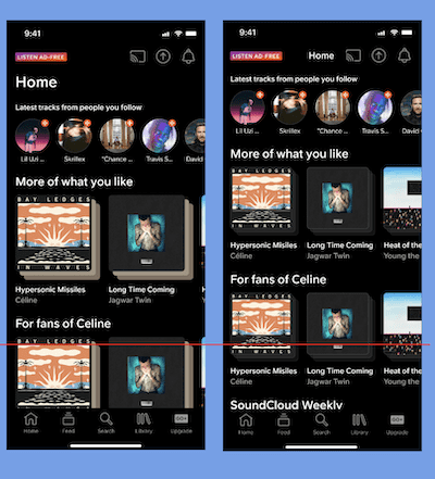
Reduced Carousel Sizes (iOS)
Following our initial reduction of track, playlist, and album cell sizes, we’ve now also reduced the size of carousels across the app to fit even more music and content you know and love.
Combined Share and Additional Options Icon (iOS)
To streamline and simplify users’ experiences, reduce clutter, and prioritize key actions, we’ve added sharing to the “more” icon.
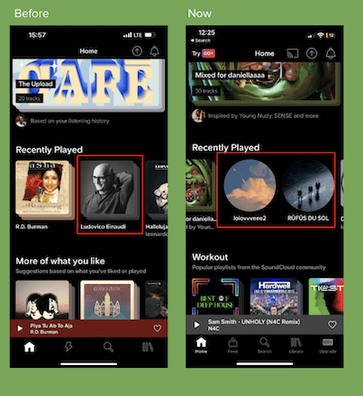
Bug Fix: Creator Profiles in Recently Played (iOS)
We fixed a bug that caused creator profiles to be displayed as playlists on Home and Library views.
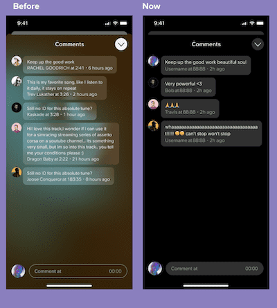
Changed Background of Comments (iOS)
In an effort to create added consistency across our app, we removed the blurred overlay in the comment section.
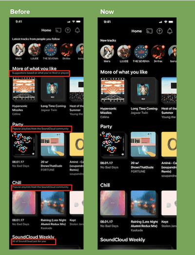
Reduced Subtitles on Home (Android, iOS)
We’re continuing to simplify screens by removing redundancies on our Home screen, including only introducing subtitles where necessary. For US users who previously had subtitles attached to almost every module, this change results in a more organized experience and faster scanning that clearly conveys the content they’re seeing.
More to Come
We’re excited to unveil future updates to SoundCloud, and we couldn’t do it without your support and feedback — stay tuned for what’s next!


