Key Takeaways
- A Google Contacts update introduces a sleeker design that merges some elements to offer more space.
- Additionally, the scroll bar in the app’s Contacts tab has been redesigned with dynamic theming, while the three-dot menu in the search bar has disappeared.
- This update also shrinks contact names and avatars to some extent, though this can easily be adjusted from Android’s Accessibility settings.
The Google Contacts app for Android has seen a handful of changes over the years. It doesn’t see design changes at the same pace as some other Google apps, which is probably a good thing. Most of the app’s design aligns with Material Design 3 guidelines, save for some elements, such as the scroll bar in the Contacts tab. While this aspect would mostly go unnoticed by frequent users of the Contacts app, Google has quietly tweaked the scroll bar’s design while also introducing some other changes.

Related
It’s time for Google to let us sort our contacts by date
Dear Google, please let us organize contacts our way
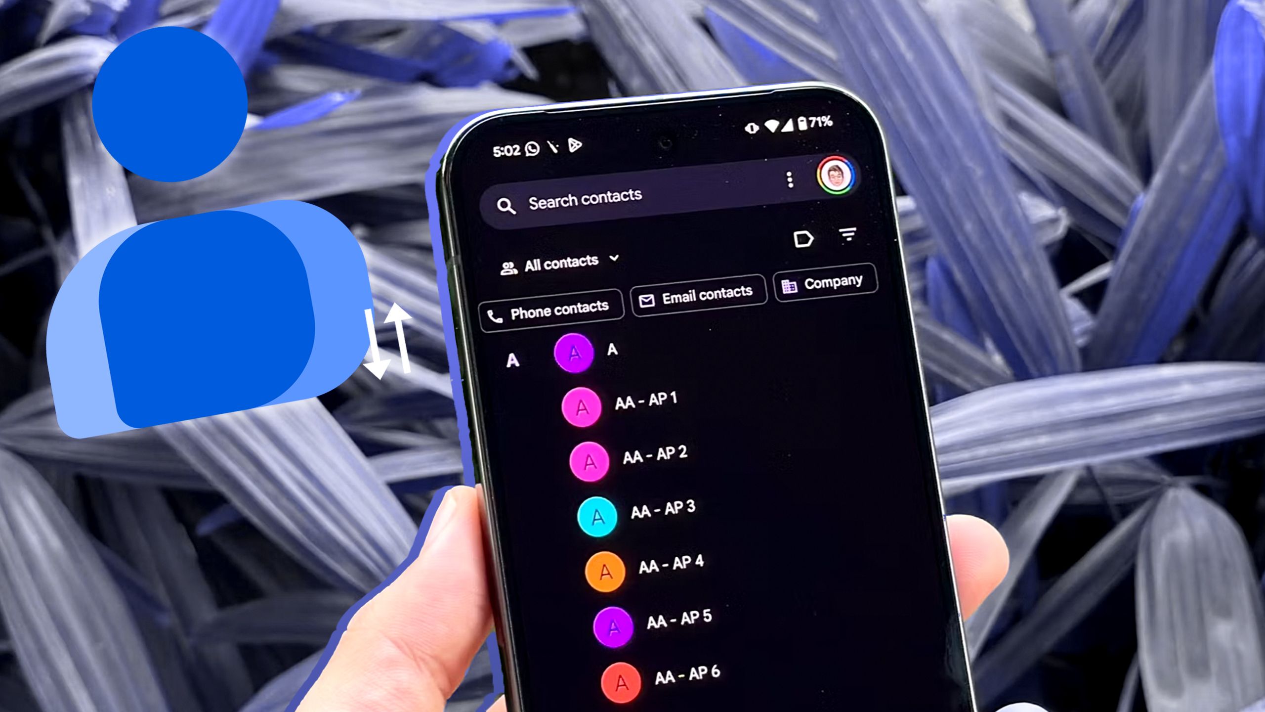
First things first, the contacts list is much sleeker than before, with the previous implementation taking up quite a bit of space to accommodate the alphabet column on the left. With this new change, these alphabets/letters are merged into the list, thus saving significant space (via 9to5Google). The updated design also mentions Favorites by name on the top, while the older version had to make do with just a star icon.
A sleeker interface overall
Previous Contacts tab design vs the updated version
As for the scroll bar redesign, it’s a big departure from the old version thanks to the addition of dynamic theming. It’s also interesting that the three-dot/overflow menu within the search bar has now disappeared. A menu will pop up if you long-press a single or multiple contacts, featuring a solitary Select all option.
Users will also find that contact names and their corresponding avatars are smaller than before, which may be great from a space-saving standpoint, but it’s not ideal if you’re used to larger fonts. This can be remedied anytime by heading to Accessibility settings on your Android smartphone and adjusting the font size. On Pixel devices, this can be done via Settings > Accessibility > Display size and text.
There’s no indication that a specific version of Google Contacts triggers this new design, so it’s likely part of a server-side switch. We’re seeing this updated design in version 4.42 of the app, as are the folks at 9to5Google.

