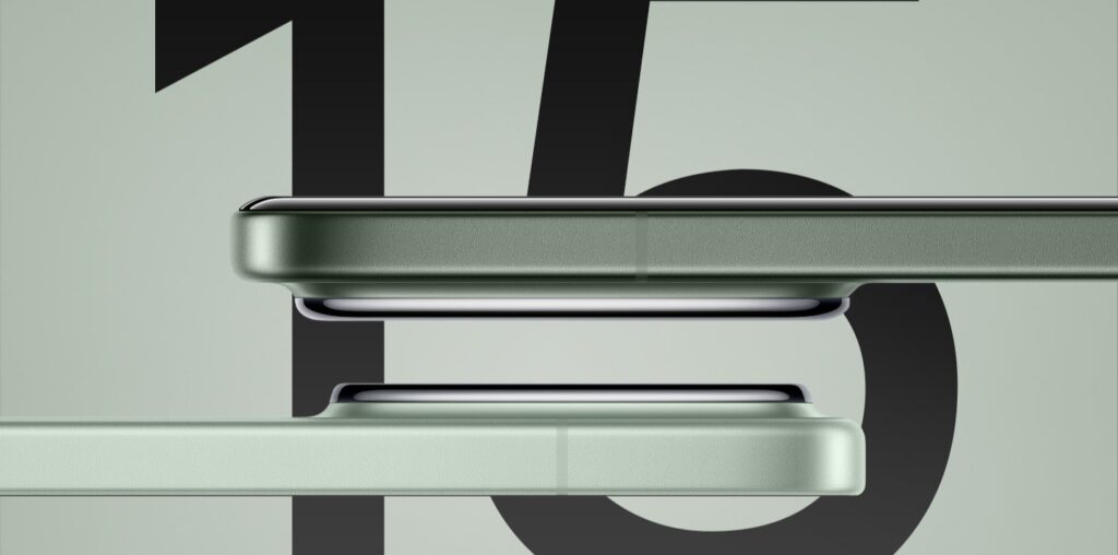
Xiaomi is going to be delivering the very first smartphone series with the Snapdragon 8 Elite, so needless to say, the entire lineup is being very hotly anticipated—though other devices will be released with the same chip the day after, and the day after that too. There’s a lot of competition.
Xiaomi has decided to give us a glimpse of what we’re in for by showing off the designs for all three phones in the Xiaomi 15 series a few days ahead of time. They certainly look clean, though if you’re expecting a radically new design, that’s not going to be on the menu this time around.
The Xiaomi 15 Retains The Design Of Its Predecessor
The Xiaomi 15 will be the template for the rest of the series, as the vanilla model. The design has been made official by Xiaomi via Weibo, and the first thing that you’ll notice is that not much has changed. The design is pretty much identical to what we got with the Xiaomi 14.
When I really focus, it seems that the bezels get a lot thinner in the renders, which really contributes to a more modern appearance. The flat display, flat frame, and the rest of the design seem entirely unchanged. The light blue colorway is new though.
Leaked specs suggest some things don’t change. It’ll be the same 6.36-inch 120Hz AMOLED panel, triple 50MP camera setup, and 90W wired charging with 50W wireless charging. It should get a substantial upgrade to a 5,500 mAh battery, despite its small profile—in line with the rumors.
The Xiaomi 15 Pro Loses The Curved Display And Gains A Periscope Telephoto
The Xiaomi 15 Pro will look similar to the Xiaomi 15, though discerning eyes will be able to spot a few differences. Compared to the Xiaomi 14 Pro, the differences are a little more evident. The curved display is gone, though the edges of the glass still sort of curve and meld into the frame. The bezels also get much slimmer.
From the pictures, it looks like the regular telephoto camera for the 14 Pro has been replaced with a periscope telephoto, judging from that rectangular aperture. Besides that, things seem mostly the same.
Xiaomi has confirmed that the device will weigh only 213 grams, which is a whole 10 grams off, and the thickness will drop a tad to 8.35mm. It’ll keep the 6.7-inch screen and triple 50MP cameras from its predecessor but will upgrade to a 6,000 mAh battery. That’s bound to make it stand out in the crowd.
The Xiaomi 15 Ultra Adopts A Very Unusual Camera Layout
The Xiaomi 15 Ultra is the phone most people want to know a lot about, especially if you’re crazy about photography. Xiaomi hasn’t made this one official, but we get a look thanks to Smartprix. The design is mostly the same. There’s a vegan leather back panel if you get the white or black colorways, the camera module remains as a massive circle, and the screen stays flat. However, look closer and that’s when you’ll spot the changes.
First, the frame infringes on the back panel less than it did with the 14 Ultra. I do wish they hadn’t done that, as it was a bit of a unique touch. However, the camera module changes by a lot and I’ve never seen such an odd arrangement of lenses before. You get three aligned horizontally on the bottom row and one placed way off-center to the right. The Leica branding sits awkwardly in that freed-up space.
Whatever the reason for such a strange arrangement, it doesn’t affect the camera quality. The 200MP 4.3x telephoto is the one sitting in an odd spot, perhaps to have its periscope hardware to the left. The remaining three cameras are all 50MP units, just like the other models in the series. The battery is also expected to match the Pro model at 6,000 mAh.


