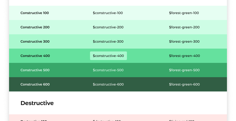
Design systems are essential for maintaining consistency, efficiency, and scalability. Central to these systems are design tokens — the fundamental units that encapsulate visual design decisions such as colors, typography, spacing, and more.
As design systems scale, you may start to struggle with token bloat.
If you adopted the popular component level naming strategy (e.g. $button-background-primary), you quickly get overwhelmed by the amount of tokens you have to keep track of.
This article explores a tiered naming strategy for color tokens, striking a balance between broad categorization and detailed specificity.
It introduces a scalable hierarchical approach that ensures clarity and flexibility as design systems grow.
Design tokens are the smallest units of a design system that store visual design attributes. They serve as a bridge between design and development, ensuring that design decisions are consistently implemented across various platforms and technologies.

