A few years after Princeton University Press published William B. Helmreich’s well-received The New York Nobody Knows, it started putting out standalone “urban walking guides” to each of the five boroughs. Helmreich, a Distinguished Professor of Sociology at the City College of New York, famously walked every street in New York City, speaking with just about everybody he came across (or so it seems), be it a building super, a doorman, a shop clerk, someone leaving their apartment, someone leaving a synagogue, … The New York Nobody Knows discusses immigration, gentrification, and other issues in thematic chapters; it is thorough, but it must have been evident for both author and publisher that the effort of walking the five boroughs and the results of talking with so many people would lead to more than just one book. The first guide published was Brooklyn, in 2016, followed by Manhattan, in 2018. Sadly, a few months before the Queens guide was released in 2020, Helmreich died, succumbing to COVID-19 in March of that year, the same month fellow CCNY professor Michael Sorkin also died. At that time, as recounted by his wife Helaine, William had already finished the manuscript for the Bronx and the couple was starting to work on Staten Island, walking (again!) the streets of that borough. It’s too bad we won’t see Staten Island, because it, like the Bronx, is not as widely known (for me, at least, and I’m guessing quite a few other people) as Manhattan, Brooklyn, and Queens. But as the earlier guides made clear, there is more to the boroughs than the familiar sites found in other guidebooks; and the boroughs are made up of people, not just buildings and landscapes, and it was those people that interested Helmreich the most. Their voices permeate The Bronx Nobody Knows, just as in the other guides. For me, someone who lives in Queens, one thing I appreciate about Helmreich’s books is the way he managed to get people to open up and say things that would both describe a place and convey the similarities binding people across the city and, on a wider canvas, across humanity.
 |
| A BEAUTIFULLY MADE SERIES ON CAROSO ST JOHN CONTINUES: |
Twelve months after MACK released the first volume in the collected works of British architects Adam Caruso and Peter St. John, the publisher put out the second volume, which takes the qualities of the first book — qualities I wrote about earlier this year in “Three Lessons from Three Monographs” — and applies them to the studio as they started their second decade and a new century began. I wrote in that post that monographs “should be comprehensive if not complete, “should convey the voice of the architect,” and “should function as archives.” Collected Works: Volume 1, I wrote, does all three: “From its simple linen cover with drawing of the steel facade of their Swan Yard project, strong stitching, and matte paper selection, to its documentation of built and unbuilt works over the title’s fifteen years and the incorporation of articles and interviews previously published in Quaderns and other venues, the book is a beautiful object that is rewarding and refreshing on every turn of the page.” Given the consistency of the two books, the same applies Collected Works: Volume 2. The numerous buildings, projects, exhibitions, articles, lectures, and other artifacts informing Caruso St John’s work are presented in seven chapters, most of them pairs: “History and the Modern,” “Greece and Rome,” “Chicago and Milan,” “Competitions,” “Thomas Demand,” “Switzerland,” “Art and Money.” These places and themes reflect their work extending beyond the confines of England as well as their teaching doing the same, with positions in Mendrisio, ETH Zurich, Harvard GSD, and elsewhere. The two architects explain how the studios they ran at universities incorporated reference texts by Rosalind Krauss, T. S. Eliot, Louis Sullivan, and others; those text are found here, enriching the monograph’s collection of texts and projects and capturing the interests of two maturing architects. (Note: the two volumes are available from MACK in a Caruso St John Bundle.)
 |
| THE CHICAGO SKYSCRAPER HISTORICALLY CONSIDERED: |
In my 2021 review of Thomas Leslie’s 2013 book Chicago Skyscrapers, 1871–1934, I pointed out how Leslie’s book is described in another book as a “‘recent study that includes thorough discussion of structural and constructive technologies,’ as opposed to more prevalent architectural histories that focus on aesthetics, politics, planning, social history, and other issues with tall buildings.” Such a focus is evident in the appendix listing the dozens of tall buildings built in Chicago between 1871 and 1934 (the years of the Great Chicago Fire and Great Depression) with such criteria as “facade type” (bearing masonry, cast iron, expressed frame, curtain wall, etc.) and “foundation” (piles, spread, caissons). It’s an excellent book, as is the second installment in Leslie’s series of books on skyscrapers in Chicago, but the subtitle of the second book, How Technology, Politics, Finance, and Race Reshaped the City, indicates the incorporation of those wider contexts eschewed in the first book. Even with these topics, technology is the most prevalent, based on a quick glance at the book’s contents, which include numerous construction photographs and 3D “digital reconstructions” of a lot of the buildings discussed in the book. Spanning from the Great Depression to the recessions of the 1970s and 80s, the new book contains a large diversity of architecture — from Art Deco and modernism to brutalism and postmodernism — but also enormous social changes and other aspects (migration, civil rights, oil crisis, Mayor Richard J. Daley) that make the embrace of broader contexts sensible. While any book on skyscrapers in that period would include Marina City, Bertrand Goldberg’s classic city within a city completed in 1967, Leslie also includes Goldberg’s Raymond Hilliard Homes, a public housing project on the South Side for seniors and families. The latter allow Leslie to compare the forms and construction of the two projects but also the opportunity to touch on racial segregation in the city.
(A couple addenda: While the two books have similar covers, three-column page layouts, and graphic design features, the use of different page sizes and proportions — from 10×10″ to 8.5×11″ — is unfortunate and a missed opportunity for consistency on the shelf, especially if a third book in the series is forthcoming. And just as my 2021 review of the earlier Leslie book coincided with the author speaking at the Skyscraper Museum, Leslie is giving a virtual talk tomorrow night about his new book and the city’s residential high-rises in concrete; the talk will be archived on the museum’s YouTube channel.)
 |
| ADVENTURES IN HOUSING: |
- Cohousing in Barcelona: Designing, Building and Living for Cooperative Models edited by David Lorente, Tomoko Sakamoto, Ricardo Devesa and Marta Bugés, published by Actar Publishers and Ajuntament de Barcelona, August 2023 (Amazon / Bookshop)
- Housing Redux: Alternatives for NYC’s Housing Projects by Nneena Lynch, James von Klemperer, Hana Kassan and Andrei Harwell, edited by Nina Rappaport and Saba Salekfard, published by Yale School of Architecture, December 2023 (Amazon / Bookshop)
If life were fair, everyone would have access to decent, well-designed housing, and those projects would garner as much attention in the architectural press as the single-family houses that are commissioned by and built for the wealthy. A modicum of balance has been found in recent years, with social housing projects winning major architectural awards and gaining coverage, most notably Lacaton and Vassal’s transformation of public housing projects in France and Lacol’s La Borda Cooperative Housing in Barcelona. The latter is the star of Cohousing in Barcelona, which features case studies of eighteen built and ongoing projects that are the result of a partnership between the Barcelona City Council and non-profit social housing providers and housing cooperatives. Even though I was fortunate enough to visit La Borda with the architects last year, the book’s thorough documentation through photographs, drawings, and lengthy commentary from the architects means I learned something new about it — and the other commendable projects in the book.
If cohousing is endemic to Barcelona, what is the NYC situation? In the 20th century it was a mix of below-market subsidized housing, public housing, and middle-income cooperatives, aka Mitchell-Lama. Today, everything is lumped under “affordable housing,” and it is typically created by developers as part of larger market-rate projects, with the city incentivizing the developers through zoning bonuses. One place proponents of affordable housing are looking is the open spaces of large public housing projects, in the vein of Carmel Place, a narrow stack of micro-units by nARCHITECTS built in 2016. A recent studio at Yale School of Architecture had students proposing affordable housing solutions for NYCHA’s Washington Houses in East Harlem; the public housing project consists of more than a dozen towers on three superblocks that are the equivalent of seven city blocks, with open space comprising more than 85% of the site. The students developed master plans and then designed schemes ranging from reimagined brownstones to terraced housing and other ways of weaving more units between the existing buildings. It’s refreshing to see architecture students tackling affordable housing in creative ways.
 |
| MONOGRAPHS WITH A LITTLE SOMETHING EXTRA: |
These two monographs are atypical — and refreshing — in that they incorporate content from outside the work of the designers who made them, but in ways that meld seamlessly with their own work. Although MODU, the Brooklyn studio of Phu Hoang and Rachely Rotem, is so young and has built so little a monograph would seem a bit premature, their Field Guide to Indoor Urbanism is nevertheless chock full of projects, each one illustrating the multifaceted nature of their output: architecture, urban interventions, installations, and socio-economic research among it. The duo makes a statement by upending conventions, literally, by starting the book with a glossary — one where the terms and definitions clearly describe their unique points of view — and ending it with the foreword. In between are essays, projects, and a series of conversations with Japanese architects, including Fumihiko Maki, Itsuko Hasegawa, and Kengo Kuma. The last is what would be considered the outsider content, but even then the interviews were conducted by Hoang and Rotem as part of their research into Second Nature, which they define as “a dual expression of social and environmental contexts. Humans and nature as one.”
Quiet Spaces is an apt title for the first monograph on UK architect William Smalley, who established his eponymous practice in London in 2010. The coffee table book is full of full-bleed color photographs captured mainly by Harry Crowder but also Hélène Binet; each photographers’ choice of film over digital jibes with Smalley’s handling of interior spaces, which could be called, for lack of a better term, timeless. The cover photograph by Binet — of Smalley’s Oxfordshire Farm, done in collaboration with James Gorst Architects — hints at this quality, but it also recalls the work of Luis Barragan. Hardly by coincidence, Oxfordshire Farm is preceded by Barragan’s own house in Mexico City, one of six “quiet spaces” in the book by other architects, ranging in time from Andrea Palladio to Peter Zumthor, with Geoffrey Bawa and others in between. Smalley’s way of treating his inspirations in the book with equal weight to his own work is refreshing and illuminating, revealing shared qualities but also Smalley’s enduring fascination with beautiful design regardless of the who, when, or where. (The Record section of his website expresses this too.) The mix results in a monograph that is surprisingly cohesive regardless of the various voices and times, reinforcing the timeless quality of Smalley’s architecture.
 |
| CAPTURING AMERICA’S PAST IN PHOTOGRAPHS: |
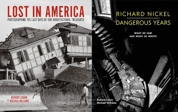
Anyone with a strong interest in architecture in the United States should know and love HABS, the Historic American Buildings Survey that is maintained by the Library of Congress. The voluminous collection of photographs and drawings spanning from 1933 to the present is a great resource for, among other things, people making architecture books. Photographer Jeffrey Ladd creatively mined the survey for A Field Measure Survey of American Architecture, creating a portrait of the US through a small sampling of the hundreds of thousands of HABS photographs. Similarly, photo historians Richard Cahan and Michael Williams pulled photographs from the survey to draw attention to the buildings and bridges that America lost to decay, neglect, demolition, and destruction. One hundred notable, lesser known, and fairly generic examples are presented in four chapters: Timeless, Forgotten, Disgraced, Doomed. Even though the HABS photographs have remained remarkably consistent over its 90 years, with contemporary photographers still using large-format film (not digital) cameras, Lost in America has a notable arc to it, with famous buildings early in the book and actual scenes of demolition, as in the cover photograph, found at the end. It’s hard not to feel a tinge of melancholy or even anger at the wanton destruction implied and captured by the HABS photographers in black and white — emotions tempered, or perhaps even magnified, by the information presented in captions by Cahan and Williams.
Although Lost in America is available on Amazon, Bookshop, and other usual outlets, people buying it directly from CityFiles have the option of getting a limited edition with a slipcase featuring a Richard Nickel photo of Chicago’s Republic Building, a Holabird and Roche building that was erected in the first decade of the 20th century and pulled down in 1961. Nickel is one of the photographers inside Lost in America, but the photographer and preservationist is also the subject of Dangerous Years, an earlier book also by Cahan and Williams and also published by CityFiles, in 2015. Cahan had written an earlier, indispensable biography on Nickel, They All Fall Down: Richard Nickel’s Struggle to Save America’s Architecture (notably, that book features a self-portrait of Nickel atop the Republic Building), so it is logical that he would make another book on Nickel, one that “in his own words and with his own pictures, is his story.” The coffee table book traces Nickel’s brief but productive and passionate career through photographs, letters, notes, sketches, and other artifacts displayed on large 9×12″ pages with black backgrounds. Like Lost in America, Dangerous Years is melancholy, not only because he gravitated to buildings that often met the wrecking ball, but because his widely known end while salvaging materials from one such building is made all the more real through letters to/from his fiancé and even notes for a missing person report made by his parents on the day he went missing.
 |
| ILLUSTRATED STORIES FOR KIDS — AND GROWN-UPS: |
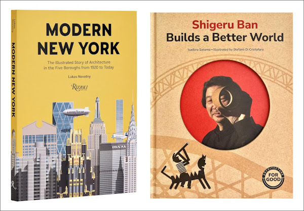
A pair of illustrated books: one for children and one for grown-ups. Modern New York is Lukas Novotny’s second book, following the similar Modern London published in 2018. The colorful illustrations — all of them straight-on elevations, as evidenced by the cover — give the impression that the book is yet another repackaging of famous and predominantly tall buildings in New York City: the Chrysler Building and Empire State Building are there on the cover, as are the American Radiator Building, the Pan Am (MetLife Building), AT&T, Hearst, and 432 Park Avenue. But the inclusion of Paul Rudolph’s Tracey Towers in the Bronx and the presence of the Goodyear blimp and a helicopter landing on the Pan Am Building hint at a wider presentation. Novotny is actually drawn (pun intended) to buildings obscure, plain, and off the beaten path — those well beyond what’s found in tourist guides. The buildings and modes of transportation, which were potentially more modern than the buildings, are presented in ten chapters: one per decade, from 1920 to present. Each is given at least 16 pages, so relatively insignificant decades (what was built in the 1940s?) reveal surprises even so-called experts, like this reviewer, weren’t aware of.
I wish there were more children’s books about architecture, not only because they provide parents a way to educate their kids about architecture and architects at an early age, but because the subject has such a great potential for doing interesting children’s books. Pop-ups! Concertina books! (I reviewed one of those.) Books by architects for their own kids! (I reviewed one of those, too.) Isadoro Saturno’s children’s book on Shigeru Ban gets creative with format, from its cardboard-like cover with cutout framing a portrait of the architect to the choice of matter paper, cutout-like illustrations, and smaller book on Ban’s disaster-relief projects inserted into the middle of the book. By focusing on the fact Ban has made many buildings from paper, from cardboard tubes, and not all of them disaster-relief projects, the book shows kids that what they didn’t think was possible is possible. The book opens their minds to the possibilities in anything, architecture or otherwise, encouraging them to think creatively and without limits.
 |
| CHANGING ZURICH (AND ITS ENVIRONS): |
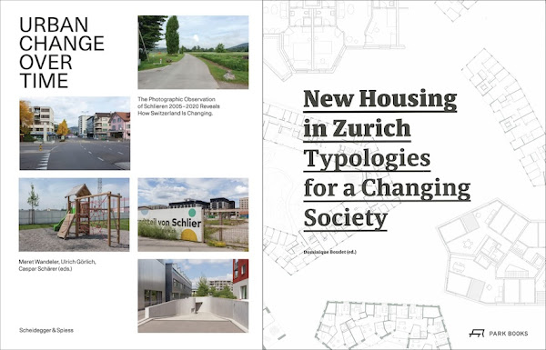
Last month the Deutsches Architekturmuseum (DAM) and Frankfurt Book Fair announced the winners of the 2023 DAM Architectural Book Award: ten books, nine of them from publishers in Germany and Switzerland, six from Zurich alone, and four of the ten winners published by Park Books or its sister publisher Scheidegger & Spiess. A winner by the last is Urban Change Over Time, a two-volume book with fifteen years of photo documentation of Schlieren, a satellite town on the western fringe of Zurich. The jury praised the book for its vision and endurance: “The book’s structure derives from the topic, explores many different aspects of the theme, and yet is very careful not to waste the reader’s time.” The slimmer of the two volumes has nearly 150 pages of photographs on landscape-oriented pages, with each spread showing the matching photographic documentation of one spot in town over those fifteen years. The matching of the framing in the photos is remarkable, as if dozens of tripods were cemented into place throughout the town for the fifteen-year duration of the project. In some cases the changes are in your face, in many they’re subtle, and in others they’re apparently non-existent. The longer volume — 480 pages in portrait format — has photographs as well, many of them larger on the page and in the context of the town’s development areas or focusing on different typologies; there are also essays, interviews, and maps that aid in orienting oneself with the photos and understanding some of the development areas. The whole is a beautiful production worthy of its accolade.
While I don’t think New Housing in Zurich nabbed a DAM Award when it was released five years ago, this book from Park Books pairs well with Urban Change Over Time, for its equally high production values, for its geographic proximity, and for simply having the word “changing” in its subtitle. (This book, though hard to find, should also appeal to readers interested in Cohousing in Barcelona and Housing Redux, featured above.) The book presents 51 housing projects spread across Zurich, some of which I was able to visit years before when in Zurich for my work with World-Architects. The projects I visited, and most of the ones in the book, are fairly large and therefore have large sites where site planning is paramount; site plans or aerial views are then included for each of the 51 projects, as well as floor plans, photographs (or renderings), and project descriptions. What makes the projects remarkable beyond their architectural qualities is the fact they are predominantly middle-class and/or cooperatives — making the book a suitable reference for other places where there is a shortage of such housing, well-designed or not.

