ylliX - Online Advertising Network
Kumagaya House Addresses Japan’s Changing Household Needs

Kumagaya House Addresses Japan’s Changing Household Needs


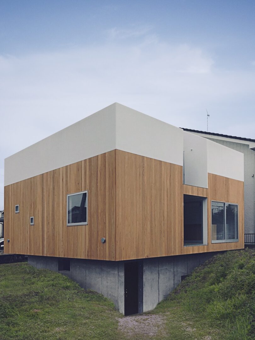
In the aftermath of World War II, Japan embraced the nuclear family as its predominant household structure, echoing anthropologist George Murdock’s assertion of its universality. However, in recent years, the prevalence of nuclear-family households has declined – a shift reflective of a desire to escape the pressures of conforming to the tightly-knit nucleus of the family unit. In response to these evolving dynamics, architects in Japan are rethinking the design of the home itself, aiming to alleviate the demands for constant cohesion within families. In Saitama, Japan, the Kumagaya House, designed by CHOP+ARCHI, is one such example of space redefined by this cultural shift.

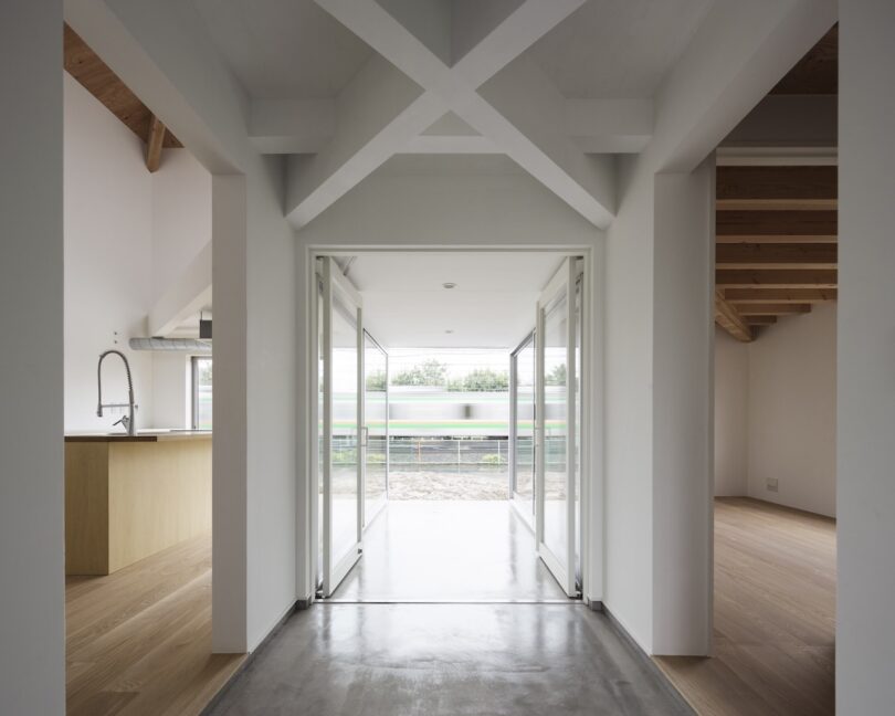
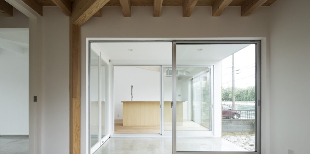
Modern interior with a hallway leading to sliding glass doors, revealing an outdoor view. Light wood floors and a kitchen with a high faucet are visible on the left.

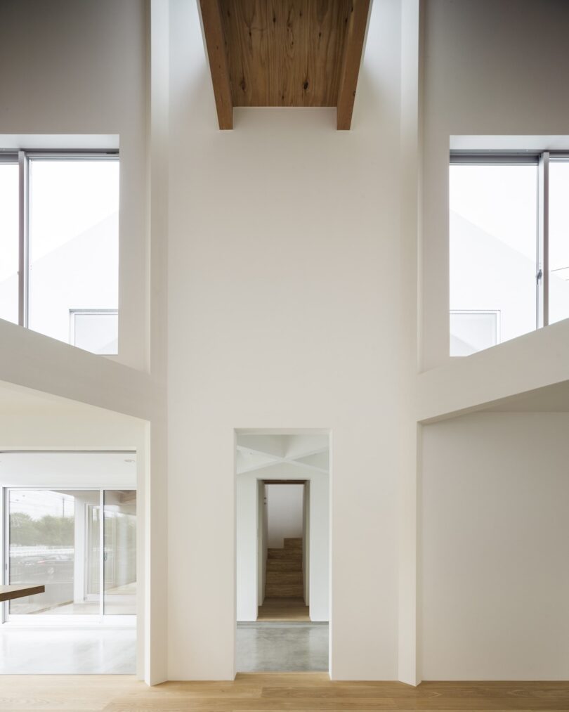
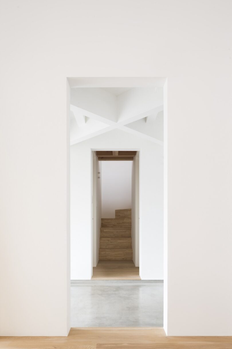
This design approach breaks up the traditional nucleus by introducing a central cruciform void that divides the home into four distinct spaces. The concept draws inspiration from the “ta-no-ji” layout, named after the Chinese character for rice field, which features a grid-like arrangement. Unlike the traditional configuration, where spaces overlap, the void acts as a buffer, creating separation between the rooms while still maintaining a subtle connection between them. Each space remains linked to the outdoors, ensuring a sense of openness and fluidity.

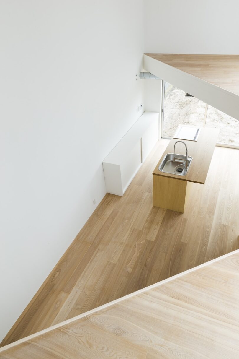
Minimalist kitchen with light wood flooring, a wooden island with a built-in sink, and large windows. White walls and a geometric architectural design enhance the open space.

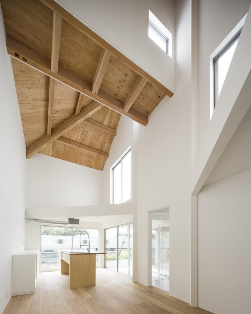
A modern, minimalist interior with high wood-beam ceilings, white walls, large windows, and a wooden floor. A central kitchen island is visible.

Interior view of a modern building with tall, white walls, large windows, and wooden accents. A narrow hallway leads to a staircase in the background.

This design approach introduces air as a key element in the home. The central void acts as a buffer, reducing tension between family members and easing the pressure to function as a single unit. By using open space instead of solid walls to divide areas, the design creates a calm and flexible environment. This allows modern families to adapt to changing needs while maintaining a sense of stability and connection, as well as respecting traditional Japanese design principles. This balance results in a living space that feels both fresh and familiar.

A minimalist white hallway with wooden stairs and a geometric ceiling detail.

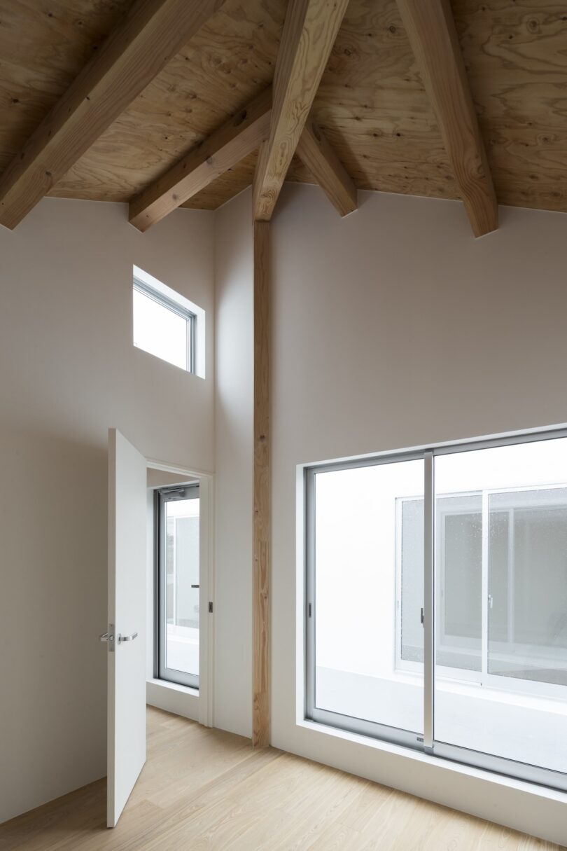
Minimalist interior with wood beam ceiling, open door, large windows, and light wooden floor, creating a spacious and bright atmosphere.

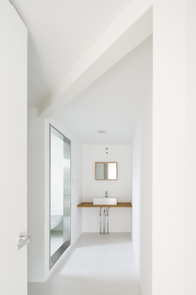
Minimalist white bathroom with a sink and small mirror on the wall, visible shower area through a glass partition on the left.

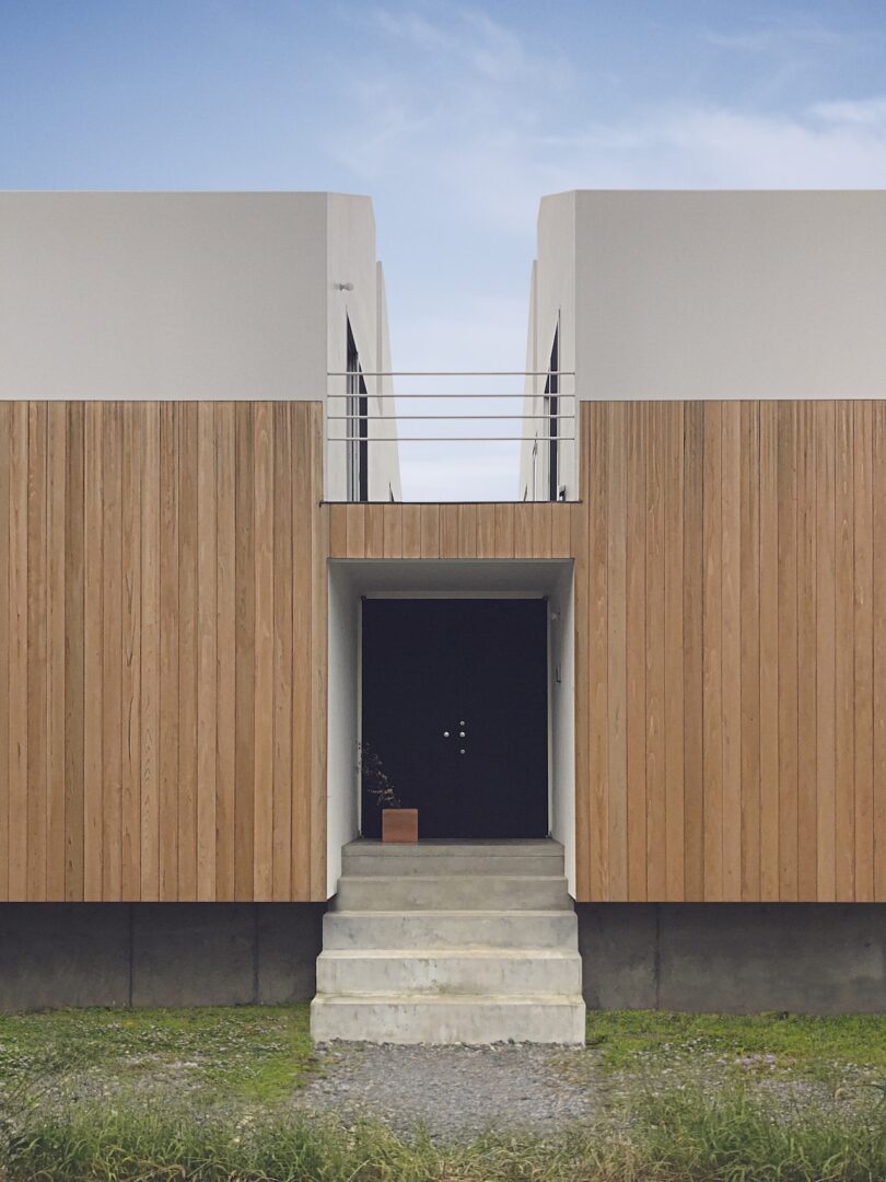
Modern minimalist building with wood paneling, white upper facade, and a black entrance door at the top of concrete steps.

Modern two-toned house with a wooden lower half and white upper half, elevated on a concrete base, surrounded by grass.

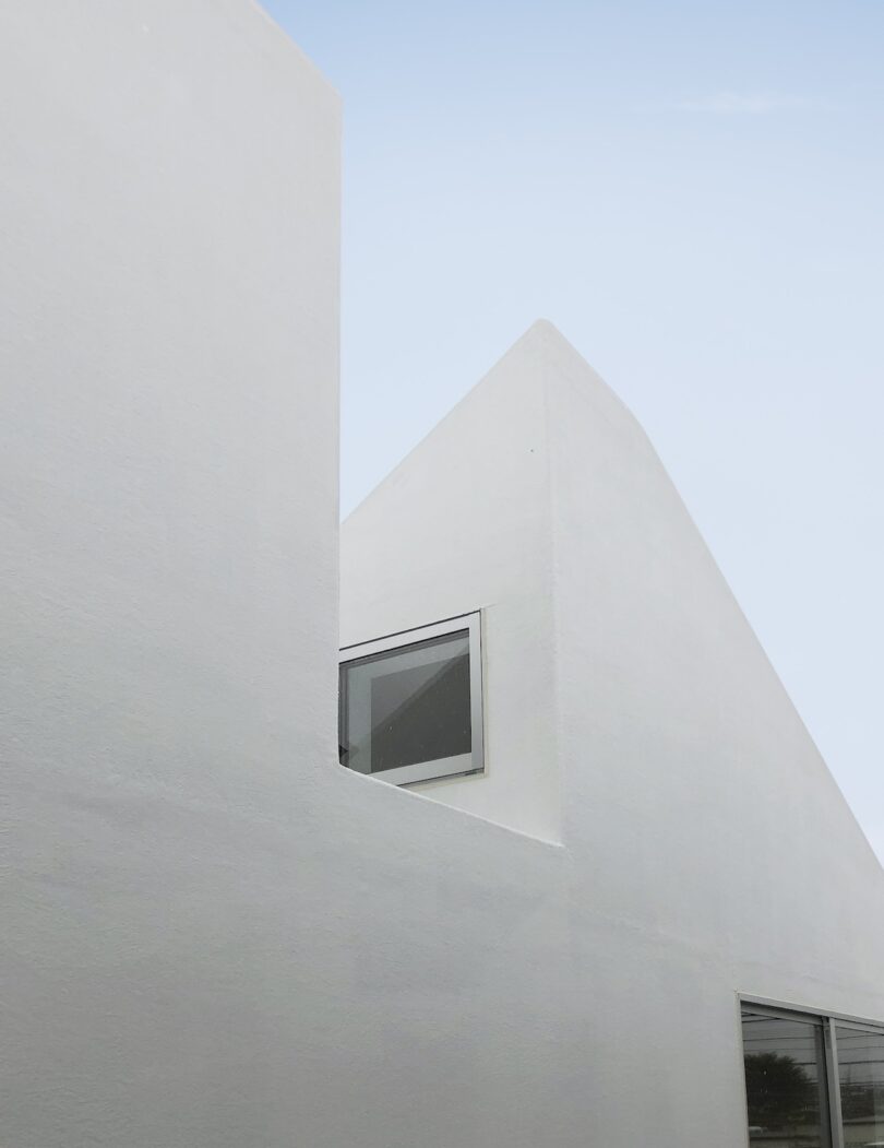
Minimalist white building with a peaked roof and a single rectangular window, set against a clear sky.

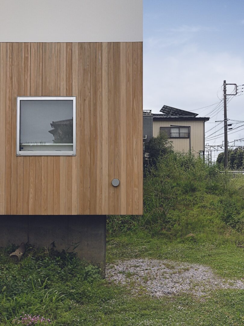
A wooden building with a single square window stands next to a grassy area, with another building and power lines in the background under a partly cloudy sky.

For more information on CHOP+ARCHI, visit choparchi.com.

Photography by Masao Nishikawa.
Leo Lei translates his passion for minimalism into his daily-updated blog Leibal. In addition, you can find uniquely designed minimalist objects and furniture at the Leibal Store.


Source link

Leave a Reply

Your email address will not be published. Required fields are marked *