As designers, it’s time we take charge of change.
We don’t need another discussion on why accessibility matters in product design. The reasons are well-established, from enhancing your design expertise and improving usability to creating a more inclusive world. What’s lacking is how we implement accessibility in a way that genuinely transforms user experiences. With this article, I hope that we can rethink how we approach accessibility specifications and make more impactful changes as designers.
Understanding how to interpret and apply WCAG guidelines is essential, but let’s be honest — it can get overwhelming. Although there are numerous courses and simplified guides available to help make sense of the documentation, it can often feel alienating and overcomplicated. As product designers, we already know how to provide a bridge between technology and the end user. We already design for various devices, browsers, and screen sizes, so our approach to accessibility needs to be practical and more actionable.
“Design is not just what it looks like and feels like. Design is how it works” ~ Steve Jobs
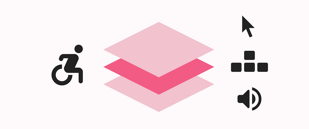
Building on a designer’s mindset, I propose a three-layered approach to accessibility design and specifications. Focusing on interactions and user flows, each layer targets specific elements that enhance the overall accessibility of a digital product.
The following layers can be treated as separate user flows in your specifications, which supports assistive technology behaviour.

