In December 2023, we publicly launched Voronoi, our free new data discovery app!
Today, roughly 300,000 people are using Voronoi every month. We’re also coming up on our one-year anniversary of the app in December, which is when we’ll unveil some very exciting features that will shape the platform going forward.
To give you a taste of some of the nearly 3,000 data stories already posted on the app, below we’re going to highlight some of the top performing visualizations from November.
Let’s take a look at a popular creator worth highlighting, a top “Editor’s Pick” of the month, and also the most popular and most commented on visuals.
POPULAR CREATOR
Ehsan Soltani
Visual Capitalist is just one of many creators on Voronoi.
In fact, the data storytelling platform has many world-class creators with insightful visualizations, including the prolific economist Ehsan Soltani.
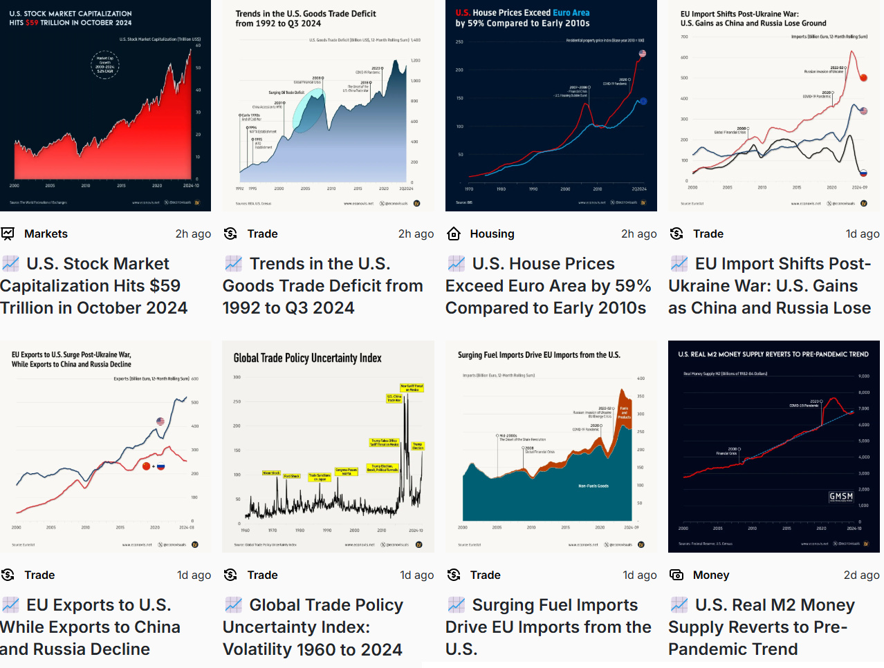
Soltani combines his expert background with data visualization, to produce unique insights into what’s happening in the global economy and trade. Here are some of his recent visualizations:
- Charting the new highs hit by U.S. stock market
- U.S. vs. EU house prices comparison
- Charting the global trade policy uncertainty index
- EU imports from U.S., China, and Russia compared
Follow Ehsan Soltani on Voronoi today, and you’ll see tons of new data flowing to your feed.
![]() View all visuals from Ehsan Soltani on Voronoi today.
View all visuals from Ehsan Soltani on Voronoi today.
EDITOR’S PICK
The World’s Largest Exporters of Goods
Which countries ship the most goods abroad?
In this infographic, the most liked post in all of November, Visual Capitalist breaks down global exports based on data from the World Trade Organization.
Interestingly, the dollar value of exports declined across 20 of the top 30 nations last year, amid a surge in trade restrictions. With tariffs back in the news going into 2025, this trend could continue.
![]() Get the data behind this visual on Voronoi today.
Get the data behind this visual on Voronoi today.
MOST VIEWED
The Two Largest Cities on Each Continent
Which cities are the largest, in terms of population, on each continent?
In this map from Visual Capitalist, the top two cities on each continent are highlighted with some interesting variance and results.
The two largest urban agglomerations in Asia are past the 30 million people mark (Delhi and Tokyo). Meanwhile the U.S. only is home to one of the largest cities, because Mexico City has an urban agglomeration of 22.8 million.
![]() To get the data, visit Voronoi today.
To get the data, visit Voronoi today.
MOST DISCUSSED
UN Member States Not Recognized by Other Members
International relations are complex, and not every country recognizes each other diplomatically.
This visualization by Julie Peasley was the most commented on visualization on Voronoi in November. (She also had the most commented on post in October!)
This unique idea charts which UN Member States recognize one another, and it raises some interesting questions. Perhaps for that reason, many users have been commenting on the post with their thoughts.
![]() Get join the discussion, get on Voronoi today.
Get join the discussion, get on Voronoi today.
COMMUNITY UPDATE
What’s New for Fall 2024?
For your convenience, we’re resharing the update from last month on what’s new with the app:
We look forward to hearing your feedback on the platform!


