Welcome to November’s new sites collection.
Minimalism continues to be a dominant trend among well designed websites, but it is clear that minimal does not mean visually dull. Minimalist design can incorporate color, animation, and even decorative fonts, as long as restraint is exercised.
On the other hand, a strong site architecture with a clear and robust structure can convey a sense of simplicity, even if the visual design is more elaborate. When content is organized, users will feel more comfortable navigating the site. Enjoy!
Muskegon Art Museums’ site uses crisp black and white along with clean typography to create a bold, modern look that lets the images used stand out.

Vibrant, characterful illustrations help bring to life this collection of oral testimonies from over 200 elders, including activists and community builders, who witnessed and helped shape change in American society.

This portfolio site for Hugmun creative studio makes clever use of a central slideshow to create a structure that can present plenty of content for an individual project while keeping others within easy reach.

Emergence Magazine is a magazine and creative studio that explores the connections between ecology, culture, and spirituality through storytelling and art across various mediums. Interviews and essays sit alongside films and immersive web experiences on a calm, unobtrusive backdrop.

This interactive experience from the RSPCA (Royal Society for the Protection of Animals) explores the impact that technology, climate change, political decisions, and even our dietary choices will have on the future. The illustration style is friendly without being too cutesy, and the gamified format allows information to be presented in digestible chunks.

The minimalist design of Duten’s website reflects the minimalist style of its product range. Considered animation effects add a layer of sophistication.

Lifeworld is an artwork by Olafur Eliasson for WeTransfer as guest curator of its artist platform. The use of black and white and the irregular grid layout creates drama and an interesting rhythm.

This site for Gelato La Boca is bright with a fun, almost comic-book feel. The color scheme is actually quite minimal, but because of how the colors are used, it seems like more.

The anarchic style of this portfolio website shows off the designer’s creativity, and it is backed up by well-structured case studies.

This is an appealingly minimalist site. Several design elements, such as the product details and customization boxes, and the display type, reflect the style of the products sold.

Skillbard has recently rebranded, and this website is part of that new brand identity. It has a sense of playfulness about it, with wiggly and animated type and a color scheme that changes randomly.

HUWD is a new platform for challenging how technology is developed and deployed with the aim of adopting a more thoughtful approach. The logotype has a deliberate liquidness, and the occasional color gradients give an ethereal feel.

The combination of lively illustration and close-up produce photographs add personality and vibrancy to this otherwise minimal site.

The soft color scheme here exudes warmth in this brand group site. This approach avoids a corporate feel and presents a much more personable identity.

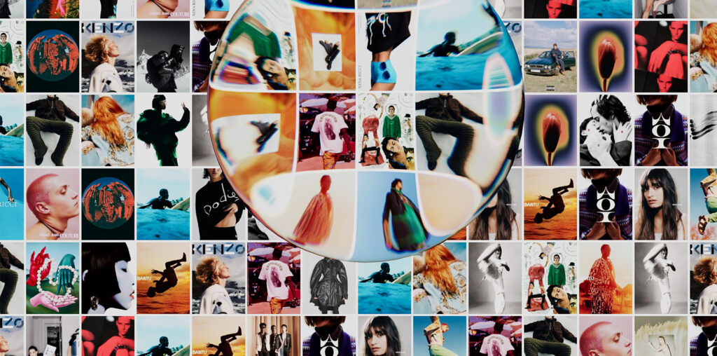
The clever landing page concept of a contact sheet with magnifier piques the user’s interest before leading to a well-organized, easy to navigate agency portfolio.

The custom type here conveys movement and dynamism. The color scheme is earthy, with bright accents that add vibrancy.

The color scheme here is muted, allowing the photographs to provide the bulk of the visual interest. The overall feel is clean while also welcoming.

This portfolio site for creative agency Otherlife focuses almost entirely on case studies. These are well presented with plenty of images and concise supporting text. The agency’s own branding is minimal and avoids intruding.

Docky is an Airbnb type platform connecting boat owners with berths. This supporting website splits into two to cover renter and rentee services separately. Animation and simple illustration add depth.

Watchmaker Omega is promoting its support of the ClearSpace project to remove manmade debris from space. Animation and illustration combine to create an impactful and informative experience.


