Header Photo by Jakob Owens on Unsplash
A new feature we’ve been building out required the use of a thumbnail picker for video files. After looking around for open-source implementations, it was clear that there wasn’t something that already existed which would fit in with our app – for this reason we needed to build our own video thumbnail picker component. This component, Thumby, can be found over on GitHub.
In this article I want to dive into the iteration of this process, from reusing existing framework classes to building our own open-source solution.
The requirements
When it comes to the selection of a thumbnail for a video, there were a couple of different requirements that we needed to bear in mind for the implementation:
- Open Thumbnail selection screen, passing Uri for chosen video
- Load a collection of thumbnails to the SeekBar as a background
- Load the current thumbnail into the SeekBar thumb background
- Update the SeekBar thumb background as the user scrubs through the video
- When chosen, finish the activity and pass the thumbnail location for retrieval

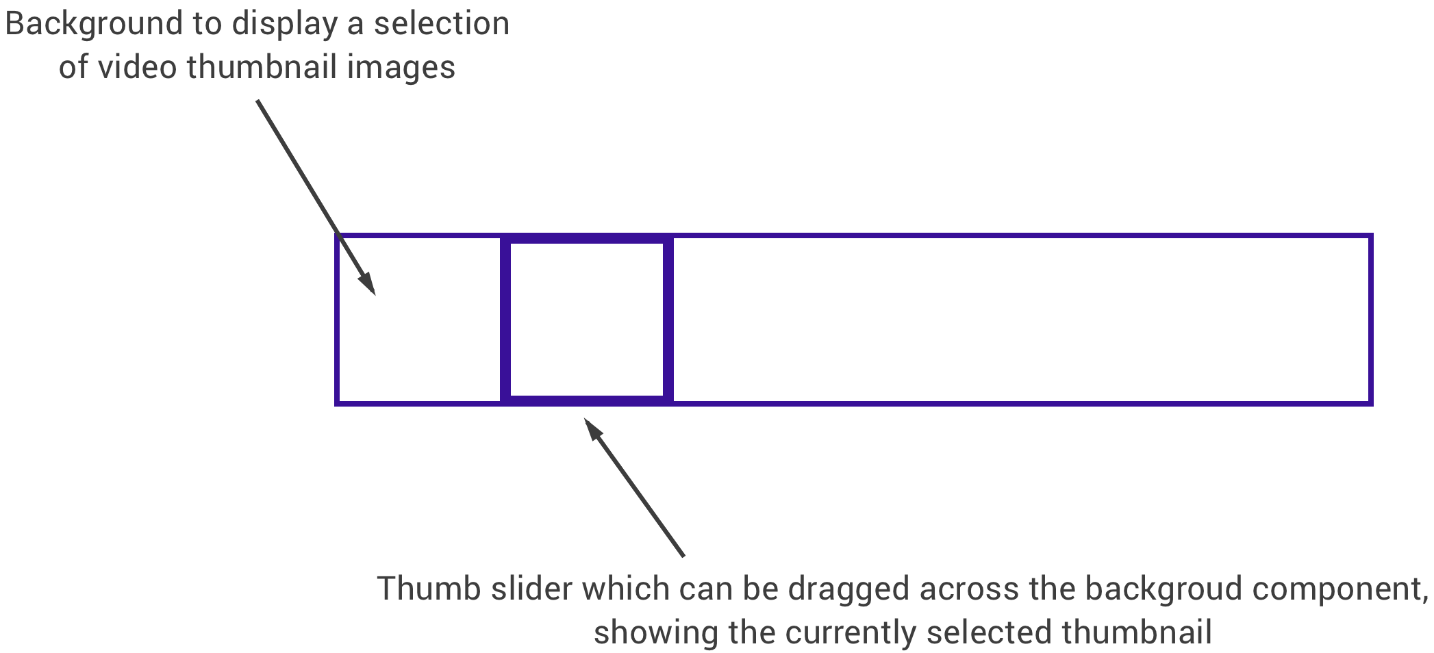
The SeekBar style component that we required in itself doesn’t come across as too complex, overall it would end up consisting of two core parts which were the video timeline (a background essentially made up of thumbnails) and a thumb which would be used by the user to scrub through the selected video:

Customising the Android SeekBar
I wanted to begin by attempting to customise the SeekBar widget from the Android framework – if we could use and tweak an existing implementation, then why recreate the wheel? We didn’t end up going with this approach as it didn’t turn out as great as I had hoped, but it was worth trying for an initial implementation.
If you’re not familiar with the SeekBar component, it’s a component used to seek through media files – you’ll likely see one within the media player in your device. Within the framework, this component extends from the ProgressBar – the main different being the thumb which is used to perform the seek operation via a touch or key press event. In most cases the SeekBar does what you need it to do – you can sync it with some media source on the screen and then use the listeners of the SeekBar to receive seek position updates and have that reflected within the media source that you’re displaying. Although we’re not going to be displaying seekable media on the screen, we do need the functionality of being able to seek through the length of a media source, which the SeekBar is perfect for.
Whilst we can check that functionality off of our list, we don’t actually need to show the SeekBar on the screen. Because it extends from the ProgressBar component we are displayed a determinate progress bar – this bar fills its progress as we seek. Whilst this is great for situations where you are actually seeking through media and require that form of progress indicator, we are not actually playing the media source here so do not require the ProgressBar to be displayed.
progressDrawable = ColorDrawable(ContextCompat.getColor(context, android.R.color.transparent))
background = ColorDrawable(ContextCompat.getColor(context, android.R.color.transparent))
Now that we have the progress state hidden, we need to make the thumb of the scrollbar display the current thumbnail. The thumb property of the SeekBar allows us to set a drawable instance to be shown within its content area, this is perfect because we intended on showing a square image for the current frame as the thumb. For this, we create a new instance of a BitmapDrawable and set it as the thumb of our SeekBar – at this point we almost have all that we need.
thumb = BitmapDrawable(resources, addWhiteBorderToBitmap(bitmap, 4))The only issue with this is an offset which is automatically applied to the thumb. This offset exists so that the drawable is always placed centrally on the thumb, so not to interfere with any scrub positioning. By default this is set to the width of the thumb / 2 – whilst in most cases this is fine, if you are showing a video timeline underneath the SeekBar then this may cause some issues. If this is the case then you may need to assign some padding to each side of the SeekBar to ensure that your thumb aligns correctly with the background that it’s showing on-top of.
With all of the above in place, this implementation mostly worked. We had our video timeline that showed a sliding thumb for the selected thumbnail at the current seek position. Whilst this worked, there were some issues with performance – and this solution isn’t very scalable. For example:
- With this approach you need the thumbnails pre-loaded so that they can be accessed by the thumbnail view within the SeekBar. Whilst you can fetch video thumbnails from the media store, hitting this every single time the SeekBar progress changes isn’t very efficient and will cause some lag in your layout.
- With the above in mind you also become a bit restricted when it comes to larger videos. For example, if the user loads in a video that is 8 minutes long you’re going to still want to show a regularly updated thumbnail on the SeekBar – otherwise it will appear as though the thumbnail isn’t changing. Without hitting the MediaStore for thumbnails every second within the progress, you’d have to keep a reference to all these thumbnails. And if you didn’t want to load them all upfront like that, then loading them on the fly in chunks would be a bit fiddly – what if the user skipped straight to 75% of the progress, and then back to 50%? There are a few situations that make that idea a bit complicated.
Due to these restrictions, we decided that customising the SeekBar component wasn’t going to work for what we wanted. Whilst this didn’t work out, this didn’t take long at all to try out and extending from existing components is always favourable, as if done properly you avoid re-inventing the wheel and at the end the implementations will likely be easier to maintain for you and other developers.
Creating a custom implementation
Because of the things mentioned above, we needed to put a custom seekbar solution in place for the our thumbnail selection. Now, the video timeline display worked fine from the previous implementation so we kept that – the only thing that needed to be changed was the seekbar with the dynamic preview.
At the top of the thumbnail selection screen, we show a large thumbnail preview. The view that shows this is a TextureView in the form of a CenterCropVideoView – we have a custom view here so that we can have a center cropped video displayed on screen. Because we already have this implementation, it’s a perfect opportunity to reuse it as our custom seekbar thumb! It can get a bit complicated to paint a TextureView on a canvas, so to keep it simple the view is added to our layout and as touch events occur, the view is moved to match the current touch position. Once we have that touch position, we do a little bit of math to calculate where the view should be relative to spacing and whether the touch state falls within the background bounds. We then translate the x position of the view to the calculated value and then set update the current position of the video that is being displayed inside of that thumb view.
The only other thing that we needed to imitate was the current progress of the SeekBar, this is so that we could use the progress of the custom seekbar to update the preview at the top of the screen. Again, this was just a little bit of math to imitate that functionality of the SeekBar (used from the extended ProgressBar).
I don’t want to go into the implementation here as the code is open-sourced, but that is essentially all of the logic that is taking place here to complete the custom SeekBar solution. As you can see, we got pretty lucky here with being able to re-use our CenterCropVideoView within our custom seekbar. The code used to handle the thumb position was nothing trivial, meaning that for a small amount of work we were able to alleviate the downsides that came from the first solution outlined in this article. We no longer required to retrieve and keep a reference to the desired thumbnails, as the video within the CenterCropVideoView was handling the display of the current location for us.
Conclusion
This brief write-up aimed to highlight two things:
- Don’t reinvent the wheel when you don’t need to! The Android framework has a lot to offer and in a lot of a cases, the first solution here would likely suffice. When it comes to implementation that require support for a lot more functionality, things can get complicated.
- Re-use what you can – if things don’t quite work out at first, it’s likely you don’t need to scrap what you have. Whilst we couldn’t directly use the SeekBar for our implementation, we were able to reuse the background of the video timeline as well as the CenterCropVideoView that we had in place. Meaning the re-implementation of the feature was more of just a tweak to change the views position on screen manually. This allowed us to keep things simple and move quick on getting the feature in place.
Whilst we haven’t got too technical here, I hope sharing this process helps to provide some future thinking points for when you come to customising components within your app – keep it simple ? If you have any questions on the above or thoughts that you want to share then please do respond below!
Try Buffer for free
140,000+ small businesses like yours use Buffer to build their brand on social media every month

