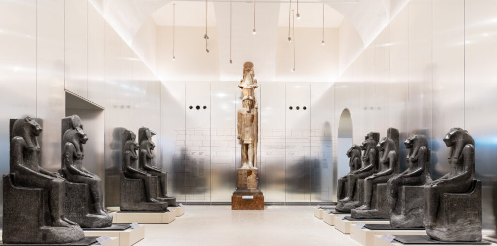
OMA renovates gallery of the kings in turin’s museo egizio
During the design tour of the recently-unveiled Gallery of the Kings at Turin’s Museo Egizio, designboom speaks to OMA partner David Gianotten, project architect Andreas Karavanas, and collaborating architect Andrea Tabocchini to learn more about the renovating process. Part of OMA’s full renovation of the museum, expected to be completed in 2025, the gallery redesign wraps exhibits in a selection of reflective materials that, together with enhanced illumination, introduce a brighter, more pleasurable visitor experience.
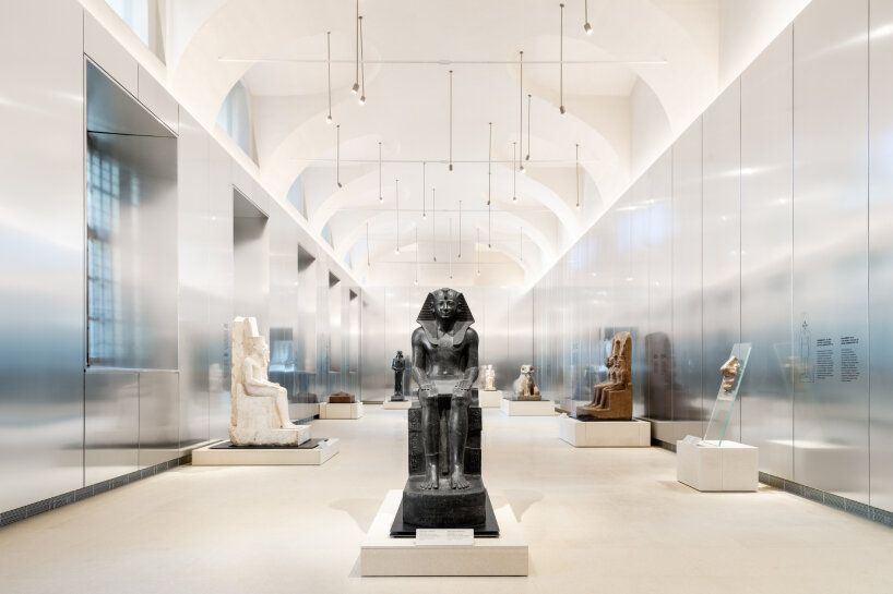
Gianotten explains that the original design of the gallery was supposed to be temporary, one that scenographer Dante Ferretti curated in 2006 in time for the Torino Winter Olympics. Ferretti realized the motif of a black box: large mirrors, earth-colored walls, grilles in the ceiling to conceal the warm spotlights, and bright beams pouring onto the raised statues that towered over the visitors. It gave a cinematic effect, a treasure hunt feel for those roaming around. Several years later, the change has come. OMA, Andrea Tabocchini, and the commissioning team revamp the design, but not without a homage to the previous look. In fact, the main theme of the renovation is ‘from darkness to light’, and quite literally, because now, a shower of natural and museum lighting fills the once darkened room. Today, large panels of anodized aluminum flank the walls, reflecting the surroundings, light, statues, and even the visitors’ hazy movement.
all photos by Marco Cappelletti, unless stated otherwise, courtesy of OMA
Redesign that helps visitors learn more about the statues
OMA’s David Gianotten and Andreas Karavanas, as well as Andrea Tabocchini, worked closely with the Museo Egizio’s curators and researchers for the redesign of the Gallery of the Kings. During the collaboration, the museum’s team informed the architects that they’re worried about people interacting with the statues to the point that they might damage them. Sometimes, these historical artifacts are also borrowed by other museums, so the renovation team needs to make sure they can be transported easily. Aside from the technical considerations, the redesign also revisits how renovating a space can revalue the worth of the artefacts on display.
During our interview post-tour, David Gianotten explains that visitors don’t come to the Gallery of the Kings to only admire the architecture. It helps, sure, but they’re there to observe and learn more about the statues and their history. ‘Most people will not realize the effects we bring in—maybe unconsciously—but they don’t fully understand. That is a great honor: to be that background while delivering something that adds to what the curators can do with these statues,’ he shares with designboom. So, they’ve put their best foot forward to let the artefacts and their origins stand out, with the subtleties of their materials and design amplifying the spotlight.
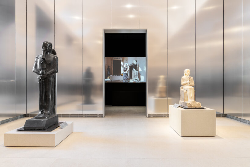
visitors first pass through a dark entryway with digital projections
Inside the renewed gallery by OMA in turin’s museo egizio
Gianotten stops us from entering the Gallery of the Kings for a while. We stand in the dark, in the black-box passageway that leads to the renovated exhibition halls. The only sources of light come from the portal towards the gallery and the projections flashing animations and information about the Karnak, or the place of origin of the statues, onto the black walls. Unlike the previous design where the facades wore earthy tones, it’s just black now to sharpen the visuals of the projected clips and backstories about the statues. David Gianotten asks us to now enter the Gallery of the Kings, giving us a heads-up about the momentary disorientation from the sudden flash of light. And the lighting doesn’t come gradually. It’s instant, natural even.
Gone are the grilles and spotlights in the ceilings. No more sand-colored walls. All the windows that were once closed or barricaded? Taken down so people see the outside and allow the natural light to flood into the spaces. There are two exhibition halls, both of which have a slightly different theme. In the first room, the statues are kept on the sides and in the corners, carving a roomy area for people to walk around. The reason behind this is that the museum wants to use it as a multipurpose space where artists can perform and companies can host their dinners (yes, tables can be set so people can eat with the statues). In the next room, there are seated statues in the middle of the hall, a group of statues of kings and gods arranged chronologically in front of the pharaoh Amenhotep II.
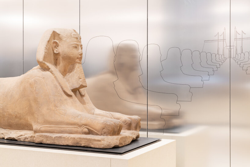
the historical information and graphics about the statues are displayed on the reflective aluminum walls
David Gianotten tells us during the tour that all of the statues, except in the second hall, are in the corners or on the sides because that’s how they’re placed in ancient temples. He points towards the anodized aluminum walls next and says that they’re modular. They’re not fixed but are just ‘hanging’ because they conceal the humidity, temperature, and other controls that keep the entire space safe from damaging atmospheric factors such as city air. One of the reasons the renovation team uses aluminum walls is because they want to create the feeling of endlessness and inclusion. They imagine the dessert, so vast and stretching that it compels travelers to keep on walking.
‘The aluminum creates a situation where everything feels endless because you don’t see the end of the room as it continues. Sometimes, you even see the statues from here. This endlessness of the Karnak or Kanokon of the desert is reflected by using the material,’ David Gianotten explains to designboom. He directs our attention to the statues. He says that in the previous design, they were raised above the eyeline of the visitors. They’ve lowered them in the redesign. Visitors can come close to them now and scrutinize their details, from their innate carvings to the inscriptions etched around their bodies.
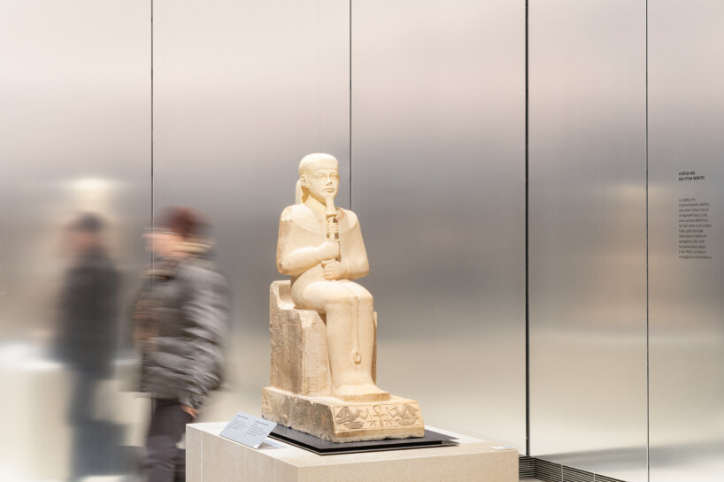
with some statues, visitors can walk around them
Lowering the statues is a way for the OMA, Andrea Tabocchini, and the renovation team to also allow visiting researchers and scientists to study the statues. In the past, they would have to move the towering pieces just so they could analyze their body writings. There’s no need for it now, even the ones positioned in the corners, because even then, there’s still a gap between the aluminum walls and the statues so visitors can see what’s behind these historical figures. Looking at their platforms, their colors share the same shade as the floor for continuity.
A feature that David Gianotten points out during our tour is the metal base of the statues. It took extra care to transport them when borrowed by other institutions, and a crane was needed to carefully lift them from where they were standing. For the renovation, the design teams create detachable steel bases and moveable white-sand-colored platforms so that forklifts can easily inject their forks under the statues, bring them up, then transport them. The technique is new to the museum, among other things.
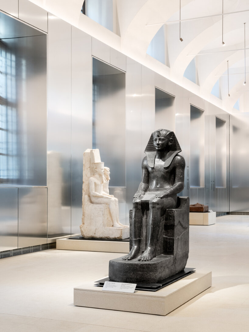
the reflective walls help diffuse both the natural and museum lights
Most of the redesign’s features are centered towards the visitors, including the reasonable spacing between them and the platforms so they can easily observe the details of the statues, the graphic information printed on the aluminum walls, and the QR codes next to the artefacts for more information about their origins. The tour and visit conclude where we started: in the dark passageway with projections. That’s also an intentional design by OMA and Andrea Tabocchini because in the previous one, it felt more like following a road. It was closed, and visitors had to walk straight or towards a fixed pathway. Now, both doors and paths are open.
Nothing separates the entrance and exit; it’s a continuous dark alley. But when the visitors exit from the second hall of the light-flooded exhibition space, they find the extension of the show through movie and video presentations. In this way, the museum can invite audiovisual artists to showcase their works before the visitors leave the Gallery of the Kings. David Gianotten wraps up the tour and thanks everyone for coming. designboom stays, and in the next room, he, Andreas Karavanas, and Andrea Tabocchini continue our conversation about the remodeled gallery, the use of aluminum walls and lighting in the redesign, and what’s next for OMA’s renovation of Turin’s Museo Egizio, which is scheduled to be finished in 2025.
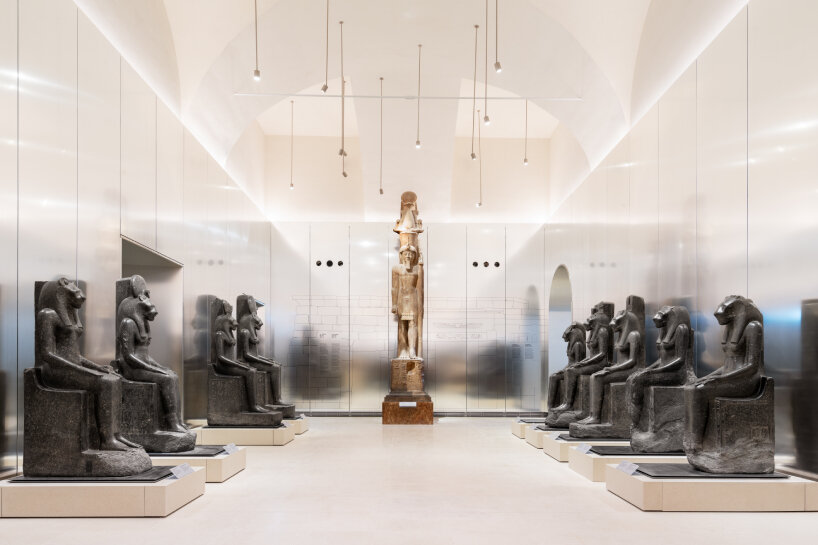
the statues are kept on the side because that’s where they’re set in ancient temples
DESIGNBOOM INTERVIEW WITH OMA and ANDREA TABOCCHINI
designboom (DB): Thank you for showing us around in this renovated Gallery of the Kings here at Museo Egizio in Turin. One of the design themes is the transition from darkness to light. Aside from that, meaning helping illuminate the space more, are there other reasons why you used reflective anodized aluminum for the walls?
David Gianotten (DG): One of the real things important for us was to create a feeling of endlessness and inclusion. The aluminum creates a situation where everything feels endless because you don’t see the end of the room as it continues. Sometimes, you even see the statues from here. This endlessness of the Karnak or Kanokon of the desert is reflected by using the material. Another important thing is that we didn’t want a difference between statues or artifacts elevated above and visitors looking at them. Especially when you look into the walls and the reflection, you see that artifacts and people actually become one because they are reflected similarly.
That creates this modern way of experiencing art as an experience rather than being a person looking at something to get wise. That is why we wanted the reflection and the anodized aluminum. You can dim the reflection, which was important, and it’s not completely mirrored. We didn’t want a silky mirror-like approach, as it creates a blur. The idea was that this transition moves from the artifacts to the old building, creating a connection from the old to the new.
Andrea Tabocchini (AT): Also, in the competition brief, light was a big topic. The commissioning team wanted to transition and an exhibition that would be of impact, where there would be interaction. Reflectiveness is one way you do it, together with the topic of light, which makes the environment brighter. It was a response to a request.
