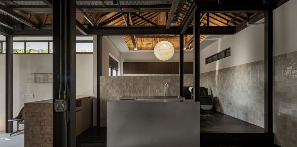

Text description provided by the architects. Tan Hapjeong is the second location of the Tan brand, following the first store in Yeonnam, both designed by oftn Studio. Before beginning the design of the Hapjeong branch, two primary points were emphasized. The first was to create a space with a distinctly different mood from the Yeonnam store. Interestingly, before starting the design, the team explored the hair portfolios and social media profiles of the designers who would work in this space. The goal was to reflect the personality and style of the actual users in the design, thereby completing the brand’s identity. The client also aimed to differentiate this location by appealing to designers with unique styles or those pursuing alternative approaches to hairstyling compared to the first store.

The second point was the unique characteristics of the site itself. The space featured a gabled wooden ceiling structure and grid-patterned framed windows on the façade. During the initial site visit, the design team was captivated by these existing architectural elements and decided to highlight them as key features. The aim was to incorporate the charm of aged elements accumulated over time into the branding.

While the Yeonnam store conveys a casual and modern image, primarily using neutral-toned tiles and metallic materials to achieve a clean and sophisticated look, the Hapjeong store takes a different approach. By embracing the aged and weathered qualities of the existing building, the design aimed to evoke a sense of craftsmanship. The intention was to create a space that is unrefined yet exudes the brand’s unique taste, turning the imperfections of the old structure into a defining feature.

Both locations share a common theme, which is evident in their naming. Rather than being called a “hair salon,” they are referred to as “hair studios,” emphasizing the idea of a workspace. The goal is to provide customers with a relaxed experience, as though they are visiting a friend’s creative studio to get their hair done.


Natural light was utilized as much as possible, and materials that reflect light retained their natural texture and properties. The transition from the main hall to the shampoo area features a subtle change in level, highlighted with pressure-treated wood that reveals its charm as it ages. This transition creates an open yet distinctly separate spatial experience. Functional furniture pieces throughout the space incorporate a variety of materials and patterns, adding diversity and character to the design.


