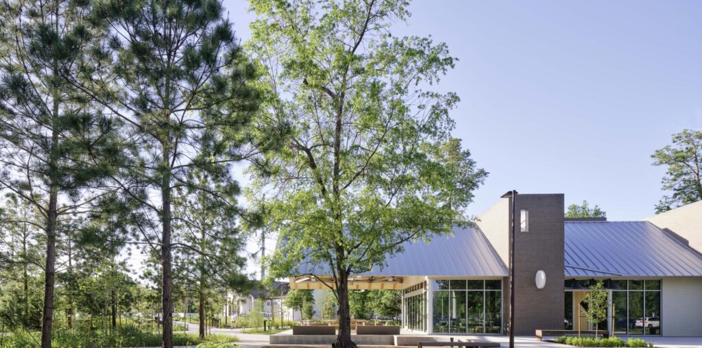
As Houston inches into the more comfortable space between summer and fall, I find myself at the Memorial Park running track to get a couple miles in. Breathless and sweaty, I walk over to Vibrant, the park’s new health-conscious food option. There’s no better reward after a solid run than only having to walk 50 feet to fuel my coffee addiction. Designed by Schaum Architects as a second location for the original cafe in Montrose, this building is intentionally made to integrate seamlessly with the surrounding landscape.


The most notable element of the cafe is the generous patio facing the park. This features a gabled steel roof that boasts a 30-foot cantilever. The structure resolves in a vaulted ceiling that ensures no columns interrupt the space below. As I walk along the building, I also notice that small squares push out of the brick to create a textured facade.


Inside, floor-to-ceiling glazing frames views of the park, and a color palette of white and light-toned wood complements the steel structure and window mullions. An operable glass wall connects the interior to the exterior, strengthening the seamless line to the park. This combination of color and glazing also allows the late summer’s pale-yellow sunlight to subtly transform the otherwise cold color scheme into a warm and inviting one. The interior is split into three bays by exposed beams: kitchen, serving counter, and seating area, with the kitchen housed within the larger brick mass at the front of the building. The second is thinner and hollows out inside to create an invisible separation between the serving and seating areas. As a testament to the intentional design, the patio even features benches instead of chairs with backs at the perimeter of the space to bring the nature in unobstructed.
Pooja Desai is a writer and researcher at the Community Design Resource Center at the University of Houston.

