The first step to any code review is understanding what the code does and why. Although the author is by far the most qualified person to answer these questions, all too often, the reviewer is left to answer them on their own. With no pull request (PR) description, reviewers need to assess changes with only the title and, at best, some kind of tracker ticket for context — and let’s be real, the ticket is probably empty too. The review process essentially becomes a big game of telephone. The truth is, empty pull request descriptions slow down teams.
When I first joined SoundCloud, that’s what PRs in many of our greener projects looked like. Every time I reviewed a PR, I had to meet with the author in real time to get answers about what their code did or why they made certain decisions. Often, after talking to them, I’d realize that all the assumptions I’d made on my own were totally incorrect. In turn, I found I was starting to avoid PR reviews because there was so much overhead in getting to the review.
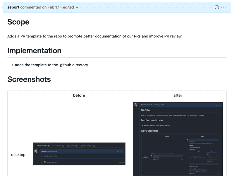
Before adding PR templates
To combat this, I recommended a PR template as a way to make it easier to orient myself when reviewing. Not wanting to introduce too many changes too quickly, we initially added the template to just one repository. There was also no rule against empty PRs; we merely added the template and left it up to the individual to decide whether or not to fill it out. Lo and behold, with just this simple suggestion, suddenly all of our PRs were full of context, explanation, and discussion!
After adding PR templates
By reducing the PR writing process to a series of fill-in-the-blank steps, the PR transformed from a throwaway document to a valuable asset for knowledge sharing across teams that will outlive its authors. PR review instantly became easier, and the feedback on PRs became more relevant. Our experiment in templates was so successful that other teams began asking for our template to use in their repositories. I even had friends outside of work curious what kind of template we were using, so today I’m sharing the template that got us there.
Anatomy of a Good PR Template
## Scope
<!-- Brief description of WHAT you’re doing and WHY. -->

[closes TICKET-###](https://link-to-your-ticket)
The scope is the big picture of what and why. If your PR were an essay, the scope would be the introduction. Scope eases reviewers into your PR, so they spend less time orienting themselves to the ticket and more time reviewing effectively.
## Implementation
With @pair

<!--

Some description of HOW you achieved it. Perhaps give a high level description of the program flow. Did you need to refactor something? What tradeoffs did you take? Are there things in here which you’d particularly like people to pay close attention to?

-->
This section gives a human-readable breakdown of the changes in the PR. It might not be immediately obvious to reviewers what every change in the git diff does, so a summary of the technical implementation gives reviewers a context to place those individual changes into.
I like to leave a spot to call out pairing in this section. It positions pairing as a core value for the team, and it comes in handy when the PR surfaces in a git blame; the more names on the PR, the higher the chance that one of them has an answer to questions.
## Screenshots
|         | before | after |
| ------- | ------ | ----- |
| desktop |        |       |
| mobile  |        |       |
A picture is worth a thousand words, so definitely include a screenshot section if your team is responsible for any kind of UI component. It’s by far the most direct way to show the changes introduced in your PR. It also provides the fringe benefit of forcing developers to QA their own work. Including a section for web and mobile screenshots ensures that responsive designs are maintained.
Screenshots might make less sense for backend APIs, but including class or flow diagrams is a great alternative to visually demonstrate your changes.
## How to Test
<!--

A straightforward scenario of how to test your changes could help colleagues that are not familiar with the part of the code that you are changing but want to see it in action. This section can include a description or step-by-step instructions of how to get to the state of v2 that your change affects.

A "How To Test" section can look something like this:

- Sign in with a user with tracks
- Activate `show_awesome_cat_gifs` feature (add `?feature.show_awesome_cat_gifs=1` to your URL)
- You should see a GIF with cats dancing

-->
There’s no better way to judge the success of a PR than actually running the code and seeing it work. A straightforward scenario of how to test your changes will help your reviewers see your change in action.
## Emoji Guide
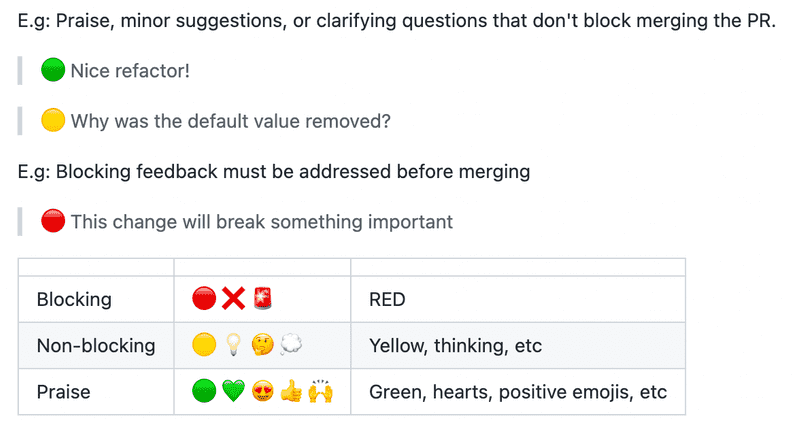
I like to include an emoji guide for reviewers in my PR templates, because it enforces code review standards on every PR. Color coding review comments with emojis helps keep feedback organized, disambiguates non-blocking and blocking feedback, and encourages positive feedback as a crucial part of the review process. 😃
The Template
GitHub makes installing templates extremely convenient. Just copy the template into pull_request_template.md (or any of the files listed here) and commit it to your main branch. From then on, you’ll see your PR template populate your new PRs automatically.
<!--

Please use the content below as a template for your pull request.
Feel free to remove sections which do not make sense.

-->

## Scope

<!-- Brief description of WHAT you’re doing and WHY. -->

[closes TICKET-###](https://link-to-your-ticket)

## Implementation

With @pair

<!--

Some description of HOW you achieved it. Perhaps give a high level description of the program flow. Did you need to refactor something? What tradeoffs did you take? Are there things in here which you’d particularly like people to pay close attention to?

-->

## Screenshots

|         | before | after |
| ------- | ------ | ----- |
| desktop |        |       |
| mobile  |        |       |

## How to Test

<!--

A straightforward scenario of how to test your changes could help colleagues that are not familiar with the part of the code that you are changing but want to see it in action. This section can include a description or step-by-step instructions of how to get to the state of v2 that your change affects.

A "How To Test" section can look something like this:

- Sign in with a user with tracks
- Activate `show_awesome_cat_gifs` feature (add `?feature.show_awesome_cat_gifs=1` to your URL)
- You should see a GIF with cats dancing

-->

## Emoji Guide

**For reviewers: Emojis can be added to comments to call out blocking versus non-blocking feedback.**

E.g: Praise, minor suggestions, or clarifying questions that don’t block merging the PR.

> 🟢 Nice refactor!

> 🟡 Why was the default value removed?

E.g: Blocking feedback must be addressed before merging.

> 🔴 This change will break something important

| | | |
| --- | --- | --- |
| Blocking | 🔴 ❌ 🚨 | RED |
| Non-blocking | 🟡 💡 🤔 💭 | Yellow, thinking, etc |
| Praise | 🟢 💚 😍 👍 🙌 | Green, hearts, positive emojis, etc |
Conclusion
Adding a PR template is a quick and easy way to improve PR hygiene on your teams. As a reviewer, I enjoy a lower barrier of entry in my reviews. As a code author, the reviews I receive are also more useful and productive as a result of including this template. I strongly recommend using a PR template, and I’d definitely consider adding a PR template for any new codebases in the future.


