- Area:
65 m²
Year:
2008
Manufacturers: Electrolux, Globo Daily, Miratap, toolbox-
Lead Architect:
Sorai Takei

Revitalizing a 1970s Wooden House in Sumida: Adaptive Reuse with Modest Updates – In Mukojima’s eastern district, a short walk from the station, stands a 65m² wooden, two-story house built in the 1970s. Previously dark and compact, the house has now been updated to better suit contemporary lifestyles through thoughtful, modest changes.

This renovation is part of Roovice’s Kariage initiative, through which we renovate old vacant properties and sublease them at no cost to the owner. The project was launched in response to Japan’s ongoing ‘akiya’ issue, with over 10 million vacant properties across the country.

A Family Home with History – The project began when the daughter of the original owner reached out to us. The home, which held sentimental value as her father’s childhood residence, was difficult to sell due to its non-rebuildable status. Leasing the property presented the best way forward.

Working with the Original Layout – The house’s original design presented some limitations, with a small kitchen beneath the stairs and an enclosed first floor that limited light. An external storage area further blocked natural light from entering the home. We aimed to gently open the space, preserving as much of its original character as possible.


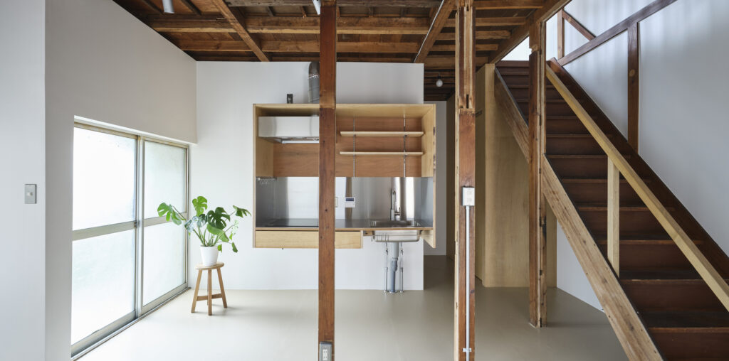
Enhancing Light and Flow – A key improvement was the removal of the external storage area to restore a blocked window, brightening the living space. We also opened up the staircase area and removed excessive walls and ceiling boards to create a more fluid layout. To unify the space, we installed neutral-tone PVC sheet flooring on the ground level and opened up the ceiling to add height and a greater sense of space.

Updating the Kitchen – The kitchen, previously confined under the stairs, was moved to a central spot in the open-plan layout. We installed a custom kitchen unit made of lauan plywood, designed to appear light and unobtrusive.

Respecting the Home’s Original Features – While much of the interior was refreshed, original elements, such as the entrance shelving, were refinished and retained to preserve the home’s character. Simple updates, such as replacing tatami mats with wooden boards upstairs, balanced modern expectations with respect for the house’s history.

Maintaining Practicality and Economy – In the bathroom, we chose to plaster over existing tiles instead of a full remodel, keeping costs down while providing a fresh look.

A Balanced Approach to Renewal – By introducing light and openness without major structural changes, we aimed to create a comfortable living space that reflects both the home’s past and present. This once-enclosed house now feels brighter and more connected, offering modern comfort in a space with roots.


